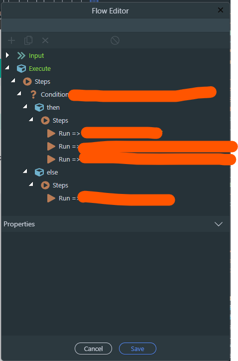
the window cannot be manually expanded horizontally or vertically to make the bigger code chunks easily readable without having to scroll back and forth.
I think there is something cooking for all such windows and popups.
SA ones (like query builder) are going to be eliminated as confirmed by the team in other posts.
Not sure what the plans are for these Flow Editor popups, but most likely there is one.
Page and inline flow editors should remain in context of the current page/tab. So a split tab should be the way for them.
A separate tab would be a productivity killer in my opinion.
Add my name to the frustrated list. I used to see what @mebeingken sees on my Mac but ever since v4 the window size is what it is and can’t be expanded to see complex flows easier. This is probably my biggest want at the moment for Wappler and I don’t care if it’s in it’s own tab or expandable whichever is the quickest to implement.
It gets to where I dread editing some of them. I usually end up in the code view because it’s easier to see what’s going on which is saying something cause it’s very condensed and can get confusing in and of itself. I guess the upside is I’m getting very familiar with how the editor formats things on the page haha.
Chiming in because Wappler 4.2.0 made me think of this!
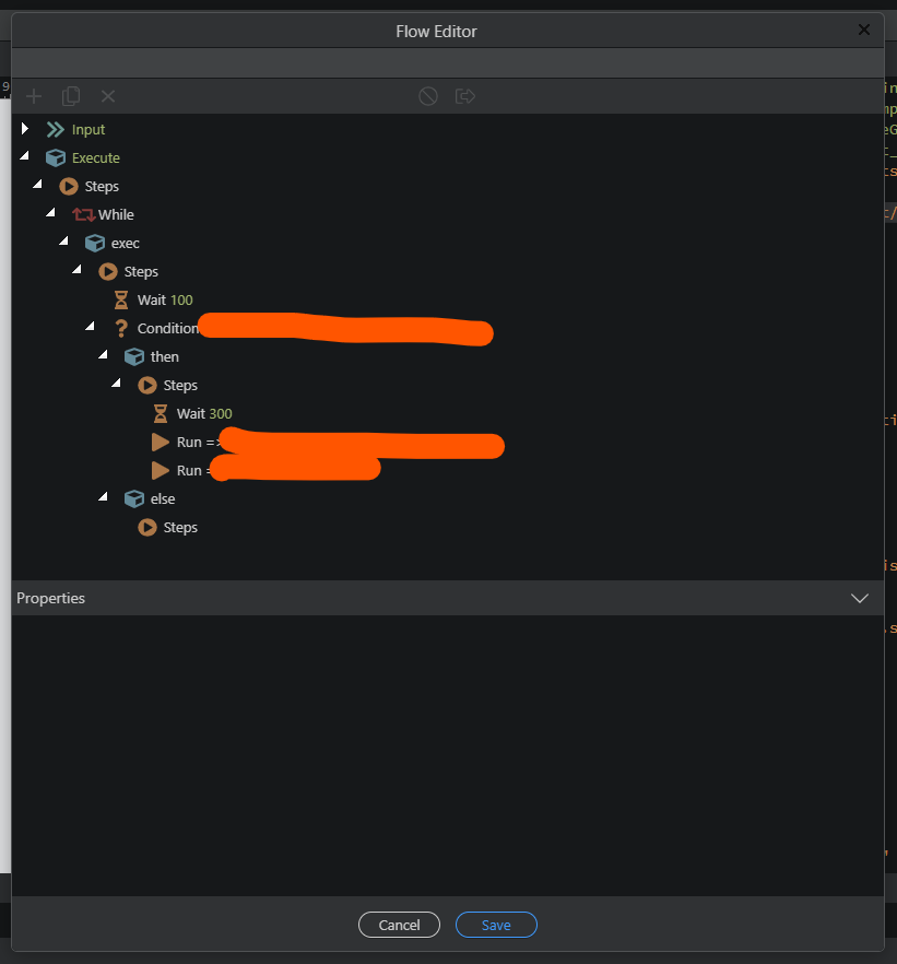
I had a quick look at the new block design for the server connects and app flows in Wappler 4.2.0, and its a big step-up in terms of readability.
The only problem is that the new design, in combination with the flow editor window being this small is that any complex/nested flows are even more difficult to view. When it was just the indented text it was only a minor inconvienience.
Since it’s an optional feature it’s not a big deal right now, just thought i’d mention it!
Given that they already started moving these to tabs I guess it’s just a matter of time they can circle back to this and deliver so we can take advantage of the extra space.