Looks like we have to manually add an asterisk to an input field to do this, which would require adding another container to each input area? I’m using the floating labels and adding a cotainer might break this, at least when I tried it it did.
Any best practices for accomplishing this?
Thank you
Label as required in the placeholder?
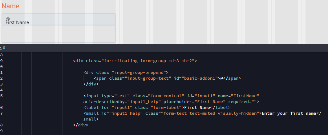
Yes, in fact that’s exactly what I’ve done – prepended an asterisk in the label but boy does that look dorky. Visually messes with label alignment.
So what exactly are you trying to achieve then?
Ideally I’d put the asterisk to the right of the input field. It would show when the required attribute is set, either manually or if data binding changes the field to required.
What about appending the asterisk to the end of your form input?
Why won’t you just enter it like:
<label>Input *</input>
Doesn’t it work for you? Or maybe provide an example of what are you trying to achieve.
Also please post your code here, not screenshots of it.
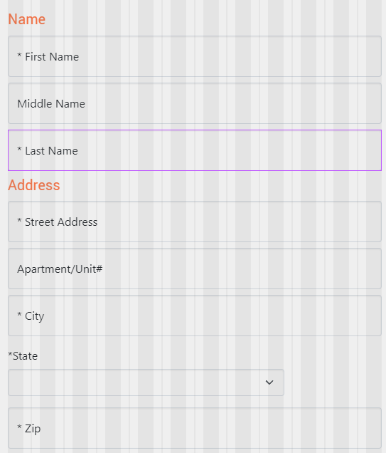
This is what I would like to see (the asterisk placement to the right of the field):
My current code is:
<div class="form-floating form-group md-3 mb-2">

                                <input type="text" class="form-control" id="input1" name="FirstName" aria-describedby="input1_help" placeholder="First Name" required="">

                                <label for="input1" class="form-label">* First Name</label>

                                <small id="input1_help" class="form-text text-muted visually-hidden">Enter your first name</small>

                            </div>
Never tried this and not near computer but what about adding a font awesome icon at the end of the text input?
Good idea, thanks, I tried this but was unable to position it correctly.
Maybe something on the lines of:
<div class="d-flex align-items-center mb-3">
                        <div class="form-group md-3 form-floating w-100"> <input type="text" class="form-control" id="login_users_username" name="login_users_username" placeholder="Enter Username" required=""><label for="login_users_username" class="form-label" style="">Username</label>
                        </div>
                        <p class="pt-2 pb-2 ps-2 pe-2">
                            <i class="fas fa-asterisk fa-fw"></i>
                            <br>
                        </p>

                    </div>
                    <div class="d-flex align-items-center mb-3">
                        <div class="form-group md-3 form-floating w-100"> <input type="text" class="form-control" id="login_users_username1" name="login_users_username1" placeholder="Enter Username " required=""><label for="login_users_username1" class="form-label" style="">Username</label>
                        </div>
                        <p class="pt-2 pb-2 ps-2 pe-2">
                            <i class="fas fa-fw"></i>
                            <br>
                        </p>

                    </div>
The width would be a little less as you can see on the 2 extra username fields as it makes space for the icon and under that is one with no icon but keeps the inputs the same width
1 Like
It looks good but I’m unable to reproduce your results.
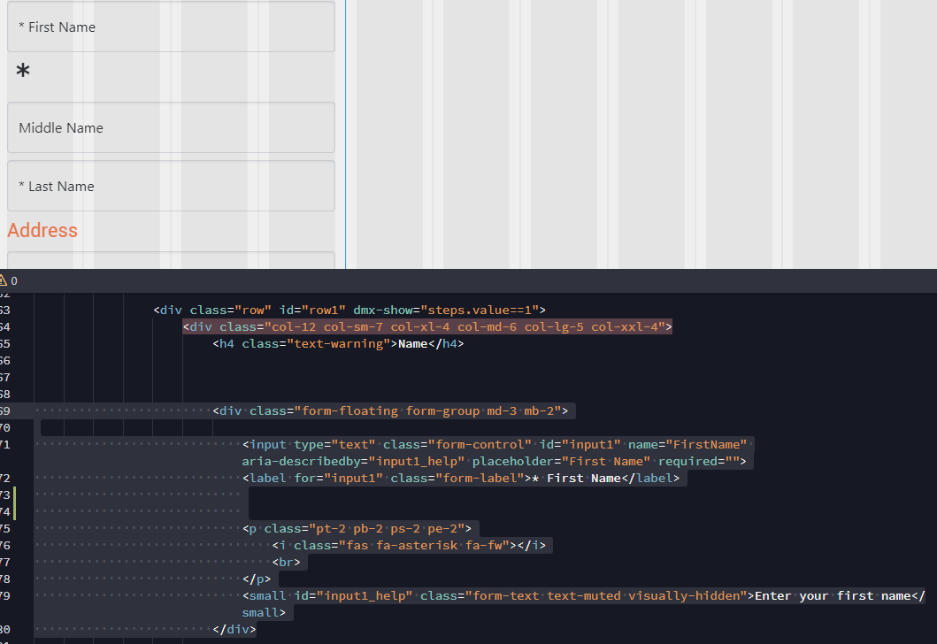
<div class="form-floating form-group md-3 mb-2">

                                <input type="text" class="form-control" id="input1" name="FirstName" aria-describedby="input1_help" placeholder="First Name" required="">

                                <label for="input1" class="form-label">* First Name</label>


                                <p class="pt-2 pb-2 ps-2 pe-2">

                                    <i class="fas fa-asterisk fa-fw"></i>

                                    <br>

                                </p>

                                <small id="input1_help" class="form-text text-muted visually-hidden">Enter your first name</small>

                            </div>
You need all the code looks like you left out the flex container
I’m not sure how to incorporate all your code into an existing form.
Try paste this under your current form group (just so you don’t lose your existing if this doesn’t work in your form):
<div class="d-flex align-items-center mb-3">
                        <div class="form-group md-3 form-floating w-100">
                            <input type="text" class="form-control" id="input1" name="FirstName" aria-describedby="input1_help" placeholder="First Name" required="">
                            <label for="input1" class="form-label">First Name</label>
                            <small id="input1_help" class="form-text text-muted visually-hidden">Enter your first name</small>
                        </div>
                        <p class="pt-2 pb-2 ps-2 pe-2">
                            <i class="fas fa-asterisk fa-fw"></i>
                            <br>
                        </p>

                    </div>
Here’s a full form so you can see how it looks:
<form id="form1">
                    <div class="d-flex align-items-center mb-3">
                        <div class="form-group md-3 form-floating w-100"> <input type="text" class="form-control" id="login_users_username" name="login_users_username" placeholder="Enter Username" required=""><label for="login_users_username" class="form-label" style="">Username</label>
                        </div>
                        <p class="pt-2 pb-2 ps-2 pe-2">
                            <i class="fas fa-asterisk fa-fw"></i>
                            <br>
                        </p>

                    </div>
                    <div class="d-flex align-items-center mb-3">
                        <div class="form-group md-3 form-floating w-100">
                            <input type="text" class="form-control" id="input1" name="FirstName" aria-describedby="input1_help" placeholder="First Name" required="">
                            <label for="input1" class="form-label">First Name</label>
                            <small id="input1_help" class="form-text text-muted visually-hidden">Enter your first name</small>
                        </div>
                        <p class="pt-2 pb-2 ps-2 pe-2">
                            <i class="fas fa-asterisk fa-fw"></i>
                            <br>
                        </p>

                    </div>
                    <div class="d-flex align-items-center mb-3">
                        <div class="form-group md-3 form-floating w-100"> <input type="text" class="form-control" id="login_users_username1" name="login_users_username1" placeholder="Enter Username " required=""><label for="login_users_username1" class="form-label" style="">Username</label>
                        </div>
                        <p class="pt-2 pb-2 ps-2 pe-2">
                            <i class="fas fa-fw"></i>
                            <br>
                        </p>

                    </div>
                    <div class="form-group md-3 form-floating mb-3"> <input type="password" class="form-control" id="login_users_password" name="login_users_password" aria-describedby="input7_help" placeholder="Enter Password" required=""><label for="input1" class="form-label">Password</label>
                    </div>
                    <button id="btn1" class="btn btn-primary" type="submit">Button</button>
                </form>
You will need to edit the labels, inputs etc to your liking but should give you an idea of the structure if still a little unsure
It’s working somewhat, I’ve lost al;l my responsive width settings from the parent “column” object. The flex container doesn’t stretch horizontally
Could you paste your entire form tags and ill see if I can adjust this design for your form see if I can get it working with the responsive widths etc
It’s a huge form… can a flex container be set to be responsive somehow? This would fix it.