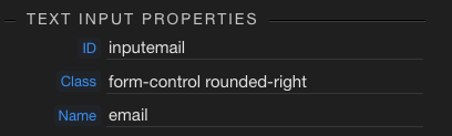
I have some inputs I want to validate before submitting a form.
However I don’t like the look and feel of the “standard” way to do validations in Bootstrap… all these random green check marks that appear in inputs don’t suit my style of user interface.
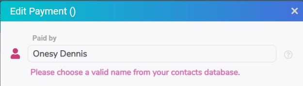
So… I am looking for a different way to do things… I don’t want any check marks to appear, but just a custom message I have placed below the input if there is an error, like this:
So I am thinking what is the best way to manage this.
I can write a flow to check each input against some rules… this will work but is quite time consuming.
I am wondering - is there a way to use the validation rules that can be set in Wappler, but turn off the bootstrap indicators, and have an invalid input be detected in some way, which I can use to trigger displaying the validation error message?
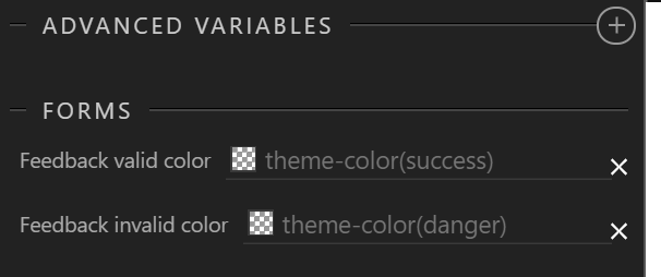
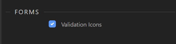
In the theme builder inside Wappler there are two settings that change the border/box-shadow colour of the form inputs:
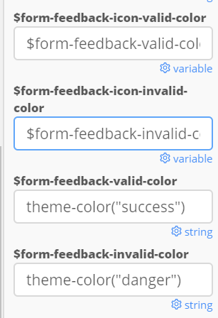
But if you use a bootsrap builder (like https://bootstrap.build/) then there are a couple of other settings you can change (and then just manually export the css file and override in your project.
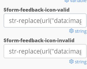
And also this one that removes the icons all together or you could perhaps look at changing the SVG image that is used in place of the tick or cross (not sure on this though)
And actually, i see Wappler has probably all those elements in the Theme Builder but they might use this simpler tickbox in the basic part to enable/disable the validation icons:
Thanks for your help so far folks! So I can turn off the tick marks okay.
However I don’t want the messages appearing as the user types… so when entering an email address for example. It feels too “Big Brother”. I just want the message to appear when they click [Submit].
Not so helpful for your question @Antony but I did read once before that the reasoning for the validation tick icons was to help those with limited sight or colour blindness, I will have to try and dig up the article, it was an interesting read and made me think more about UX for those with disabilities.
Indeed. We tend to forget about accessibility very easily. It’s unfortunately natural and you need to make an extra mental effort to add that into the equation when designing.
I got reminded of that when looking for a way to remove an ugly css style for one particular element in a plugin.
While looking for the way to do it I ended up in a github issue where the author clearly stated that he had put a lot of effort and thinking into making his plugin 100% accessible and asked people not to remove/change that piece as it was very important for those that couldn’t use a mouse.
So now I try to be more aware of accessibility in general.
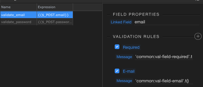
@teodor, I have done that. When I submit the form then I get a invalid submission, but I'm not seeing the messages I have set up on the server side appear on the client side.
Is there something specific I have to do to make the server side messages appear to the user beneath the specific input?
Next question… my design is multi-lingual, so I need to fetch the validation failed message from the database an apply it to the server side validation rule… what syntax do I use to apply the database value to the message…?