I have a dmx bar chart that I need to base on a server connect API (as returned below)
I cannot get it to group by activity_type and then count each in the chart datasource
Appreciate Thursdays are a busy day for the Wappler team, but could do with getting some help on this. I had read a few others having queries about the Group By on charts.
Is there anything I can do post Server Connect API to format the results to play nicely with the X / Y axis?
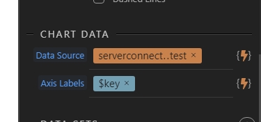
In the chart for Data Source use chartData.value.keys() and for Axis Labels use $value.
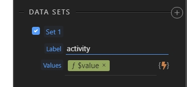
Data Set 1, Label Activity and in Values use chartData.value[$value].length.
Add a set value step and use the group by formatter there for the resources. Group by activity_type and enable the output option for the set value step.
Then use the set value step as a data source and $key as a label:
Use $value.count() as values for the data set:
EDIT: sorry it seems i posted the same time as Patrick did
Hi @patrick
Sorry to bring this up again.
I got the original chart working perfectly following your assistance.
However, I need to create another chart based on the same server connect data with another field included.
In the chart for Data Source use chartData.value.keys() and for Axis Labels use $value .
Data Set 1, Label Activity and in Values use chartData.value[$value].length .
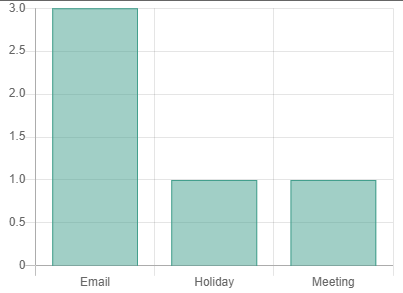
The variable is still being grouped by 'activity_type'
and the labels need to be the same, but I need to sum the activity_cost rather than count the number of items that are under a specific key.