Hello,
I made a swiper with slides in it and on each slide an image that uses Lazy load (how can I test if it works?), but they have different sizes (height) even with swiper auto height all images don’t stay fullscreen…
But what should happen on this page exactly?
It has nothing to do with the showcase link you provided. On the showcase page we only have the swiper and nothing else on the page…
How do you expect this on your page to be fullscreen when you have other content below it?
I need the swiper just like the showcase but with the menu on the right.
Or the images from swiper to be fullscreen on the height and not by the width.
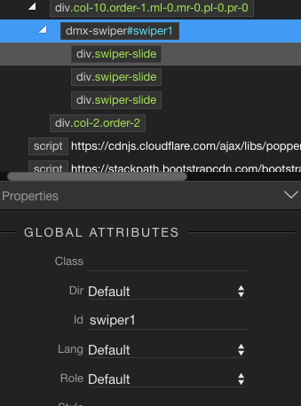
Well you need a swiper with slides, which have background images applied, instead of img tags used inside them. The background size should be set to cover.
Then you need to set the swiper height to 100vh using CSS.
This, however requires you to have at least basic knowledge of CSS. You can inspect the source code of the showcase you posted link to in your browser, to see how it’s made.
Looking good, just a small suggestion - you can put the height: 100vh; directly to the swiper container, no need to set it for each slide.
Also you can do this directly in your CSS, not inline. The only inline property that you need is the background image itself. So in your custom CSS add:
No Andre,
Just copy the code i provided to your custom css file and remove the inline styles you placed on each slide, just leave the background image style there.
No other change is required on the page.
The class you mention is applied automatically by our script.
@Teodor,
Is possible call smaller images just for mobile?
I want good quality photos on big screens, but on mobile, the swiper animation is not fluid, I think is because the images are too big.
@Teodor,
I still have some issues with the swiper, specially on Mac with safari.
The preloader sometimes don’t work and the images on the swiper with the animation are not fluid. The dropdown menu in mobile, is the same, not fluid.