Is it possible with Wappler Swiper to set slides showing to auto so slides with different heights can fit into a fixed height but resize their widths?
Like here: http://idangero.us/swiper/demos/140-centered-auto.html
Is it possible with Wappler Swiper to set slides showing to auto so slides with different heights can fit into a fixed height but resize their widths?
Like here: http://idangero.us/swiper/demos/140-centered-auto.html
@pixlapps, hi!
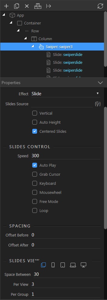
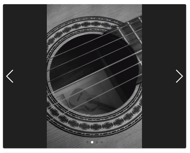
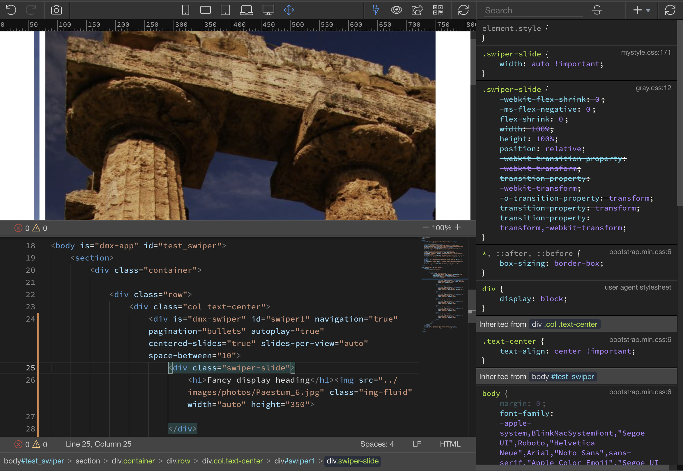
I will skip the steps to align the column in which the Swiper is placed and go straight to the steps to configure it. Note only that the height of the Swiper is set to 300px: http://svk.cy65837.tmweb.ru/swiper1.html
To set up Swiper I have done the following steps:
I centered the slides, turned on auto play, set the space between the slides and increased the number of slides displayed:
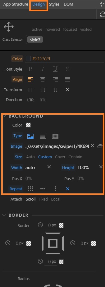
Images are set as a background for each slide (for this example, I did not bother with dynamic data). I applied the following settings to the image:
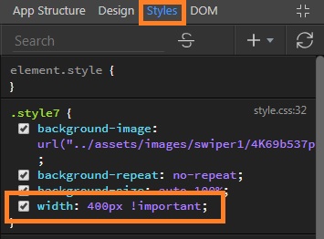
The last and most important step was to set the width of the slide in which the image is displayed. For the setting to work, it was necessary to see how wide each image is at a height of 300px, you also need to set the property !important to set the width was in priority (on the screen example of setting one slide, but each slide will have its own width):
Note that this width setting works, but I do not think it is correct. In theory, instead of a specific width in px should work value auto and take the desired width of the image automatically. But I have a similar configuration apply failed. If someone knows why this is happening, I would be grateful for an explanation.
Good luck all!
Watching Swiper work with the settings described above, I noticed the following:
Swiper takes the width of the first slide, and based on it sets the width of all subsequent slides. As a result, even if we set the individual width of the slide in css and use the property !important, the slider itself will play the slides as if they all have the same width. In other words, visually we will see that all the slides are different, but swiper will scroll through them as if they are all the same. Perhaps that is why it is not possible to adjust the width of the slide by simple methods, because it is set by swiper. If you still apply the settings listed above, you may experience problems on the mobile screen resolutions, because when adapting the error in scrolling will be even more noticeable.
Because Wappler generates a code Swiper different from the standard code, I’m not clear exactly where swiper from Wappler generates the width of the slides. Therefore, it would be very interesting to know how it works and whether it is possible to adjust the individual width of each slide correctly, so that there are no problems with changing slides when working with Swiper and mobile adaptation.
Thanks for your help @Mr.Rubi. Best person to enquire to about swiper and wappler is @patrick. He has provided some feedback in the past.
Your suggestion about using image as background-image instead of placed inline in html was very helpful.
I am using a repeat to create slides from database entries. So I just added the repeat slide and used dmx-style:background-image="‘url("./stock/’ + image + ‘")’" for the dynamic background.
Also this CSS for the slide size and background:
#swiper_item .swiper-slide {
height: 480px;
width: 100%;
background-size: auto 100%;
background-position: center;
border-radius: 0.25rem;
background-repeat: no-repeat;
background-color: black;
}
Lastly the images all open lightbox so I added an invisible container with 100% height and width absolutely(you can probably add it easily with Bootstrap flex classes but I used css)
My html now looks like this:
<div is="dmx-swiper" id="swiper_item" navigation="true" pagination="bullets" dmx-bind:slides="serverconnect_gallery.data.query_images" grab-cursor="true" slides-per-group="1" centered-slides="true" auto-height="true">
<div class="swiper-slide" dmx-style:background-image="'url("./stock/' + image + '")'">
<a dmx-bind:href="'stock/' + image" dmx-lightbox:items_images=""><div class="itemcover"></div></a>
</div>
</div>
And my swiper componant works like I want it to:
Hello @pixlapps
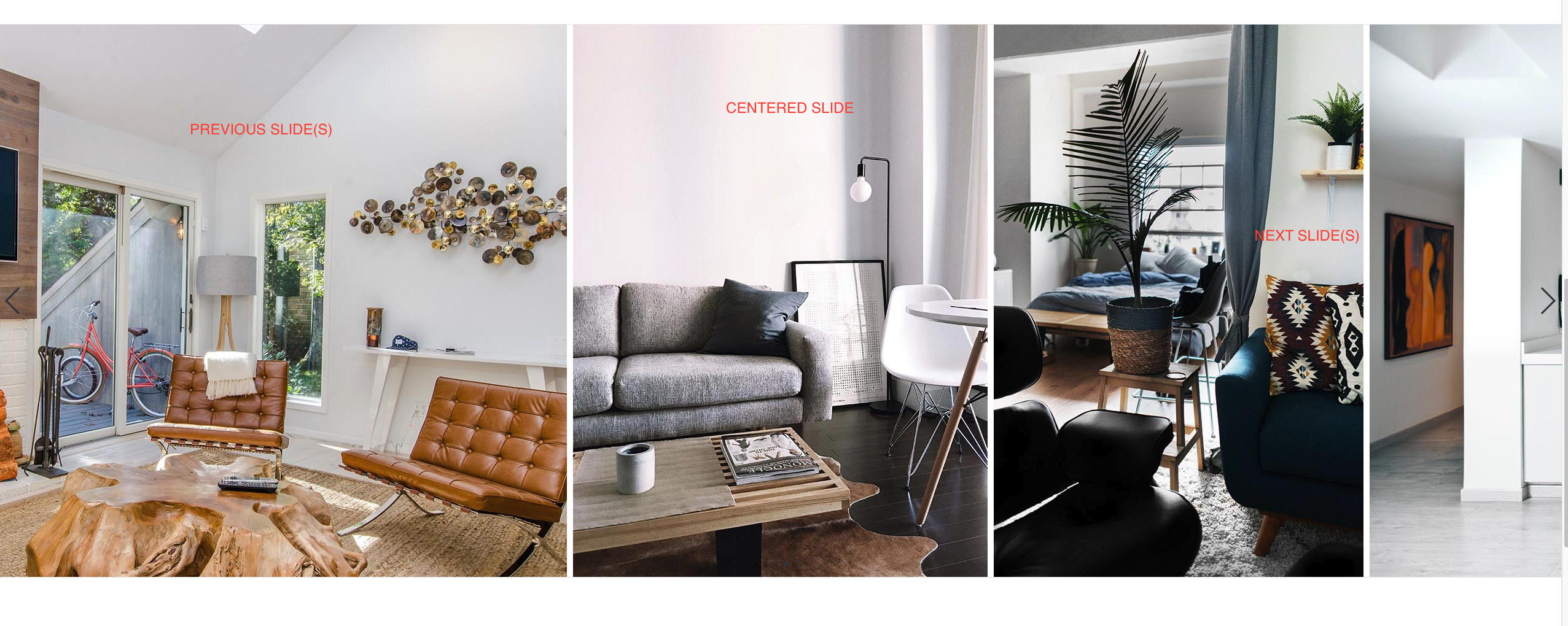
Are you trying to achieve what’s shown in our showcase below?
Real Estate Swiper
Exactly - my images are some portrait and some landscape with different heights - I need them to be all the same height.
@Teodor Any tutorial for that available somewhere or will I be able to just check page source for the code?
There’s nothing too special about this.
In this showcase all the image have the same height, and the width is different as per the aspect ratio.
The slides per view option is set to auto and the centered slides option is enabled.
The only custom thing is the following rule in your css:
.swiper-slide {
    width: auto !important;
}
Usually you can see how is something achieved by inspecting the source code of the showcase.
Great - thanks. I tried auto instead of 1 or 2 etc and my slider broke, but maybe I made another error if you say it works for you.
appreciate!
This is a really big deal. It looks like easy but it isn’t.
Look at this page:
https://www.campaniaturismo.org/test_room/test_swiper3.php
I’he a swiper component with 2 slides.
The images have the same height but different width.
I want to show each image one by one and I want to maintain proportion.
How can I do it.
I also set a css this way:
.swiper-slide {
    width: auto !important;
}
@media (max-width: 480px) {
    h2.display-4 {
        font-size: 26px;
    }
    .swiper-slide {
    height: 230px;
}
    .swiper-slide>img {
    height: 230px;
}
}

@media (min-width: 481px) and (max-width: 768px) {
    h2.display-4 {
        font-size: 26px;
    }
    .swiper-slide {
    height: 150px;
}
    .swiper-slide>img {
    height: 150px;
}
}

@media (min-width: 769px) and (max-width: 1024px) {
    h2.display-4 {
        font-size: 26px;
    }
    .swiper-slide {
    height: 320px;
}
    .swiper-slide>img {
    height: 320px;
}
}

@media (min-width: 1025px) and (max-width: 1200px) {
    h2.display-4 {
        font-size: 26px;
    }
    .swiper-slide {
    height: 600px;
}
    .swiper-slide>img {
    height: 600px;
}
}

@media (min-width: 1201px) {
    h2.display-4 {
        font-size: 26px;
    }
    .swiper-slide {
    height: 920px;
}
    .swiper-slide>img {
    height: 920px;
}
}
You have applied styles in your custom css which break the styling of the swiper and its contents.
These are totally wrong, you should not be setting a fixed height to your images:
    .swiper-slide>img {
    height: 230px;
}
...
    .swiper-slide>img {
    height: 150px;
}
...
    .swiper-slide>img {
    height: 320px;
}
...
    .swiper-slide>img {
    height: 600px;
}
...
    .swiper-slide>img {
    height: 920px;
}
What exactly are you trying to achieve - show one slide (image) per view? Is that all?
Yes
But do you want to display them as the different images in the swiper here:
https://showcase.wappler.io/SwiperRealEstate/index.html
If not, can you please clarify this a bit or show some example, as your page is totally messed up with these styles you added and i can’t understand your idea?
Hi Teodor,
I want this:
https://www.campaniaturismo.org/test_room/test_slideshow.html
In this page I’m using slideshow with static images and a trick.
The trick is the vertical image is not vertical:
this is swiper page:
https://www.campaniaturismo.org/test_room/test_swiper.php
I’ve deleted image height in css
What you are trying to achieve is a bit illogical and impossible for responsive images. You can do it with layouts like:
where the slides per view are set to auto because then the slide width adjusts accordingly based on the height.
In your case when you have one slide per view, this won't be possible because of how the responsive images work. When one image per slide is used your landscape image will first fill the width and start automatically decreasing the height because of its aspect ratio, while the portrait image will first fill the height. So different slides will have different heights.
That's not any limitation by the component, it's how responsive images behave. You can just switch to the solution in the screenshot above to keep the swiper height the same for all the slides inside.
The other option is to enable "auto height" in the UI and have your swiper resize automatically per each slide depending on the image.
Ok.
https://www.campaniaturismo.org/test_room/test_swiper.php
Landscape and portrait images are 1280px height.
Anyway there is something wrong.
Images are too big.
How can I resize them?
Maybe by css?
You need to add:
.swiper-slide {
    width: auto !important;
}
To your css.
Also make sure the slides per view option is set to auto and the centered slides option is enabled.
Yes it is