Dynamic / Re-usable partials / components creation

Hi! It would be amazing if we could create partials / components that we can reuse with dynamic values, something like the props in ReactJs components.

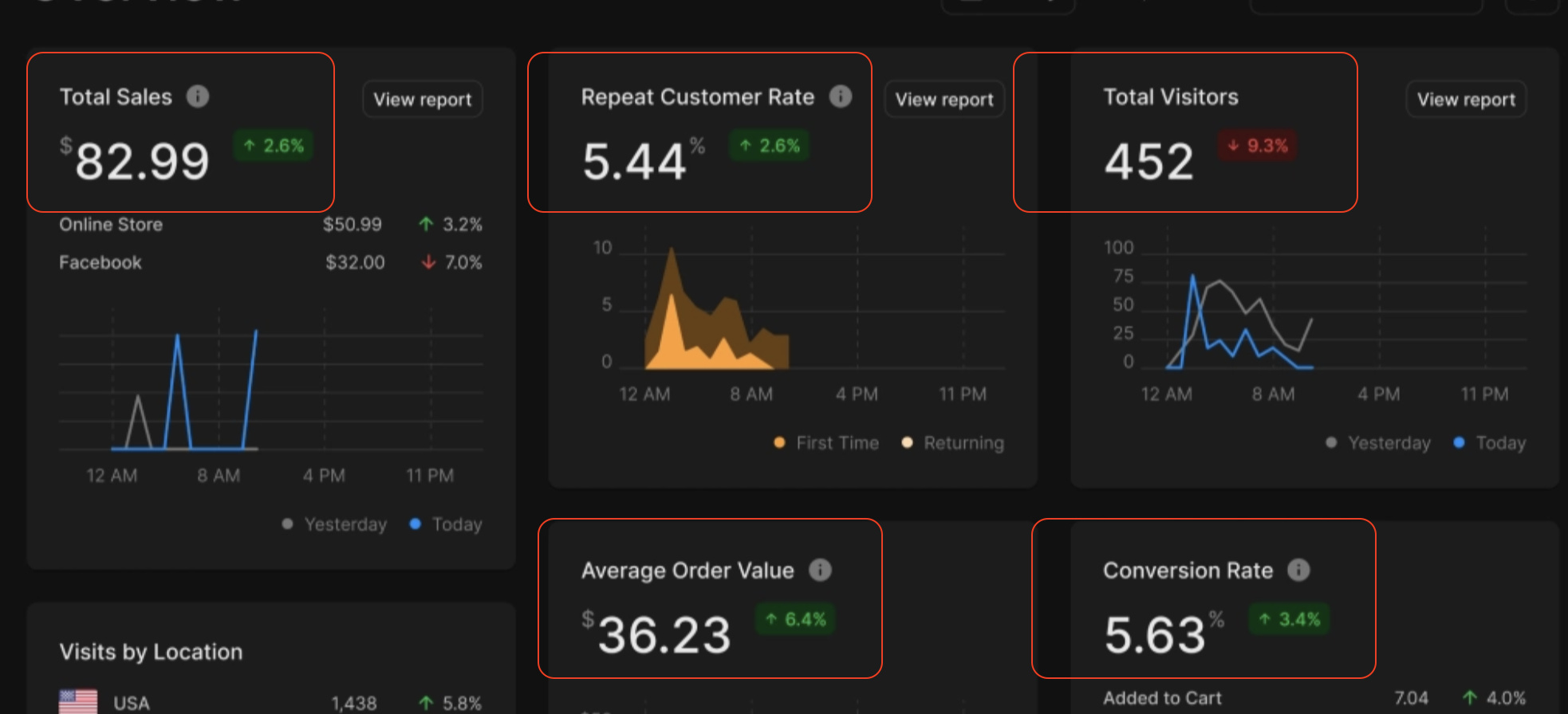
Right now I’m redesigning a dashboard page, a lot of the design is repetitive, with dynamic valued partials I could create one component and reuse it everywhere with different values.

  • This would save a lot of time
  • This would ensure a uniform design across the app
  • When a UI design update is needed, this can be done in the component and it will apply everywhere saving hours
  • This goes very well with Wappler’s philosophy of saving time and make stuff easier :slight_smile:

For example:

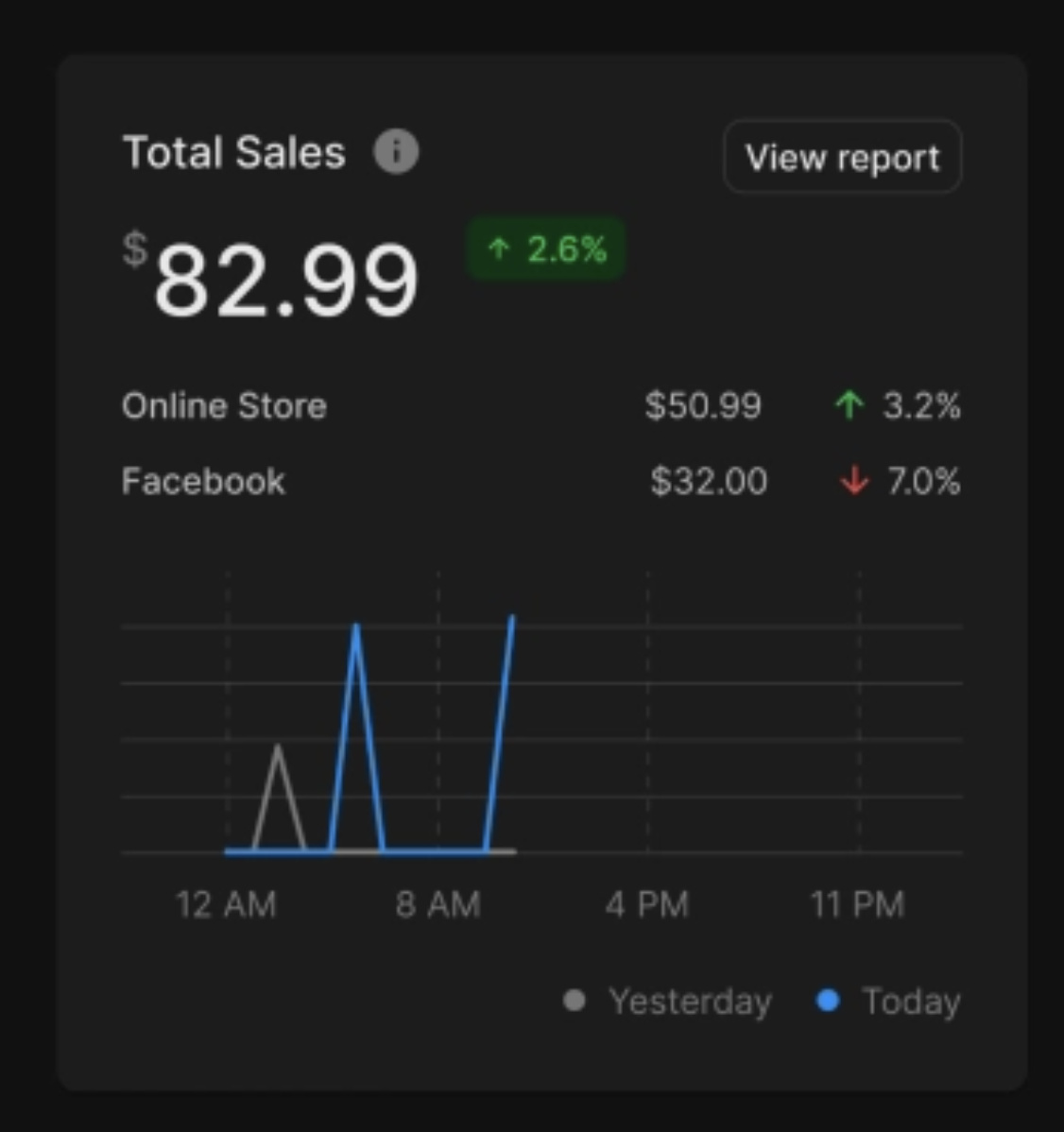
From this example I could make the header part a component (Total Sales, amount, the 2.6% badge, the view report etc) and reuse it in another card with different values.

There are many areas in a web app where the components should look exactly the same, using this will ensure that the UI looks uniform and professional. I see a lot of designs for example in Wappler demo’s where the UI doesn’t look 100% because it’s not easy to make all areas look the same, and UI design changes a lot.

(No expert) but I believe this should be easy to implement as the system with partials are already there, all that’s needed is dynamic input values and to able to use the values as bindings in the partials.

Trying this now, seems to work easily with Wappler

You can create your own custom elements as in:

This is especially useful when creating a static website where server side includes do not work.

PS: Could this be an idea for Wappler @George?

2 Likes

Hi! Yes so the library I shared above simplifies using the web components.
It works great with Wappler with data bindings etc. It was very easy to learn as well.

I just made this steps component for example:

The JS logic for the web component is easy to set up:

class McStepsContainer extends WebComponent {
    static observedAttributes = [
        'step'
    ];
    currentSteps = {
        node: null,
        step: 0
      };


    get template() {
        let steps = this.steps;
        return `<div class="d-flex flex-row" style="display: flex; width: 100px; margin: 0 -10px;"><slot name="step"></slot></div>    `;
    }

    get stylesheet() {
        return '<link rel="stylesheet" href="/bootstrap/5/css/bootstrap.min.css"> <link rel="stylesheet" href="/css/style.css">'
    }

    onMount() {
        const steps = this.querySelectorAll('[slot="step"]');
  
        steps.forEach((el, index) => {
            
          if (this.step > index+1) {
            el.color = "bg-primary";
          } else if (this.step == index+1) {
            el.color = "bg-light";
          } else {
            el.color = "bg-muted"
          }
        })
      };

      onUpdate() {
        const steps = this.querySelectorAll('[slot="step"]');
  
        steps.forEach((el, index) => {
            
          if (this.step > index+1) {
            el.color = "bg-primary";
          } else if (this.step == index+1) {
            el.color = "bg-light";
          } else {
            el.color = "bg-muted"
          }
        })
      };

}

McStepsContainer.register();

class McStep extends WebComponent {

    static observedAttributes = [
        'title',
        'color'
    ];
    step = 0;

    get template() {
        let steps = this.steps;
        return `<div class="d-flex flex-column align-items-center" style="margin: 0 10px;">
                                <div class="rounded d-flex mb-2 form_step_dot {color}"></div>
                                <p class="mb-0 small">{title}</p>
                            </div>`;
    }

    get stylesheet() {
        return `
			<style>
				
			</style>
		`;
    };

    get count() {
        return this.steps;
    }

}

McStep.register();

I can just easily bind with Wappler the “step” to a variable and all will work perfectly. Now I can use this component everywhere in my app and it will be consistent

2 Likes

This would be absolutely awesome.
Im very novice but i started to learn react and vue a while back, and i suppose im stuck in that thinking with wappler, but when ive tried to work with partials, i couldnt seem to get it to work in same way. Im guessing im thinking of partials in the wrong way

This would personally be a game changer for me. Or if its already possible, detailed tutorial for fully dynamic partials would be awesome.

2 Likes
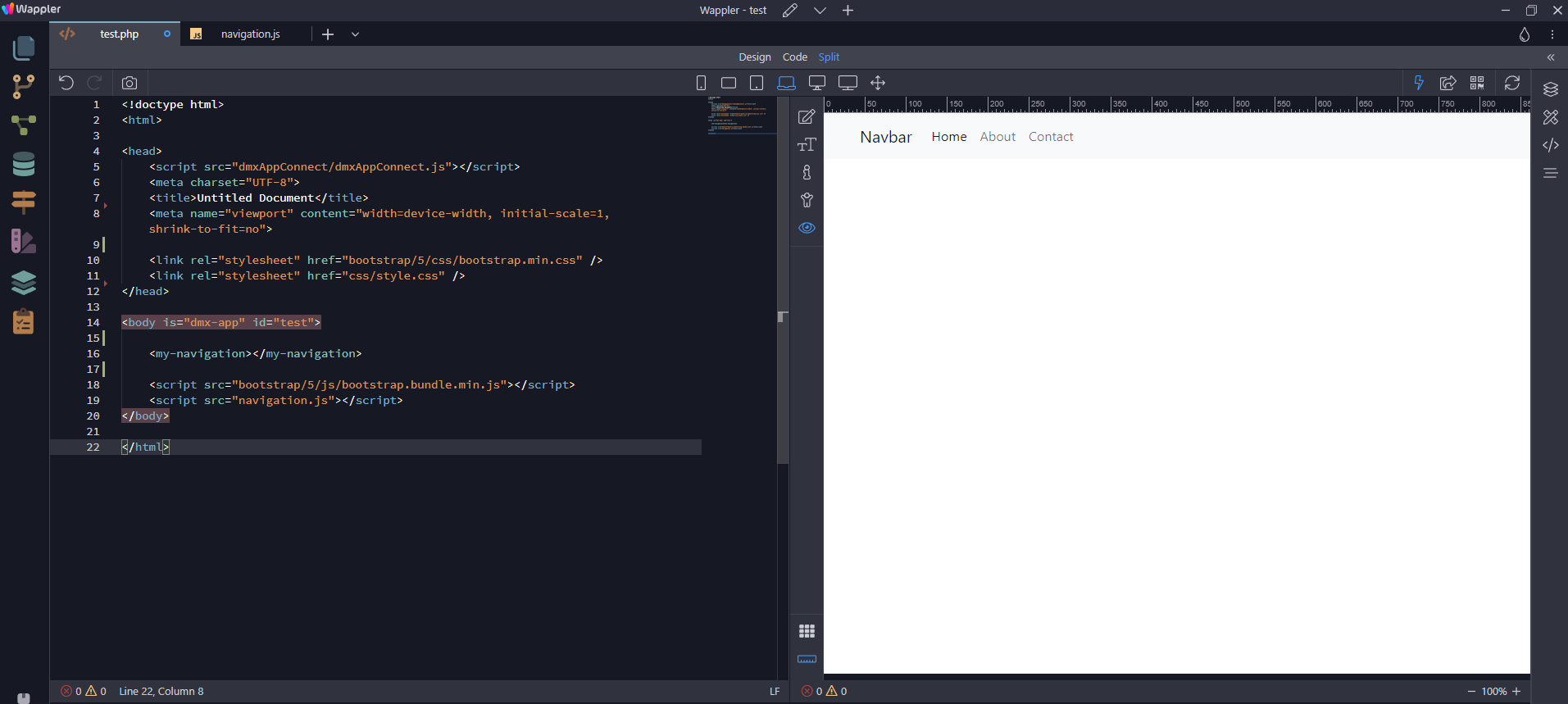
  1. Create a normal HTML page and insert a navigation bar
  2. Cut the navigation bar from the page
  3. Create a JavaScript file containing the following code. I have named this file navigation.js; but this can be anything to your liking, especially if you intend to add a number of custom elements.
class Navigation extends HTMLElement {
    constructor() {
        super();
        this.innerHTML = `

         `;
    }
}

window.customElements.define('', );
  1. Paste the navigation bar code between the back ticks resulting in
class Navigation extends HTMLElement {
    constructor() {
        super();
        this.innerHTML = `
            <header class="bg-light">
                <div class="container">
                    <div class="row">
                    <div class="col">
                        <nav class="navbar navbar-expand-lg navbar-light bg-light">
                        <a class="navbar-brand ms-auto" href="#">Navbar</a>
                        <button class="navbar-toggler" type="button" data-bs-toggle="collapse" data-bs-target="#navbar1_collapse" aria-controls="navbar1_collapse" aria-expanded="false" aria-label="Toggle navigation">
                            <span class="navbar-toggler-icon"></span>
                        </button>
                        <div class="collapse navbar-collapse" id="navbar1_collapse">
                            <div class="navbar-nav">
                            <a class="nav-item nav-link active" href="#">Home</a>
                            <a class="nav-item nav-link" href="#">About</a>
                            <a class="nav-item nav-link" href="#">Contact</a>
                            </div>
                        </div>
                        </nav>
                    </div>
                    </div>
                </div>
            </header>
        `;
    }
}

window.customElements.define('', );
  1. In the last line of the above code, add a name (must be a hyphened name) for the custom element and class name as in
window.customElements.define('my-navigation', Navigation);
  1. To add more custom elements, simple add the code as shown in the first code example and follow the same procedure.
  2. Now add the custom element and the link to the JS file to the HTM to finish up with
<!doctype html>
<html>

<head>
    <script src="dmxAppConnect/dmxAppConnect.js"></script>
    <meta charset="UTF-8">
    <title>Untitled Document</title>
    <meta name="viewport" content="width=device-width, initial-scale=1, shrink-to-fit=no">

    <link rel="stylesheet" href="bootstrap/5/css/bootstrap.min.css" />
    <link rel="stylesheet" href="css/style.css" />
</head>

<body is="dmx-app" id="test">

    <my-navigation></my-navigation>

    <script src="bootstrap/5/js/bootstrap.bundle.min.js"></script>
    <script src="navigation.js"></script>
</body>

</html>

Hey ben

Quick question, is this using the web components method you were referring to in your previous reply?

The method you just showed would have any wappler UI interactions, right? would all need to be done and handled by code?

Yes. There are more features that can be added; I have shown a quick and simple example/

Yes. Use Bing (I have a dislike for the Google tracking system) to search the subject and you will find many tutorials including videos.

Well actually The current App Connect components are already kind of custom elements and easy to create. We hope soon to publish a guide for this as we also open the app connect from end for extensibility.

5 Likes

oooooo highly looking forward to this

This is cool, mind sharing a video, how are you doing it? Something simple like this. From start to finish?

I am a bit loss on the binding part.

Thanks

Hi! Below a boilerplate on setting up a component with that library with comments on important lines

So obviously you should add the library cdn script, and then:

// change TagName below to any name you'd like to use as a html tag. 
// With capitalized letters TagName becomes <tag-name></tag-name> for example

class TagName extends WebComponent {
  static observedAttributes = ["title", "text"]; // These are example attributes, add as many as you need to bind data
  static mode = "none";


  get template() {
    // Add any html below between the quotes, use the attribute name like this: {title} to bind the data
    return `
    <div>
    <h1>{title}</h1>
    <p>{text}<p>
    </div>
    `;
  }

  get stylesheet() {
    // You can add css classes below if you want to be with the component
    return `

		`;
  }
}

// Add the tag name below in the array to register the component. 
// When you have more components you can list them separated with a comma

WebComponent.registerAll([
  TagName
]); 

Then you can use the component like this in html:

<tag-name title="Title here" text="Text here"></tag-name>

You can bind stuff from Wappler server connects / variables / text inputs etc with dmx-bind:

<tag-name dmx-bind:title="{{dynamic.value.location}}" text="Text here"></tag-name>

You can create the design in Wappler, and then just copy paste the html code in the component, bind the attributes to make it easier.

You can use the component tags inside the component too to build blocks

A couple components I made:


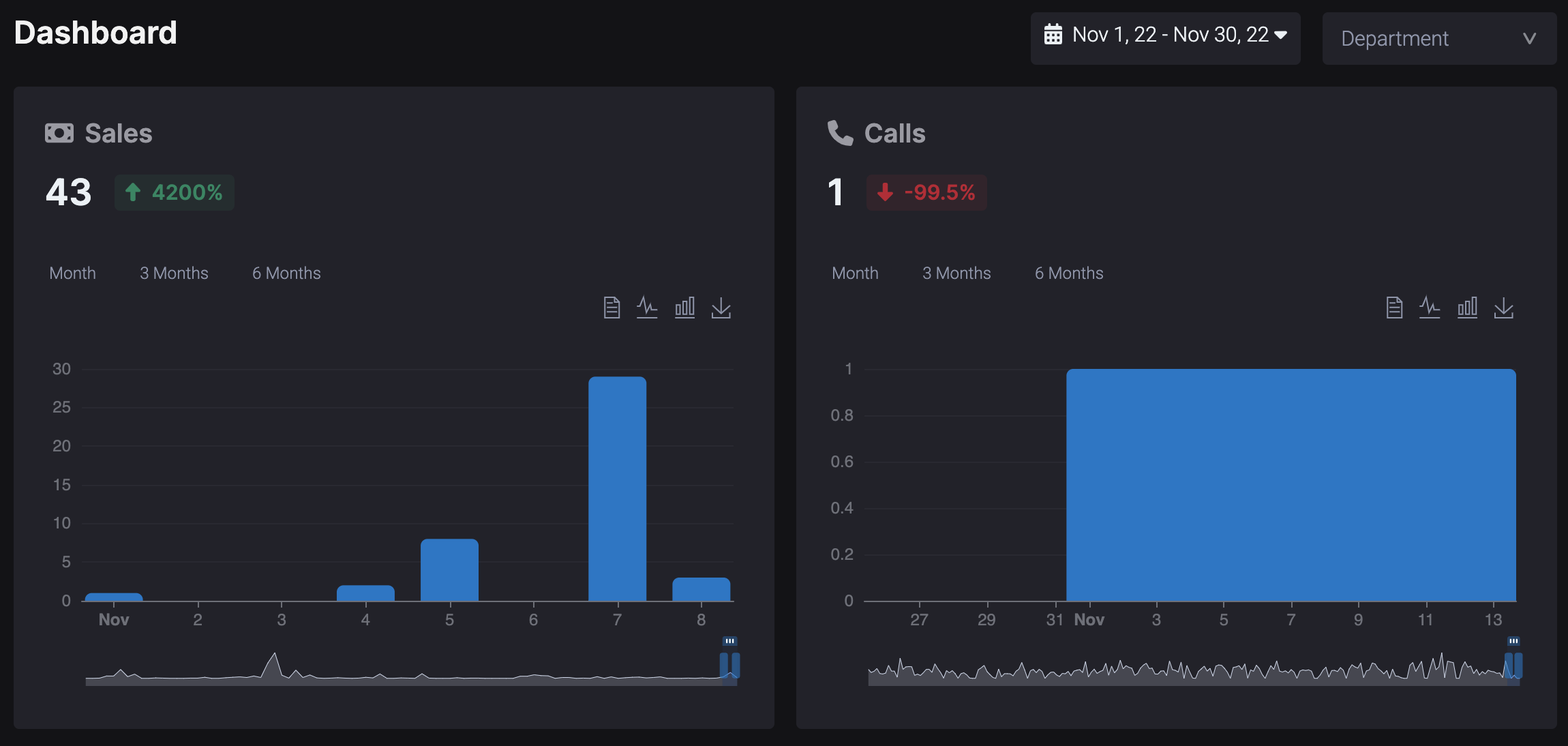
The whole block is made with components, including the chart, as you can see adding the “calls” block was very simple and consistent after that

In the library’s documentation you can find info to do more stuff like:

  1. Creating a base component, and then extending it with variations
  2. Events like onMount, onUpdate to run code when that happens, you might need to look into those when using server connect dynamic data as usually the component loads before the server connect api loads

I probably forgot stuff but I’m sure when you start building you’ll understand it better
That library has a tutorial video here:

2 Likes

I owe you a beer :beers:

Thank you so much for the detailed response. Much respect 🫡

This also reminds me of htmx.org

1 Like

Take into account that you can kind of do that with App Connect as it already is semi-component based.

It is not as streamlined as CWCO as you need to use pure javascript to handle the html and it’s missing helpers and other goodies. But it’s enough if you want to keep it all under App Connect’s umbrella and avoid adding more KBs to the website.

This is a small example:

1 Like

Yeah was waiting a long time for a guide from the team on this as from what I remember George recommended to wait with experimenting with app connect extensions as things could change.

When it becomes official to make components within Wappler with the same functionalities, I will for sure redo them in Wappler

Also with web components / cwco you have lifecycle events like onMount, onUpdate etc, would the same things be possible right now? I needed to use them with my charts library for example as otherwise stuff were not working properly

Yup.

see also:

Bump… just accidently created my feature request for this LOL

Btw. FlutterFlow implemented it quite nicely:
https://docs.flutterflow.io/customizing-your-app/custom-components