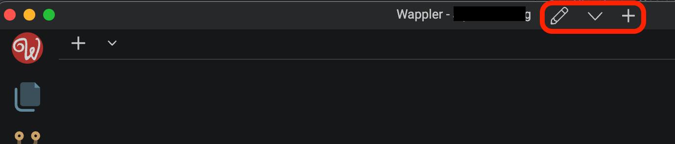
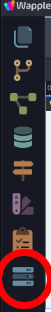
I totally appreciate that having the project options in the bottom left as an icon makes sense however I don’t see how the UI is improved by removing the old method (next to the project name in the top bar of the window). There’s no useful space gained:
I personally found it a much more convenient way to access other projects and project settings. At least allow clicking the project name to open the Project Manager for quick switching (I know the handling of targets/environments is likely to change given previous posts and screenshots so it may not be an option to trigger in the same way)
I think the change was because the header bar info is lost if you go to full-screen view on a mac. However, I like the idea of having both so those not using full-screen (I’m one of them) can still access the projects in the top bar so I’ve voted for this.
both really, but mainly clicking on the project title to switch projects.
I completely get why there’s a new button in the bottom left but don’t see the harm of leaving the old options for people who have a workflow that is used to it. It’s not taking up any space that could be used for anything else… (at the moment)