
Just want to add - that drag and drop is well received and long overdue 


3 Likes
+1 in that.
Replacing the traditional view would be a mistake
My first impression is that a complex api can be difficult to read and for example, it could be very hard to post a screenshot of the new flow view on this community to receive some support, which is related (I guess) to the ux of this forum.
For example this:
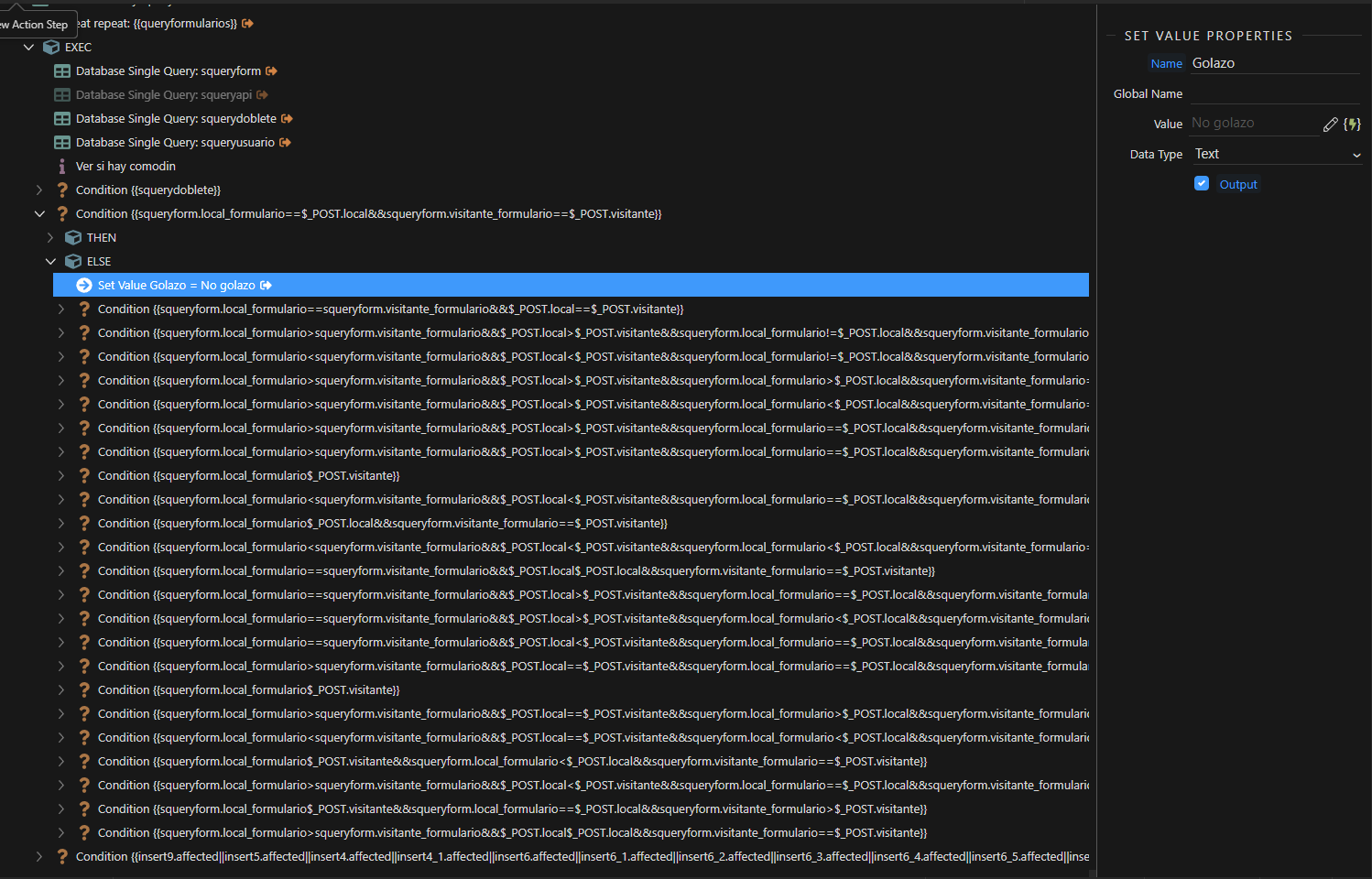
I can’t even describe how messy looks this api on the new flow view.
I could eventually get used to it.
But I think it can be very stressfull to understand or compare complex steps.
In the other hand, It’s simple, clear, and for basic apis will work fine. (And it’s a plus for new users).
Saying this, I want to give an applause to the whole team as they’re working for us to have the best experience on Wappler.
Some small hints about the new Flow Designer:
-
You can still toggle groups to hide steps.
-
You can add steps be dragging from the left panel, by clicking the plus icon between the steps.
-
You can
ctrldrag to copy a step. -
You can drag the canvas around
-
Clicking on
 will toggle back the old tree designer.
5 Likes
Can someone point me to how I turn on the Flow Designer? I’m in Beta 6.3 and have Experimental Features turned on but can’t see the Toggle to show the Flow Designer. Thanks.
1 Like
You need Wappler 6 beta 4 
Ok, have had a chance to play with it for a couple hours. As I don’t know enough about how to do complex actions, this feature really doesn’t solve any issues for me. I can see some really complex actions looking pretty messy. More advanced users can comment on that. For me, it’s not a ‘wow’ but it’s not a deal breaker either.
Off Topic: I did notice the Project Settings panel is now in a tab. Took me a bit to realize it and figure out how to close the panel. I like the tab idea though.
Others have mentioned that the new flow designer will be less suitable for long server actions. At least from my point of view, one change which would make a big difference to this would be the ability to display multiline comments (within the flow section).
Comments can be entered in a textarea with multiple lines, but unfortunately, it’s necessary to click on the comment to read the text. This is a problem with the current server action editor, but more so with the new flow designer.
The red parallel lines indicate the same steps displayed using the new/old methods. The yellow lines are corresponding comments sections. I wouldn’t usually have so many separate comments (I think this is an old server action), but I would much prefer to be able to read them like this. Ideally, they would be displayed in a collapsible panel, with right-aligned text (like the input panel for example).
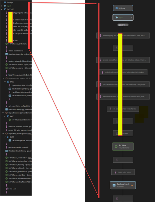
The facility for adding comments is much better than in the past, but it’s still very unsatisfactory and cumbersome.
4 Likes
It’s not directly related to the flow designer, but a long-standing request, included in the roadmap:
Add support for case and else if functionality
…is related to the issue/problems with space as mentioned above.
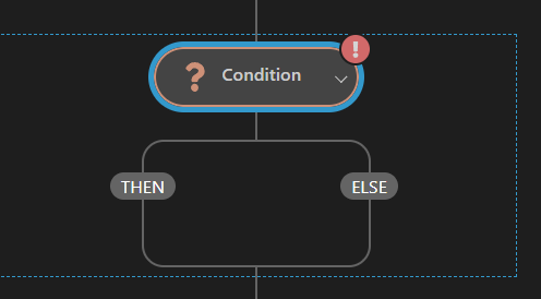
The Condition block takes up a lot of space - if we could use else if and/or switch statements, fewer conditions would be needed. (The need to have extra conditions is unsatisfactory in itself and leads to ‘code’, or flows which are more difficult to read.)
I thought it might be a good idea to mention it again now, while the flow designer is being developed. Obviously, provision for the new options will need to be planned.
5 Likes
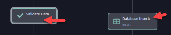
Validate Data does not display the name so it is not vertically aligned with the icon.
Remove colon from database actions.
1 Like
I’m wondering whether something like these 8 comment lines, or say 8 Set Value lines, can be placed into a group so they appear as one box… I’d love it if you could then just hover over an icon on the box and see the details in a popup in some way… that keeps your attention in the flow and not constantly looking away to a different area of the screen.
That would explain it. LOL! Thx.
Comments appearing in a popup would be a good option too - but I would still like to have then in a collapsible panel, which would remain displayed. If I look at a server action (or any sort of code), I created a year or two ago, I typically spend more time looking at the comments than any other part of the code - and often wishing I’d added more comments.
I like the idea of that.
I tried to use it since this afternoon, but honestly it doesn’t bring any value.
It might look good on paper when you have some simple nested conditions, but in a real life api it would be just 1 or max 2 nested conditions, which is much more organised in the standard view.
But it might be a great feature anyway, others might find it easier for them.
As long as the old/standard view never gets abandoned, that would make Wappler unusable in my case.
Why not implement the drag and drop into the old view?
After playing with it for a couple more hours, I have to agree. @Teodor, would there be a way to add in the Wappler preferences to show or hide the components panel by default? I don’t work with a mouse only a track pad so drag and drop is not very user friendly. I found myself using the plus icons and pop up components panel way more. So in my case the component panel is redundant and just takes up valuable screen real estate.
Unless there is more planned for this feature, it’s not really a game changer for me. I will continue to play with it and try and get used to it for now, but …
1 Like
I’ve just played with it for 10 minutes, and my initial reaction is I find it a massive step backwards, and pretty well unusable for a real world design.
Here is a screenshot of the final third of a medium complexity repeat filling my entire display:
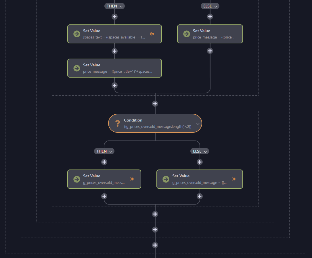
I can see 6 statements on the whole screen, and they are embedded inside 3 set of dotted lines but I have no idea what they refer to as they start off the screen. Most of the Set Value statements are incomplete and therefore unreadable.
In the existing GUI, I can see the entire repeat, and every bit of code is readable and in a larger font:
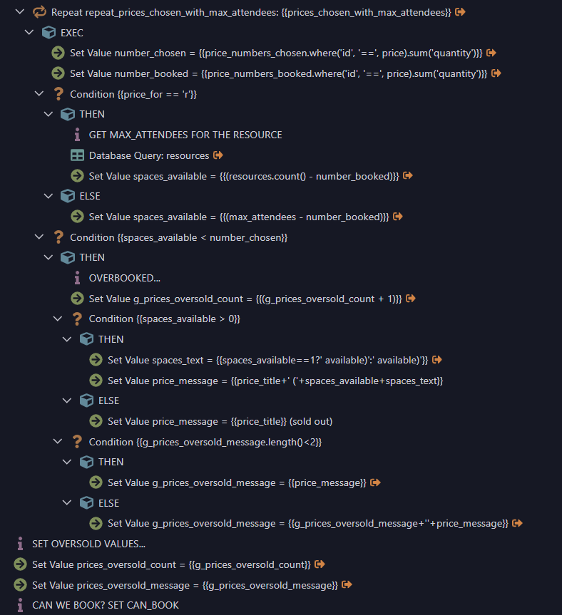
Please oh please don’t take away the existing GUI… and if you are going to add the productivity features like cut and paste, please add them to the existing GUI too!
8 Likes
If it ain’t broke don’t fix it. Have been trying to wrap my head around how this feature would cope with extensive Actions and think you just summed it up.
1 Like
+1 for co-exist.
I see the value of it primarily if it helps bring in more users (customers to support the Wappler team) as the initial learning curve for less experienced people will be smaller thus increasing the stickyness of the product. But then expect as they get more experience, they’ll want to switch to ‘advanced’ which would be the tree structure.
To take it away entirely, is a bit of a concern to me.
What I could see being really useful with a flow diagram, is if you can run a ‘test’ action, and see where the api in action, and if/where it fails for debugging. This would be amazingly useful as debugging SC’s right now takes a while. If this is one step towards that direction (if it’s been on the table) then great!
1 Like
What if the new Flow Designer was more compact? Would that sway more of you to use it?
Currently, it seems it’s taking up too much vertical space. The action steps could be wider with less height, and the height/space between the action steps could also be reduced. Maybe get rid of the plus symbol and allow for a right-click between the steps to add a new step so the space can be reduced?
Having worked with both types of editors in other systems for years, visual workflow designers can help quickly understand the paths of highly complex workflows. However, with this initial design, I agree it needs more work to be useful. I don’t feel it provides much benefit since it appears to only be a visual design rework at this stage. It doesn’t appear to use a draggable canvas or have the ability to easily add/remove connectors between objects or other features I am familiar with in other workflow designers.
3 Likes
Absolutely essential for any visual structural representation. Without this, and from what I see as can’t use Beta 4 on Linux, this is what is missing. No idea if it is to be integrated at a later date as do understand this is an early look at what is to come?