Personally, I would not touch the horizontal spacing for containers, rows and columns.
Background:
- Containers are wrappers for Rows.
- Rows are wrappers for Columns.
- Columns are wrappers for content.
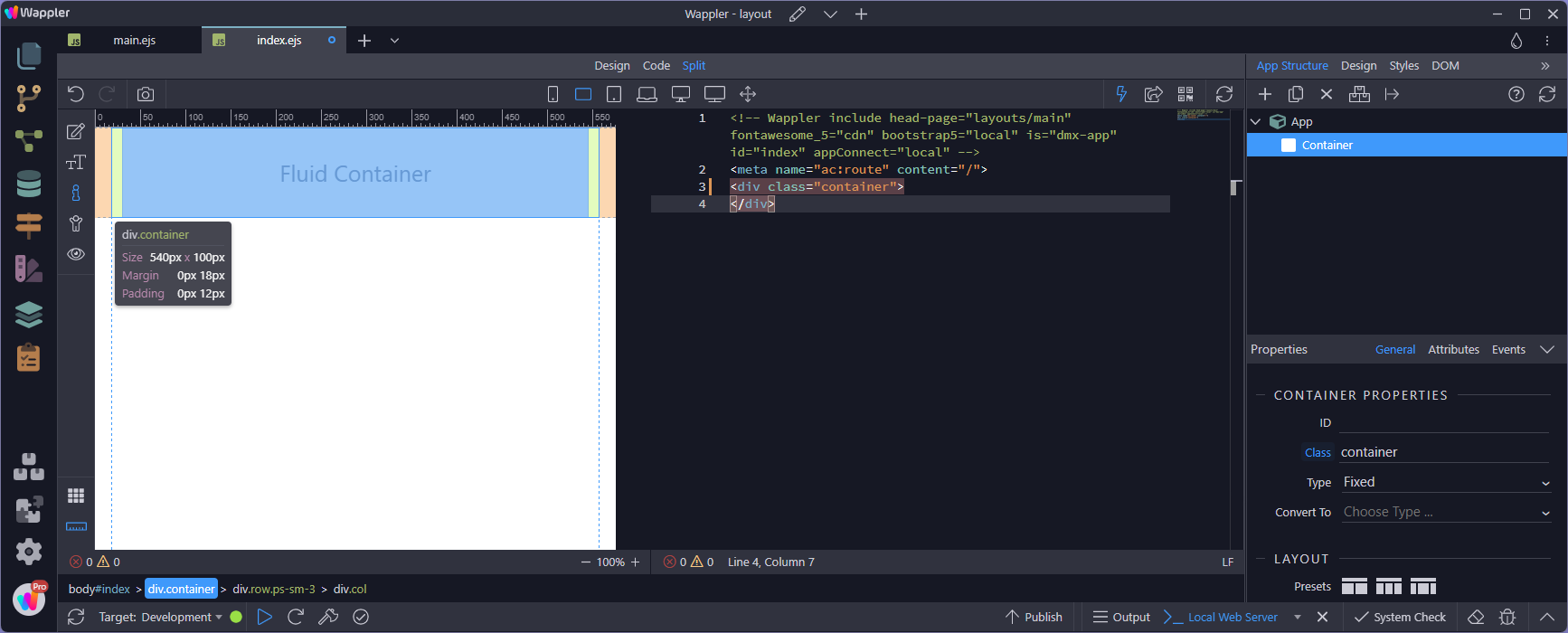
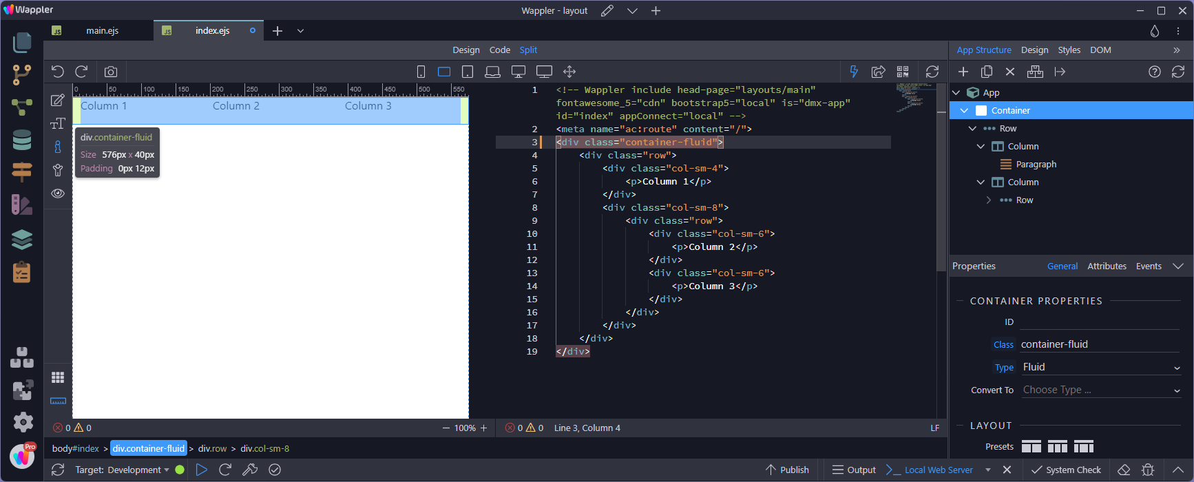
When I add a fixed container, I see a margin and padding:
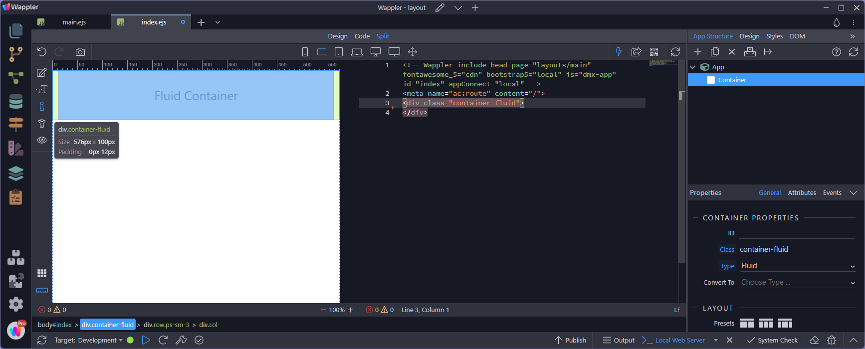
Changing this to a fluid container, the margin disappears, yet the padding remains. The reason for this will be evident when I add a row:
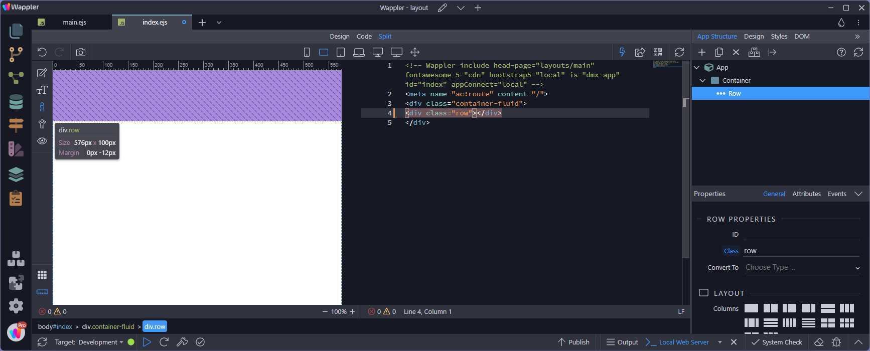
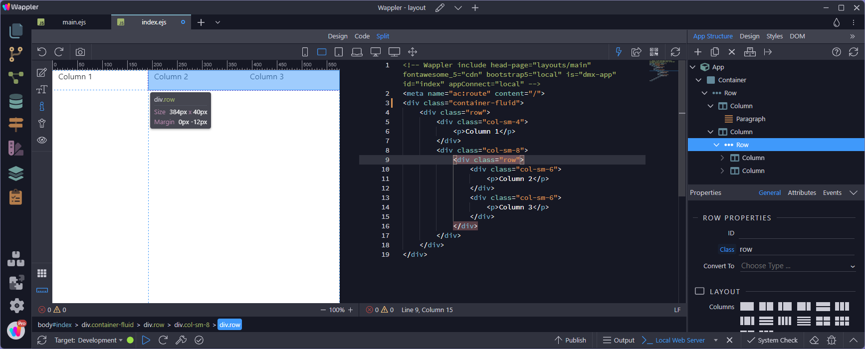
When I add a row, it has the same size as the container (fluid or fixed). The reason is the negative padding that overrides the padding of the container. This is a very tight relationship between the container and the row:
Adding a column, the column is the same size as the row. However the column has padding to keep the contents away from the edges:
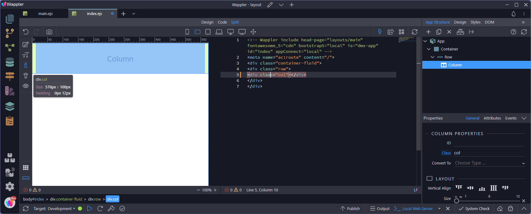
As you can see, this is a very tightknit layout and should not be fiddled with.
But what happens when a row is not inside a container but as a child of a column?
Again, this is the container with padding:
And this is the column, likewise with padding:

The row behaves in exactly the same way as though it was inside a container:
For more on layouts (particularly - gutters):
Correction:
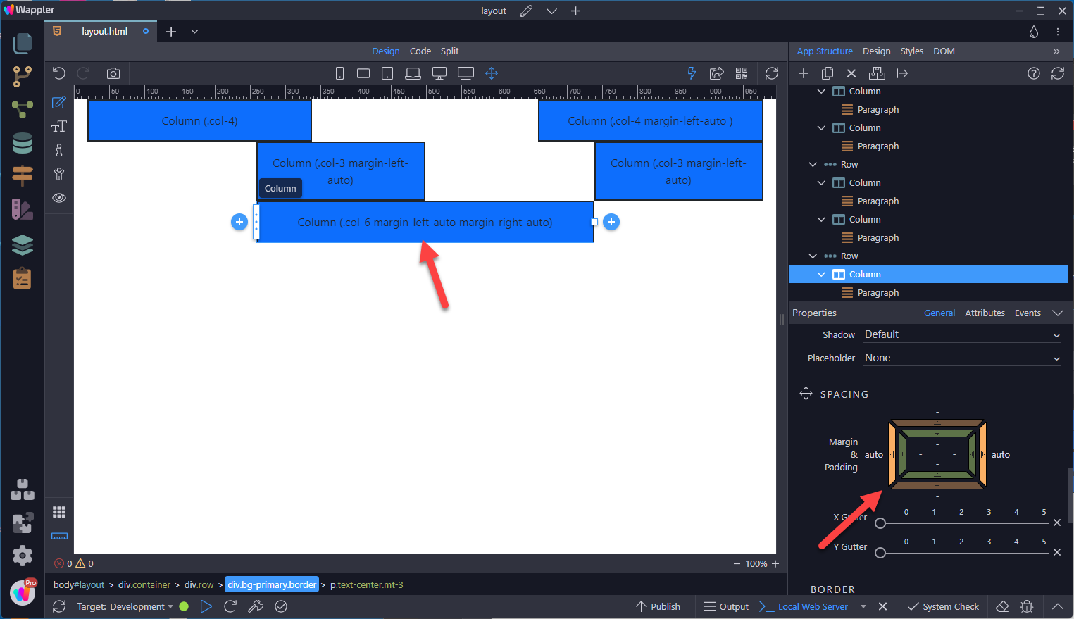
Horizontal margins can be used to place columns, as the documentation points out