I’ve recently been optimising part of my app for mobile, and I came across the issue where a row can accidentally stick out horizontally beyond the intended width of the page. I always knew there was an issue about where to add horizontal margin and padding to the container-row-col combos, but had never quite got the rules clear in my head… until now!
So for the benefit of those who may also struggle with this, and its effect of the page sometimes jumping around just a little, here are my conclusions…
Comments welcome!
Best wishes,
Antony.
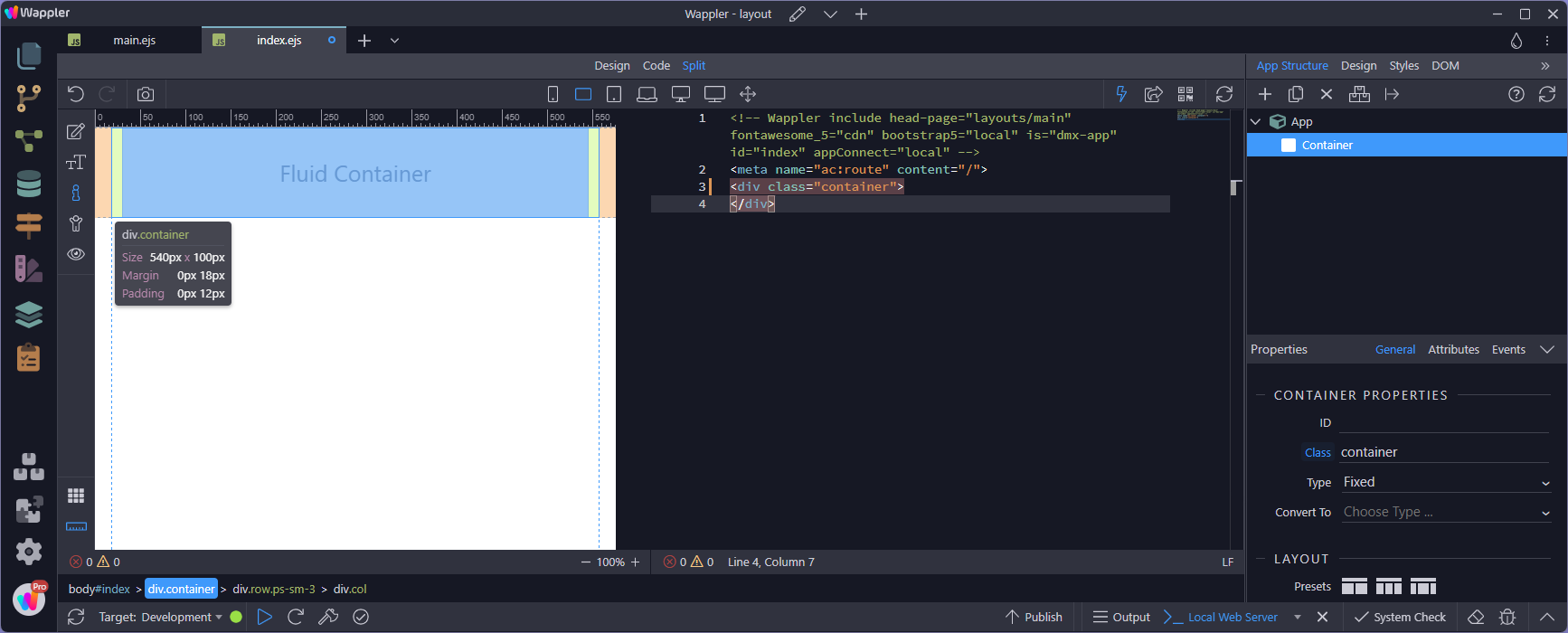
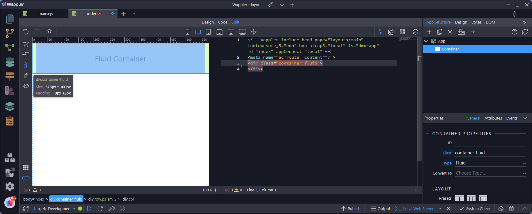
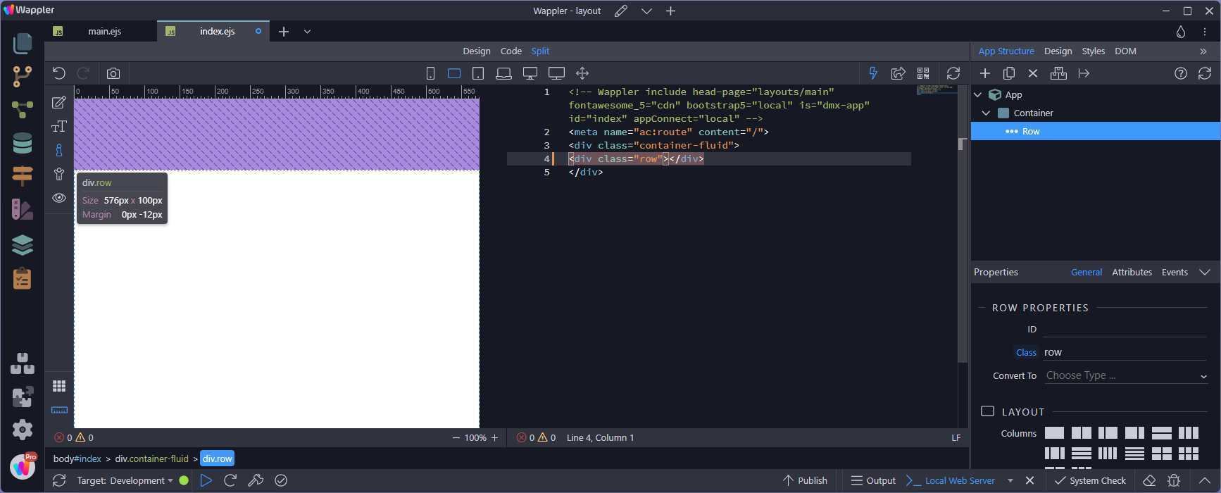
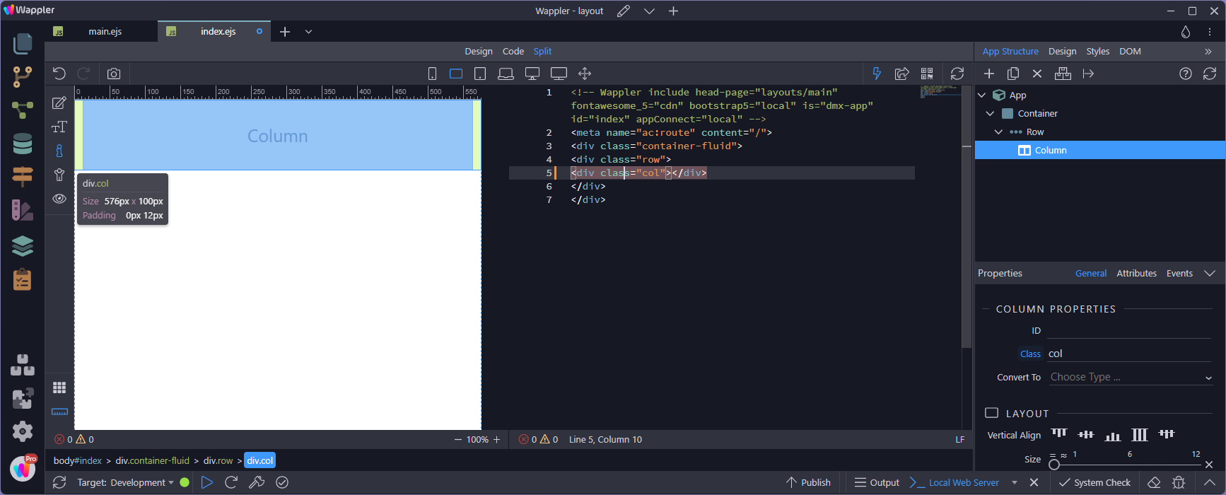
First for background, here is what I understand Bootstrap adds to these elements:
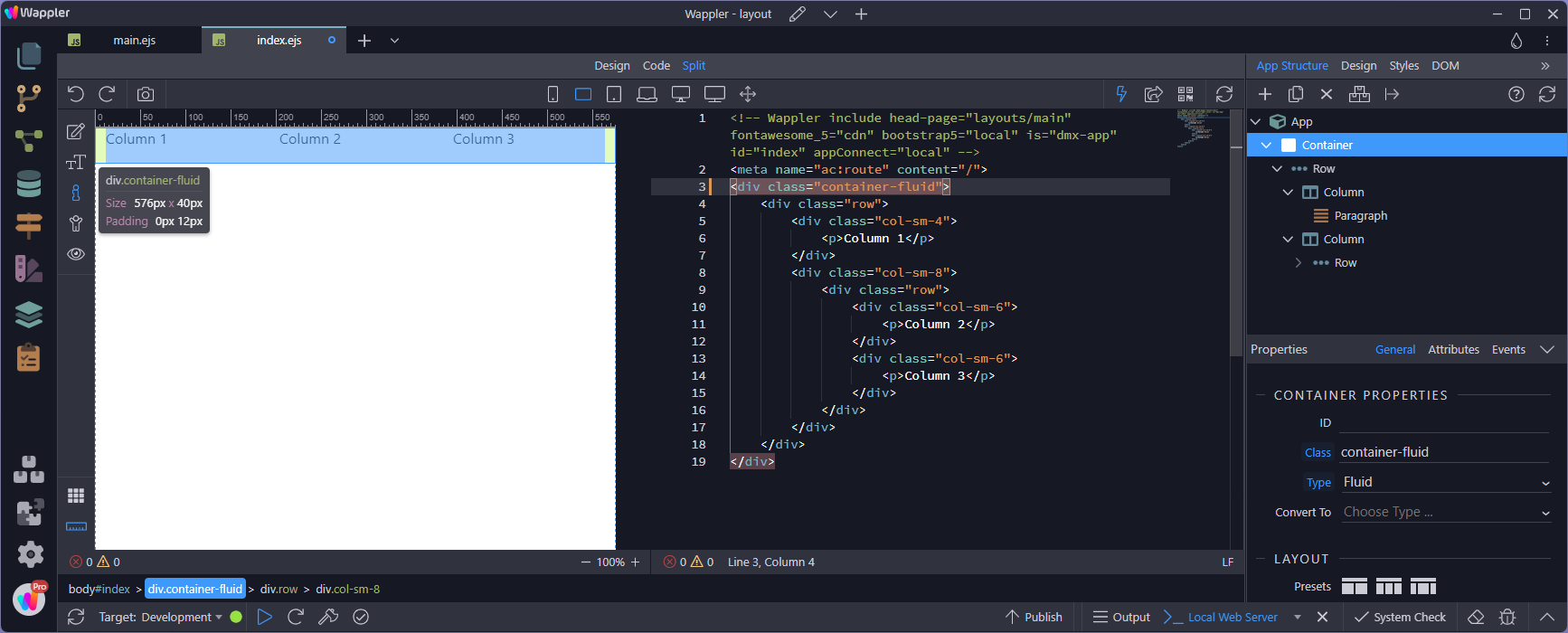
<div class="container"> <!-- margin-x:auto, padding-x:15px -->
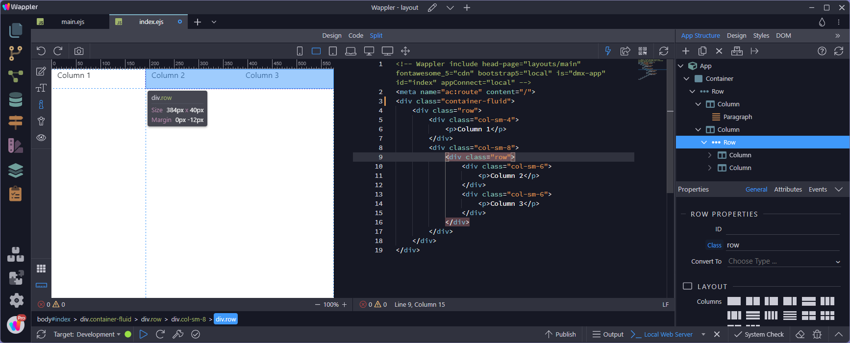
<div class="row"> <!-- margin-x:-15px, padding-x:0 -->
<div class="col"> <!-- margin-x:0, padding-x:15px -->
<p>Outer R/C</p>
<div class="row"> <!-- margin-x:-15px, padding-x:0 -->
<div class="col"> <!-- margin-x:0, padding-x:15px -->
<p>Inner R/C</p>
</div>
</div>
</div>
</div>
</div>
it is that pesky margin of MINUS 15px on a row that can throw things… and the basic rule is that it is best not to mess around with the padding on any container of a row… be it an actual container or a col.
So here are the rules I’ve devised for where it is safe to add horizontal margin or padding…
<div class="container"> <!-- margin-x:NO, padding-x:NO -->
<div class="row"> <!-- margin-x:NO, padding-x:YES -->
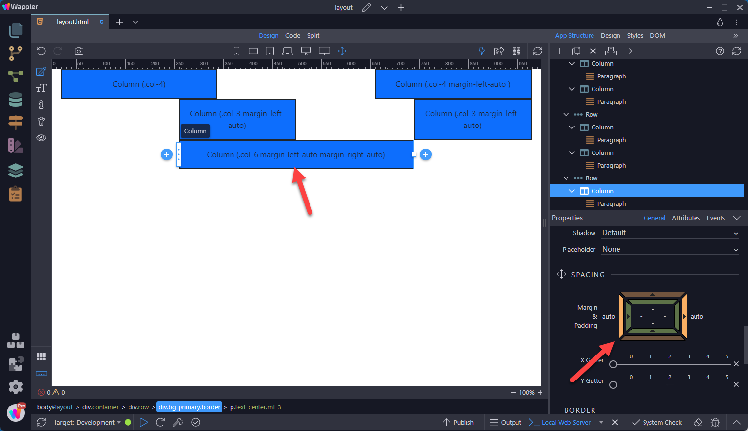
<div class="col"> <!-- margin-x:YES, padding-x:NO -->
<p>Outer R/C</p>
<div class="row"> <!-- margin-x:NO, padding-x:YES -->
<div class="col"> <!-- margin-x:YES, padding-x:YES -->
<p>Inner R/C</p>
</div>
</div>
</div>
</div>
</div>
So in simple terms:
Add padding to rows and inner columns
Add margin to columns only
Or even more simple terms:
DON’T PUT PADDING LESS THAN px-4 ON SOMETHING THAT CONTAINS A ROW…