Last updated: August 2025 — Wappler 7.2
We will guide you trough the main UI components of Wappler. Wappler’s UI is minimal, intuitive and easy to use. It consists of several main panels, needed in your workflow. The panels can be opened and closed by clicking on their icons in the toolbars.
Top Bar
The Top Bar provides quick access to essential project and workspace controls.
Project Selector
Switch between active projects and manage them.
Project Settings
Configure options and preferences for the current project.
Project Updater
Keep all extensions and frameworks up to date.
Quick Open
Instantly search and open files, components, or workflows.
Publish Button
Open the Project Publisher to deploy your project.
Layout Chooser
Customize your workspace with split views and saved layouts.
Theme Chooser
Switch between Wappler’s built-in UI themes to personalize your workspace.
Main Menu
Access standard application commands such as creating, opening, saving, and closing files or projects.
Left Sidebar
The Left Sidebar contains the main managers and tools you will use throughout your workflow. Each manager opens in this area and provides a dedicated set of controls.
Site Manager
The Site Manager organizes your project resources. It includes the Pages Manager, Assets Manager, File Manager, and Search Manager, making it easy to manage your entire project structure in one place.

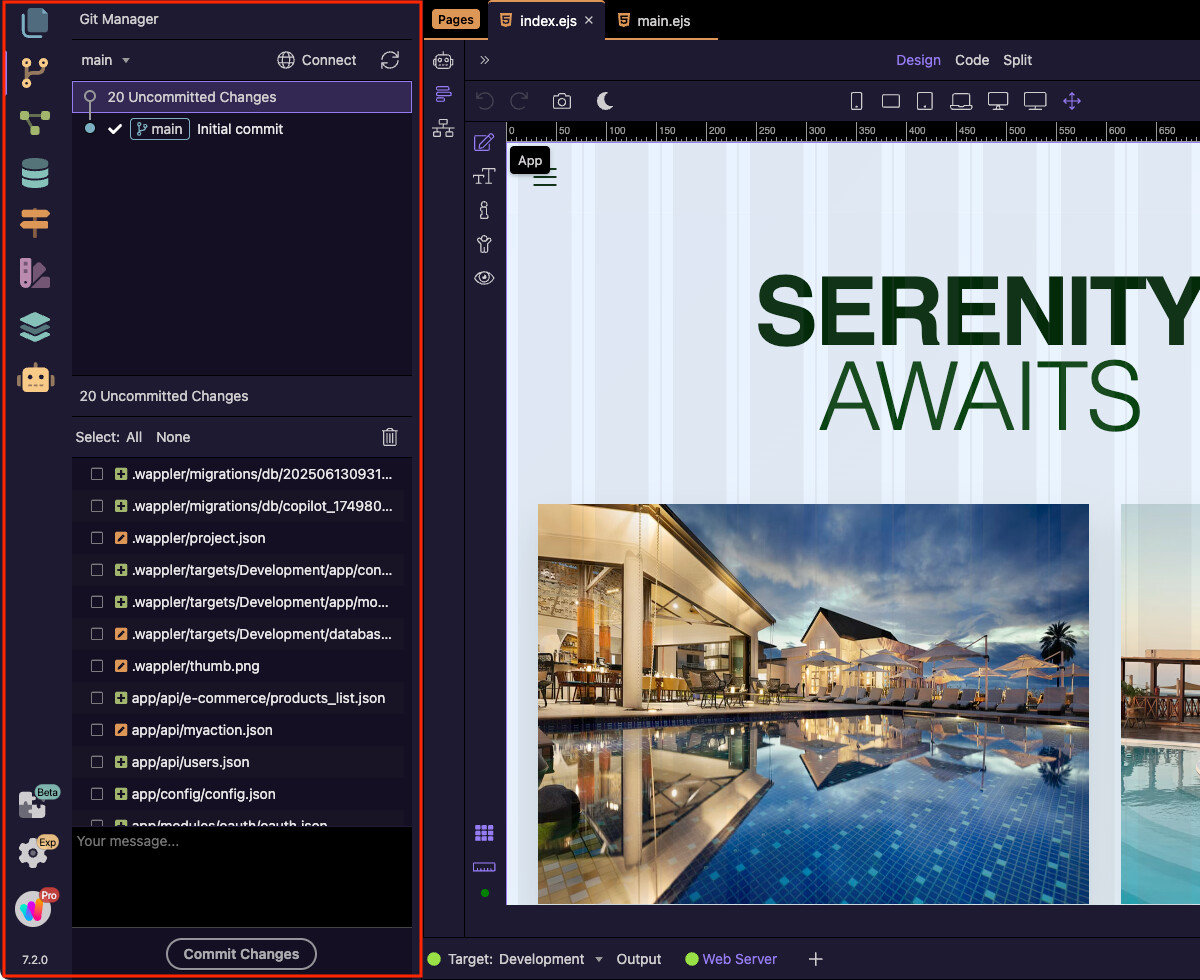
Git Manager
The Git Manager integrates version control directly into Wappler. It allows you to track changes, commit updates, switch branches, and synchronize your project with remote repositories.
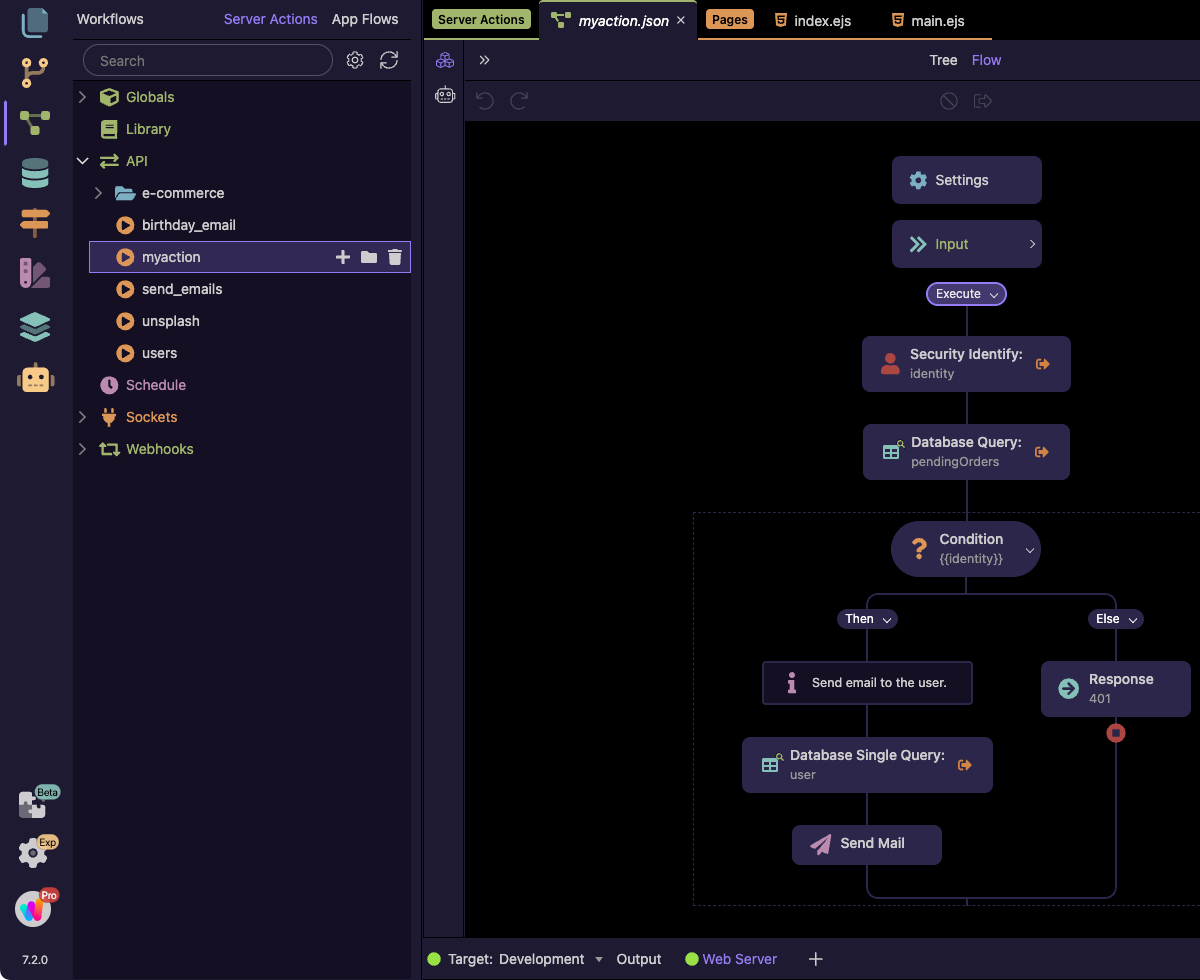
Workflows
The Workflows Manager (Server Connect) is where you build backend logic and automation. You can create server actions, connect APIs, and define workflows that power your app’s dynamic functionality.
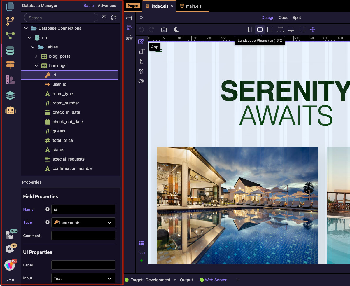
Database Manager
The Database Manager provides a visual way to connect to your databases, manage tables and structure your data. It helps you build and maintain your project’s data layer without leaving Wappler.
Routing
The Routing Manager lets you define and manage your application routes. It supports single-page applications (SPA) as well as multi-page projects, giving you full control over navigation and page structure.

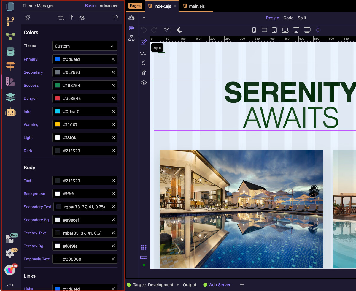
Theme Manager
The Theme Manager is where you customize Bootstrap themes for your project. You can adjust colors, typography, spacing, and other design variables to match your branding.
Resource Manager
The Resource Manager lets you organize all your project-related resources in a single place. From cloud servers and database servers to storage solutions and local services, it provides a central hub for managing everything your project depends on.

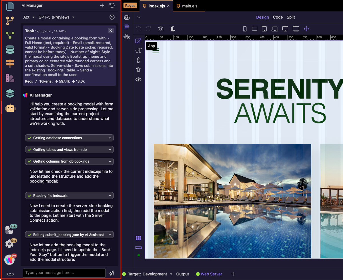
AI Manager
The AI Manager is your central AI conductor. It coordinates tasks across Wappler’s editors by dispatching them to the Design, Code, Database, and Server Connect assistants. Simply describe what you need, and the AI Manager can generate database tables and migrations, scaffold server-side workflows, and insert HTML and CSS in the right places — all working together seamlessly.
Bottom Section
At the bottom of the Left Sidebar, you’ll find additional controls:
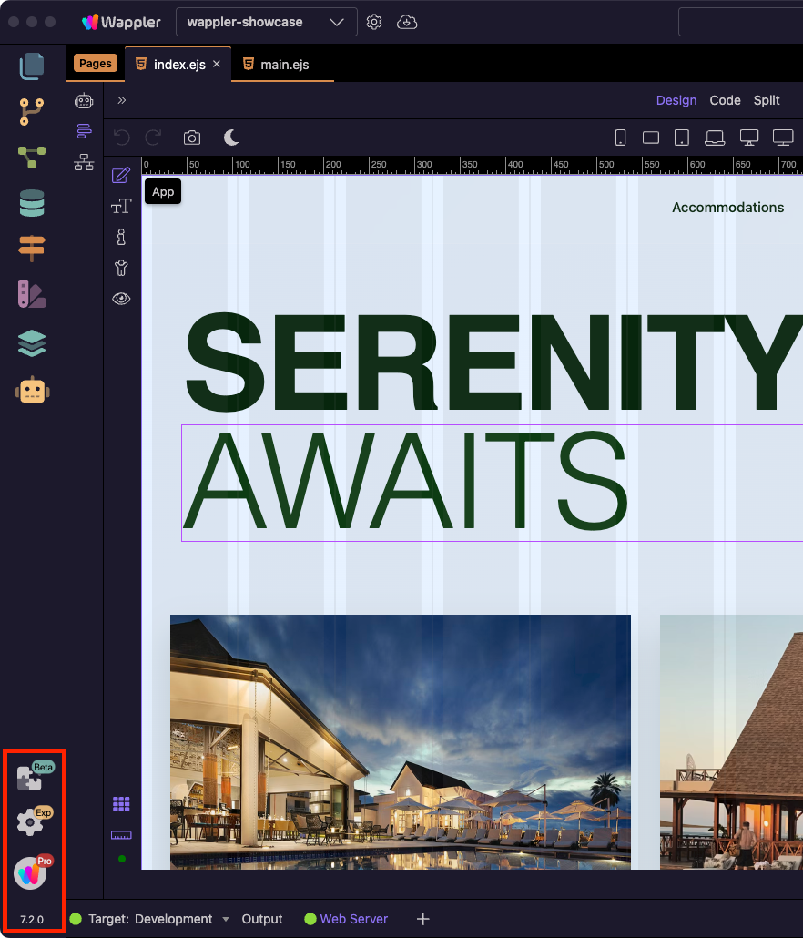
Extension Manager
Displays information about every installed Wappler extension.
Options
Access general Wappler settings and preferences.
Account Info
View your Wappler account details.
Wappler Version
The currently installed version of Wappler.
Right Sidebar
The Right Sidebar contains panels for configuring elements, styling with both visual tools and raw CSS, and inspecting live data.
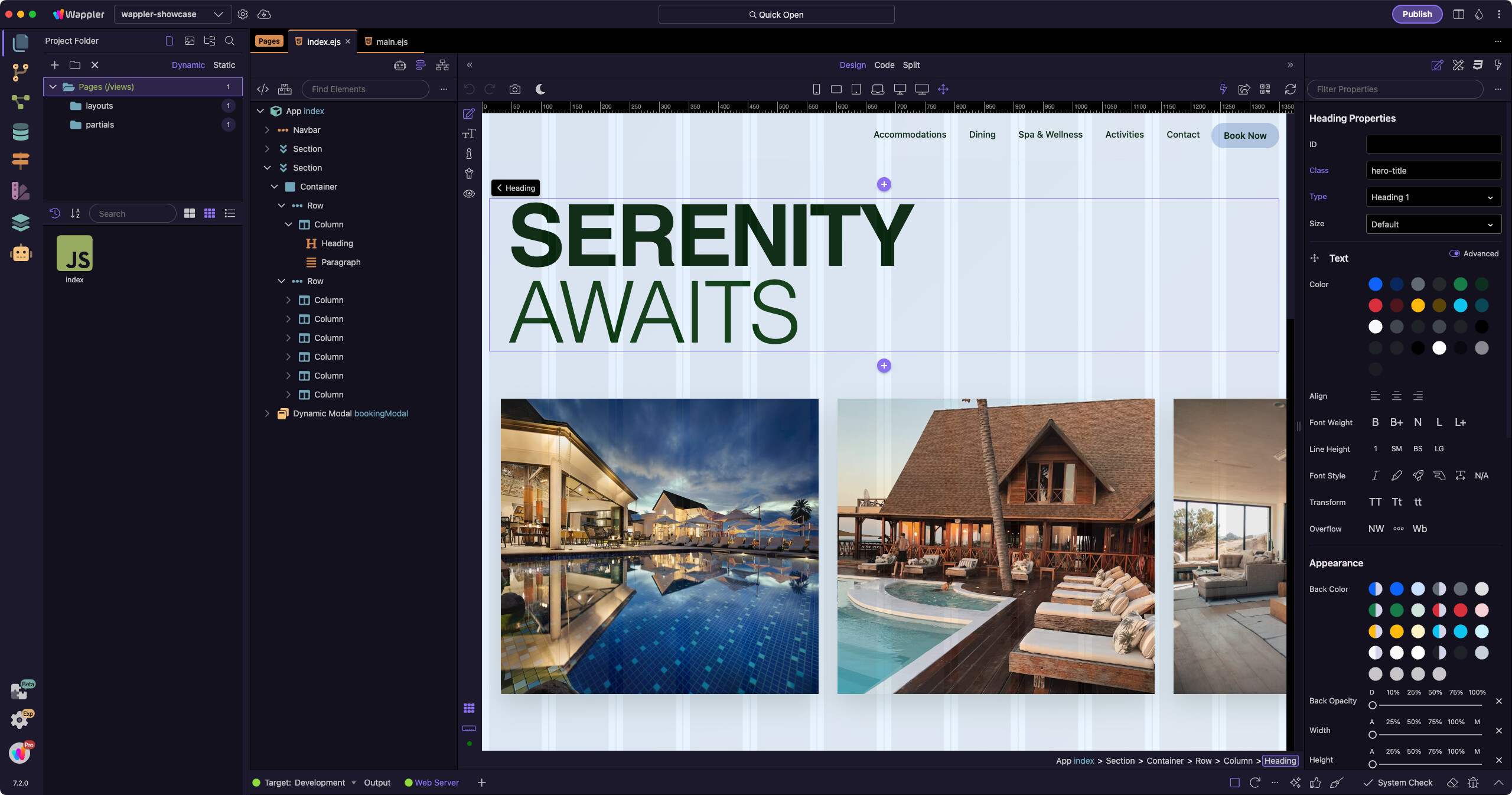
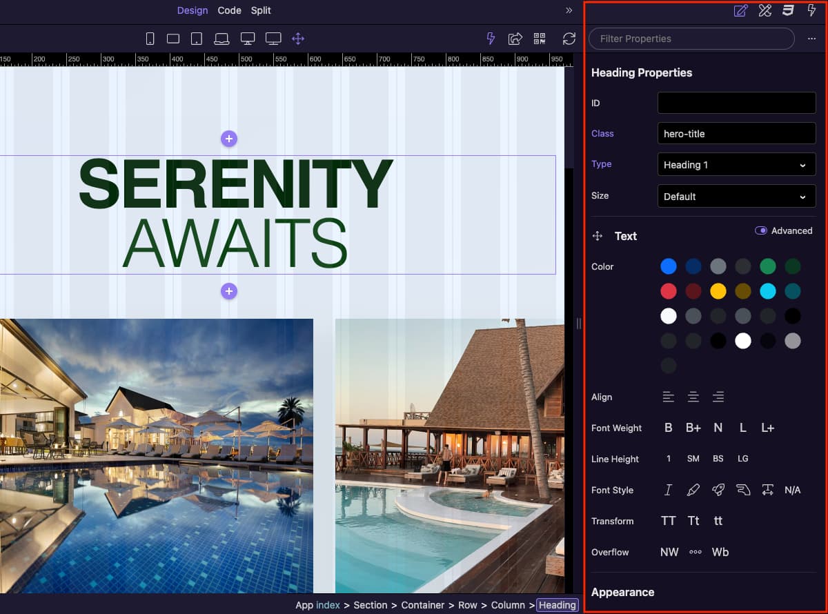
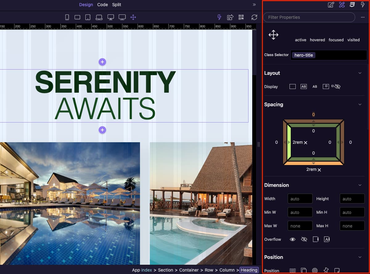
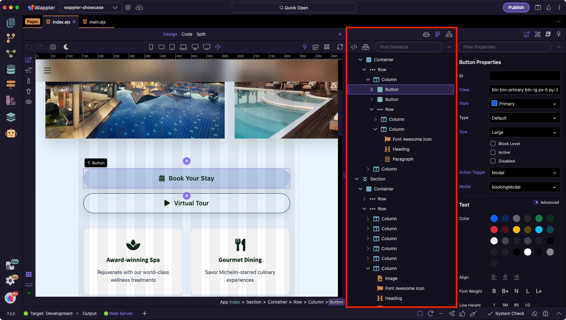
Properties Panel
All options and properties for the selected element or component appear here. This includes everything from colors, text size, margins and padding, to Bootstrap 5 options and specific App Connect component properties.
Design Panel
A visual CSS designer where you can adjust layout, positioning, alignment, spacing, and other styling options without writing code.
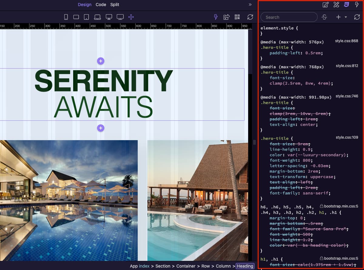
Styles Panel
A developer-focused CSS panel, similar to browser dev tools. It lets you directly inspect, edit, and apply CSS rules to your elements.
Live Data Panel
The Live Data Panel shows real-time data from the components on your page, much like checking dmx.app.data in the browser console. This makes it easier to debug and bind dynamic values.

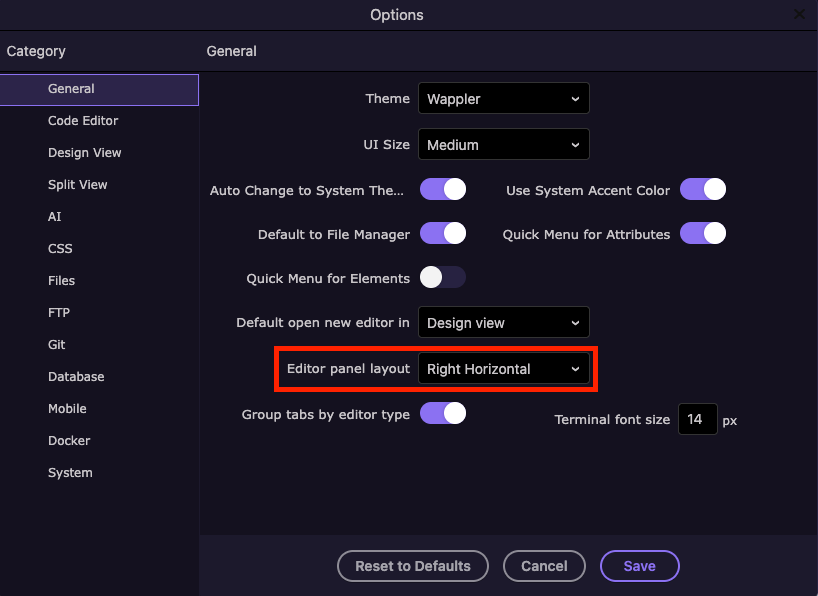
Layout Options
Depending on your selected layout options in Wappler’s General Settings, there can be another column of panels on the right sidebar, containing the AI Assistant, App Structure and the Network Panel. By default, this column is positioned on the left side of the Design Canvas.
In the General Settings, you can choose where these panels are displayed.
Panels displayed on the left side of the Design Canvas:

Panels displayed in the right sidebar:
These panels are always available, regardless of the layout position you choose.
AI Assistant
The App Connect AI Assistant works directly on your pages. It can generate code, bindings, or transformations based on natural language prompts.

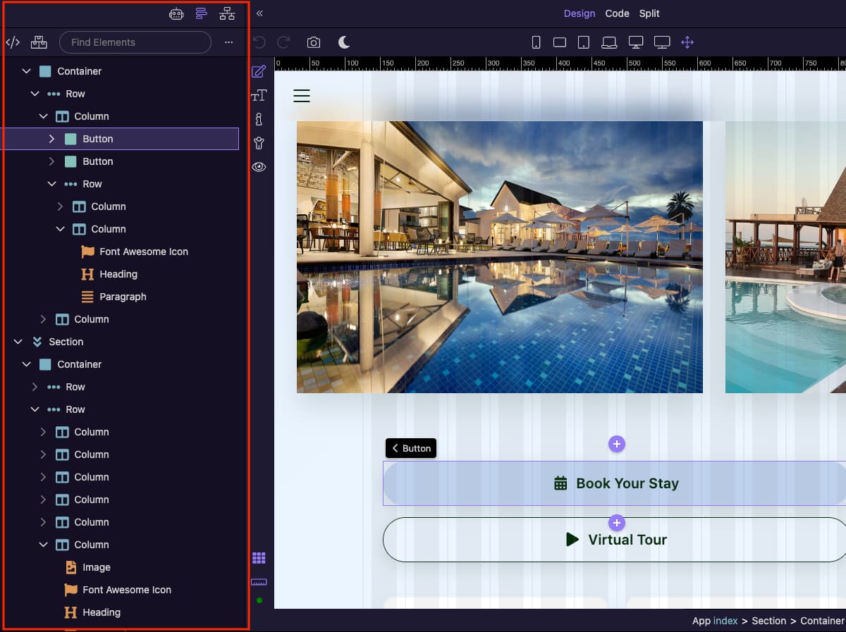
App Structure
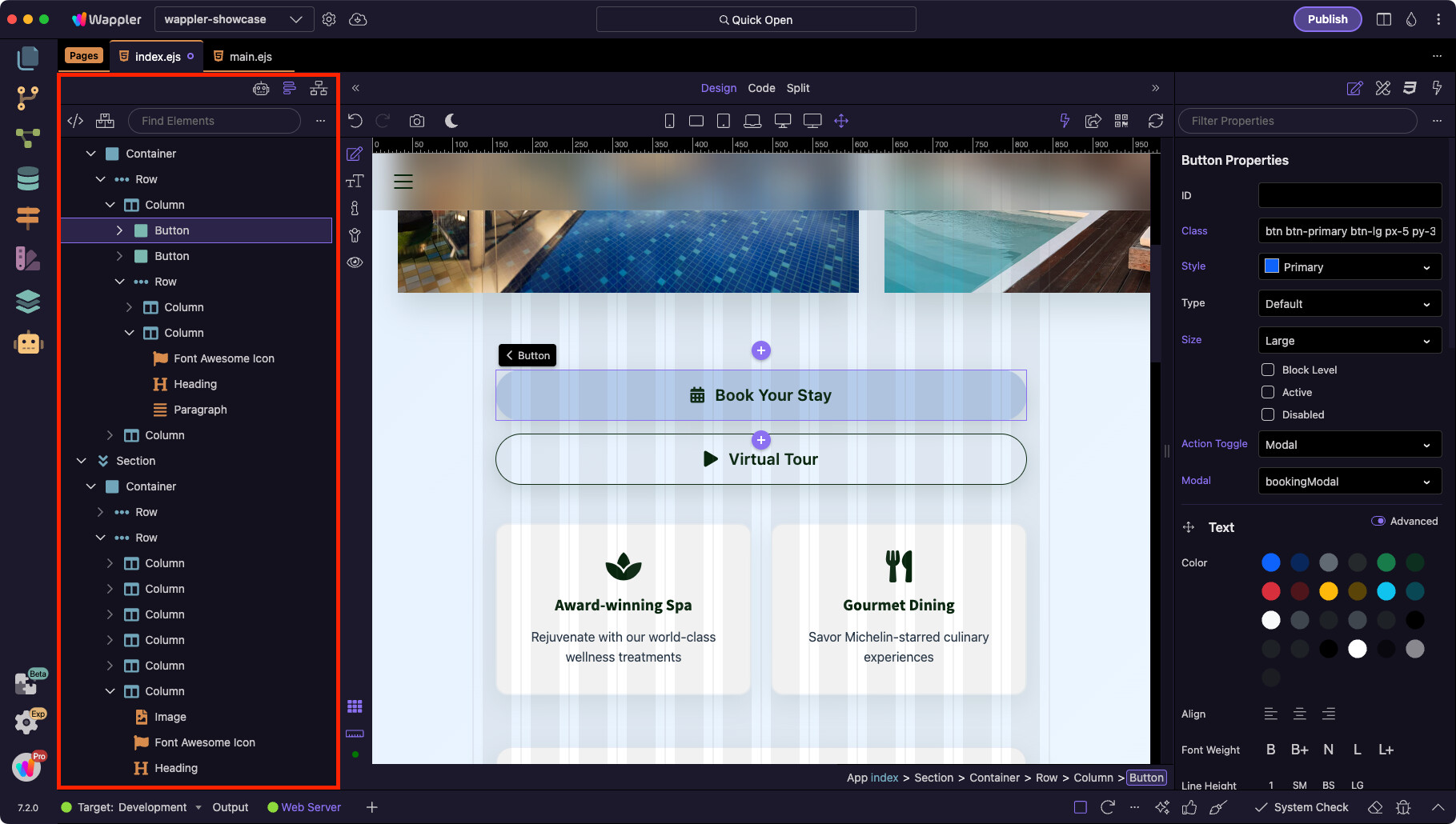
The App Structure panel displays the full structure of your page or application. Here you can explore elements, select them in the tree, and drag them up or down to reorganize your layout.
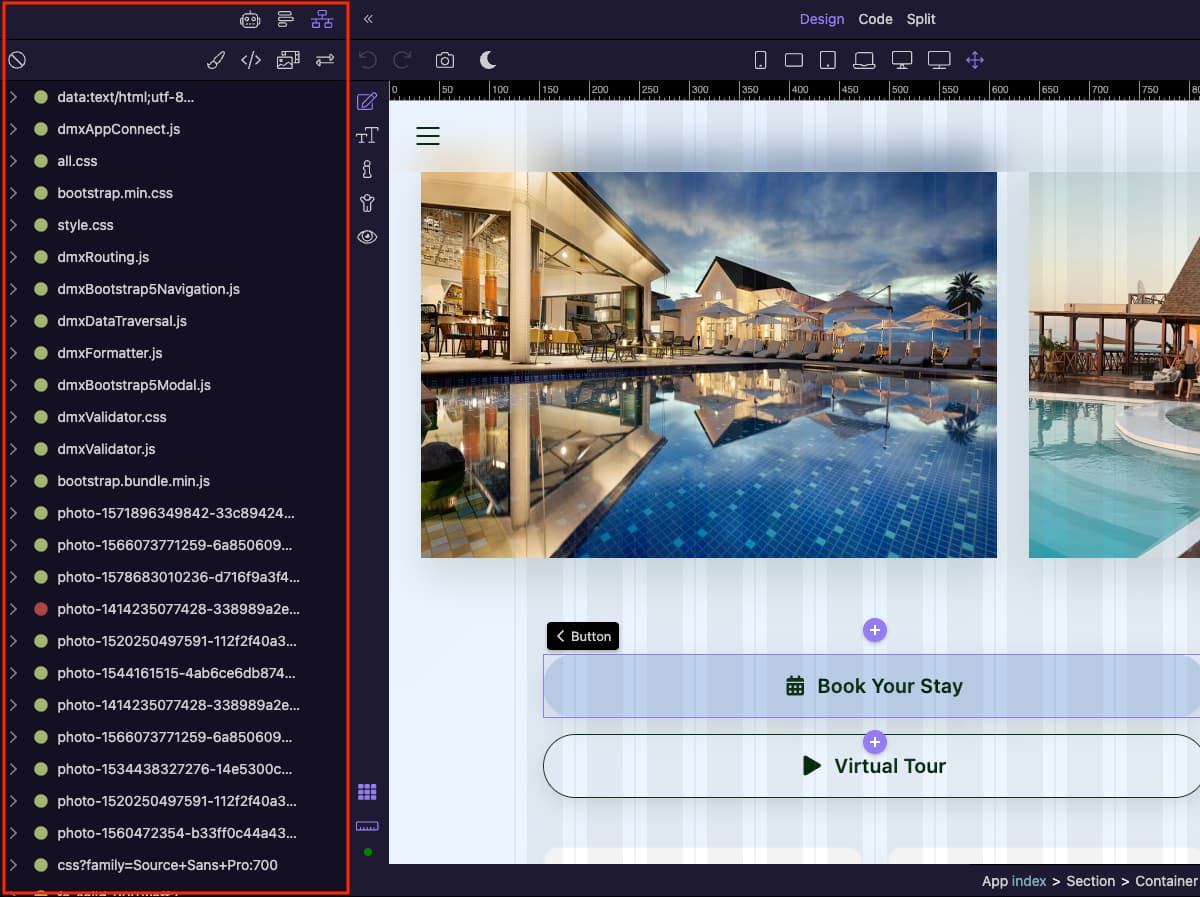
Network Panel
The Network Panel helps you inspect network requests and spot errors, just like browser developer tools — but built directly into Wappler.
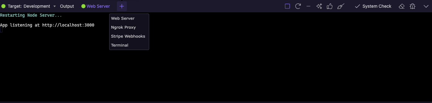
Bottom Panel
The Bottom Panel provides quick access to publishing targets, system checks, the output console, package installer, and a built-in terminal. It helps you monitor your project, install dependencies, and debug issues — all without leaving Wappler.
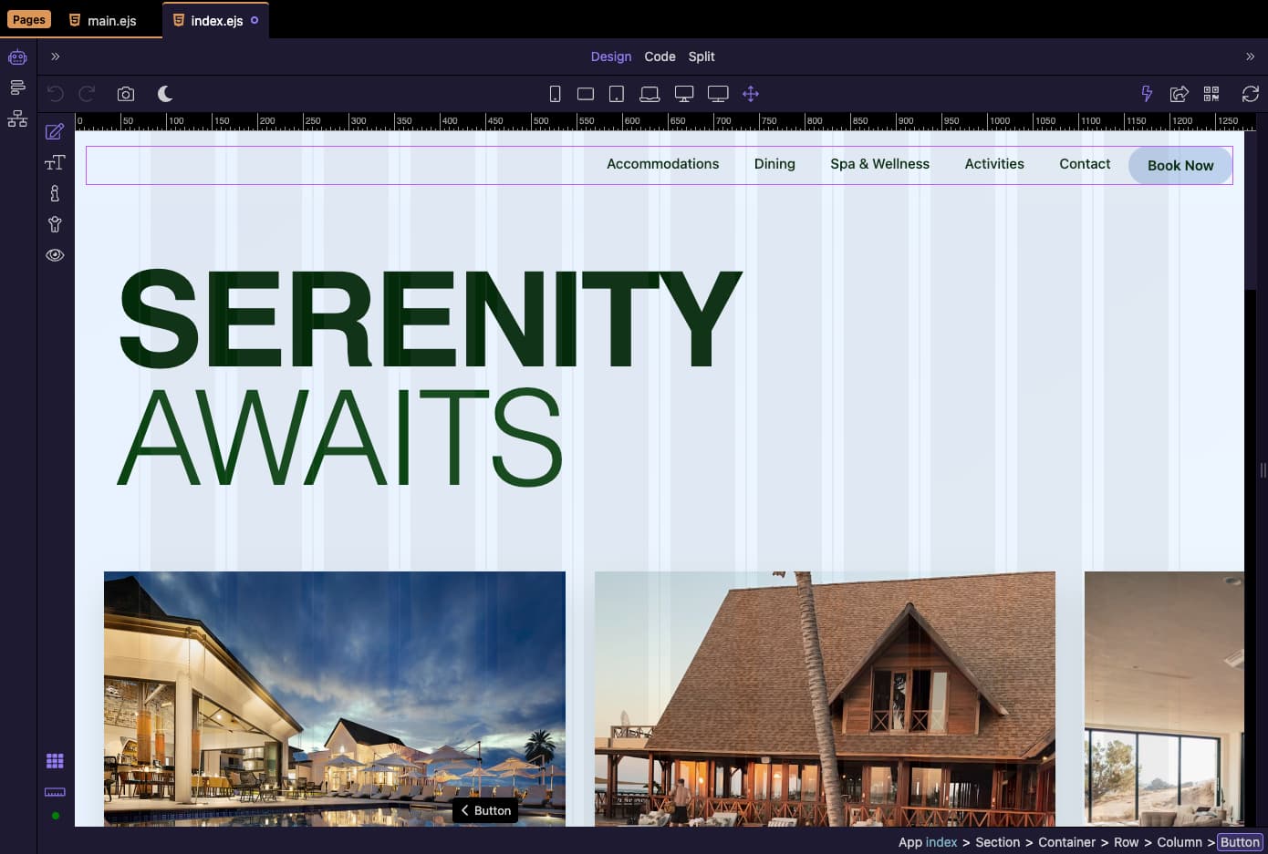
Design Area
The Design Area is the central workspace of Wappler. It combines visual editing, responsive design tools, and code synchronization, allowing you to build your app exactly the way you want.
Views
At the top of the Design Area you can switch between:
Design View
Drag and drop elements, visually edit layouts, and instantly preview changes.
Code View
Edit the underlying code directly.
Split View
Combine both views side by side for full control.
Device Previews
Quickly switch between responsive breakpoints to preview how your design looks on different devices — from mobile to widescreen monitors.
Grid & Layout Guides
Enable Bootstrap grid overlays and rulers to design precisely with responsive layouts. These options can be toggled on and off depending on your workflow.
Element Selection & Editing
Selecting an element highlights it in the canvas and reveals contextual controls. You can drag elements around, resize columns, and adjust spacing visually.
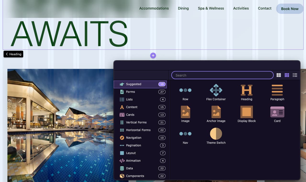
Adding Elements
New elements can be added directly in the Design Canvas using the Add Element buttons. These appear as purple (+) icons before or after the currently selected element or component, letting you quickly insert new content in the right position.
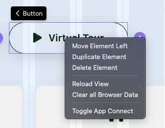
Context Menu
When an element is selected, a contextual toolbar appears for quick actions such as duplicating, moving, or editing properties.
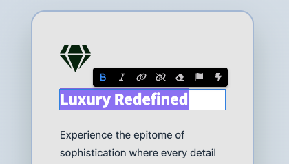
Inline Editing Toolbar
Double-click any text (or content area that supports text) to enter Text Edit Mode. A floating inline toolbar appears next to the cursor with quick actions for bold/italic, links, icons and dynamic data binding.
Edit & Preview Modes
Wappler offers several working modes to facilitate design, development, and testing:
Component Edit Mode
The primary design mode for adding, selecting, and adjusting components.
Text Edit Mode
Allows direct editing of text content such as headings, paragraphs, or button labels.
Inspect Mode
Lets you inspect the DOM and see properties and styles of elements.
Accessibility Mode
Checks your page against accessibility standards and provides feedback.
Preview Mode
Renders the page exactly as users will see it in a browser, without editor overlays.