Hi,
When I insert one of the Nav Bars with Brand, Menu & Social Icons, the menu bar looks fine on PC, Laptop as soon as it goes responsive the social icons disappear?
Hi,
When I insert one of the Nav Bars with Brand, Menu & Social Icons, the menu bar looks fine on PC, Laptop as soon as it goes responsive the social icons disappear?
Hello Charlie,
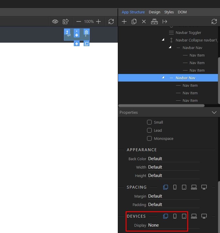
Bootstrap 4 allows you to hide specific elements on specific screen sizes.
In Wappler that is really easy to change. Currently the default display setting for the navi containing the social buttons is set to display: none
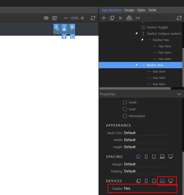
As soon as you get to a laptop screen this property changes to display: flex
If you need to change the default behavior of these buttons, just change the display property according to your needs.
Hi Yah Teodor,
Came across that tonight while playing around - Thanks very much for the reply