Loving the recent changes in the Beta ![]() But... we're losing more and more 'work space' I feel. Due to increased padding in many places.
But... we're losing more and more 'work space' I feel. Due to increased padding in many places.
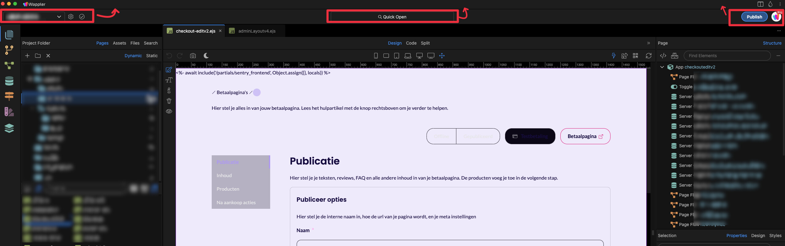
One concrete idea to fix it is to merge the the 3 navigatoin bars at the top into 2:
Loving the recent changes in the Beta ![]() But... we're losing more and more 'work space' I feel. Due to increased padding in many places.
But... we're losing more and more 'work space' I feel. Due to increased padding in many places.
One concrete idea to fix it is to merge the the 3 navigatoin bars at the top into 2:
I agree…
If you are concerned about the extra titlebar and want to save space, you can just switch to full screen mode with F11. Then the titlebar will be hidden.
Hasn't the title bar always been there? Had the project selector/settings tools in the centre?
Full screen mode won't work for me as I use a window management system that breaks with full screen mode.
Please consider merging it into a singualr title bar. And in general the design updates makes me feel like I'm losing space int he center (what I call 'work area').
I've overlayed the new beta UI on top of the wappler 6:
The 'webhooks' server action folder is 121 pixels lower than it used to be. (
Have to agree. I also don’t think a design solution should be forcing users to use full screen mode if they don’t want to.
That's great! that helps a bit.
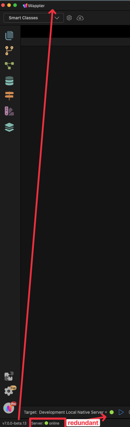
But this is a little bit ironic, now we have another bar at the bottom causing less "work space" in the center ![]()
would rather have this merged into 1 bar as well
There's also redundancy: there are 2 indicators that tells us the server is online now.
I would put the v7.0.0-beta.13 personally at the very top left next to the logo
We are still in the progress of moving elements around, most of the status related UI elements will be moved to the new statusbar. The new statusbar already replaces the 2 statusbars from design view and code view, making more space and we are moving more elements to it. We will cleanup the duplicates, it is only temporary until we have determined its final destination.
Perfect, then i'll be patient. Thanks for clarifying.
Just saw the multiple project option in the latest release, and finally installed a beta version for the first time.
But I was immediately distracted by all the wasted space, extra-huge padding and such a small working-area left in the UI.
There are so many bars at the top and bottom - definitely needs to be compressed or merged as @karh has suggested as well.
Not sure if this is being done to accommodate some future feature.. but in the current state, its taking up lots of valuable space.
Also, an additional feedback - I have used Wappler on a 15.6" 1080p screen for some time in the beginning, and for past few years on a 14" 1080p screen - and this is the first time it feels like I am looking at a 125% or 150% zoomed-in version. I keep Windows scaling to 100%, and it still looks so zoomed in.
I'm sticking with Beta 8 or something until Patrick makes the compact UI
Why do I always feel challenged when I read a comment like this?
Is this meant in humour or is it seriously telling another Wappler how to lead their life? ![]()
I thought it's a funny reference to what George has said before but apparently it was not a joke. Then I'm in your camp Antony.
I use 2x 27" screens... but telling users to get a better screen because of an unoptimized interface is like a restaurant serving food on dirty plates and telling customers to bring their own dishes instead of washing their plates properly.
Loving the debate!
I know for me I am quite a digital nomad and travel by train quite a lot...
... and using two 27" screens on a train is not recommended.
A 14" laptop is waaaaay better.
We can't assume someone else's life is the same as our own!
The same thing happened with the tree view, Wappler team was going to remove it until we had to beg not to. Half the users were ok, half weren't...
At the time I swore I'd pull an Antony and stick with v5 forever.
We just have to keep begging so they're reminded every day in January 2025 ![]()