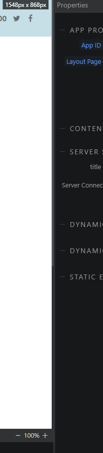
Biggest issue for me applies to all themes, the scroll bars for the panels are extremely thin and do not contrast well with the panel. As a result i find it hard to identify were the scrollbar is and find it really difficult to select. For example, who can spot where the scrollbar is?
Needs to be thicker or in a stronger contrasting shade/ colour.
I agree, I have actually found it impossible to use the horizontal scroll bar (I can see it, just) because it then activates the panel resizing instead.
I don’t know if this was an issue before the new theming, but selecting the handle/grabber to resize the mail body is very difficult, particularly on Windows. The handle starts as a tiny dot:
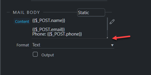
… but becomes easier to use once the area is made larger. Perhaps increasing the initial/default size would solve the problem.
It works better on a Mac. If you resize the area to make it as small as possible, the handle become a little dot, but even then it’s easier to select than on Windows.