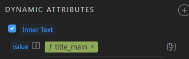
I don’t agree with your first case. Actually the information there is much more cleaner that a formatter has been applied. The “f” in front and the green color indicates that. So in first sight you don’t need to know what formatting is applied you need to know on which field. And if you are interested in the whole formatter you can hover.
Maybe even better we can implement a double click that will get you straight to the formatter dialog.
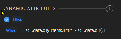
The second case with complex expressions I do agree - maybe we should shorten them differently so you see both fields (as shorten tags) and the comparison operator clearly.
Thanks George. I must admit I had vaguely noticed the 'f' but it hadn't occurred to me what it was for. It's certainly helpful and it does make things cleaner.
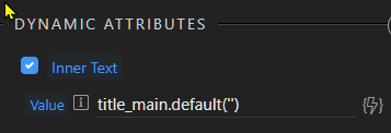
In general, having complete expressions displayed when hovering will be a considerable improvement. Double-clicking to get straight to the formatter dialog would be very useful.