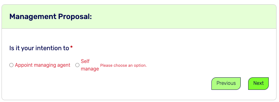
I have an issue with the validator feedback message position with a radio group. Any ideas how I can improve the display from from my current result as shown in screenshots attached.
Here’s the layout code.
<div class="col">
<div class="form-group row" id="managetypes" is="dmx-radio-group">
<div class="col-12">
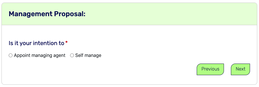
<h3 class="form-sub-head required">Is it your intention to</h3>
</div>
<div class="col-12">
<div class="form-check form-check-inline">
<input class="form-check-input" type="radio" value="Appoint agent" id="appointAgent" name="manage-type" required="" data-msg-required="Please choose an option." dmx-on:click="">
<label class="form-check-label" for="appoint-agent">Appoint managing agent</label>
</div>
<div class="form-check form-check-inline">
<input class="form-check-input" type="radio" value="Self manage" id="selfManage" name="manage-type" aria-describedby="selfmanage-label" required="" data-msg-required="Please choose an option." dmx-on:click="selfmanage.validate()" dmx-on:focus="selfmanage.validate()">
<label class="form-check-label" for="self-manage" id="selfManage-label">Self manage</label>
</div>
</div>
</div>
</div>