I have to build a portal that contains many tables of data. I found I can do it successfully if I use the truncate text option. But how can I set the truncate value based on device size?
For example set to 32 characters on phones and 48 characters on tablets, etc …
Brad consider using CSS media queries and define your device size styles there (font sizes, letter spacing, etc). Won’t truncate for you how you request above but will re-scale the font size so you possibly would have no need for truncation.
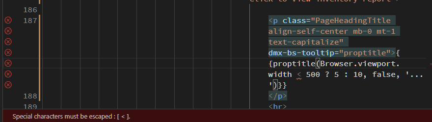
I like the idea of this @Teodor but how do you escape the < and avoid the error there? Also how could we build this in the formatter, is it possible to extend upon this with further browser input?
No need to escape this. That’s something Monaco editor thinks should be escaped, but that’s not the case.
Maybe you can try using < but it’s not required.
An idea for you Brad, a combination of Teodors approach and my suggestion, and you can do it with the standard pickers in Wappler too, no need to go outside Wappler generated code (hacks are great and get the job done though), so just came up with this (using the class toggle).
So we have the style .360mobile with its defined font size etc, specifically for sub 360 sized display. Do the same for the other aspects as classes and Robert is your fathers brother (I actually do have an uncle Bob)…