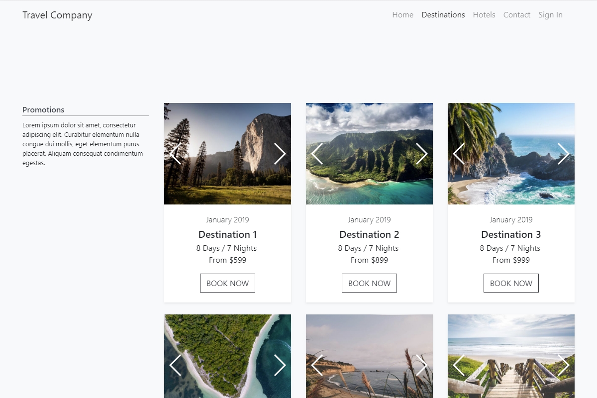
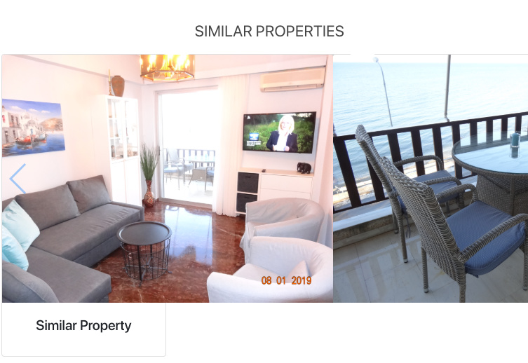
For this showcase we used Bootstrap 4 Cards and the Swiper Component to create a catalog of destinations for a repsponsive Travel Company website. We added the Swiper inside the cards and included 3 images per destination, which the users can swipe through.
Hello,
could you write more … for example how did you make swiper to fill the boundaries of the card instead of spilling all over.
I want to place images that are bigger than the card so they shrink and look nicely like yours.
I don’t want to create smaller images as I want them to be responsive. I will use them in another place on the site but in other dimensions.
Thanks
Did you add ‘img-fluid’, a Bootstrap utility class, to the img src tag as in the example code in the showcase?
<img class="img-fluid" src="img/1.jpg">
Adding that makes the image responsive.
The swiper is placed in card body, with padding 0 applied to it:
<div class="card-body p-0">
 <div is="dmx-swiper" id="swiper1"...>
  slides here
 </div>
</div>
1 Like
I was adding a card with image and then replacing the image with a swiper which seemed logical but wasn’t as it must be in card body not just card div.
Thanks @Teodor.
Here’re my cards in action http://kalimeraholidays.com