My goal is to leverage a standard Tagify component to replace standard Selects in forms to feature images and additional text. I'm unable to get the Wappler component to work like this one in the official Tagify docs: Tagify - Tags input Component
The expected behavior is to be able to type in a value and have it present options (like a standard select) or to click the field and have it diplay the list of select values. What I'm experiencing in Wappler is one an either/or:
By default (i.e. no selected settings) I'm able to type in a value to the tagify input and it will present matching options, as expected. However, clicking on the field will not display the dropdown of options. It seems only typing is accepted.
If "No Input" is selected, the dropdown appears when it's clicked but it's not possible to type an option.
The ideal scenario would have it do both as the standard Tagify example does in their docs. Has anyone used this successfully? I wonder if I'm missing something in the settings or if there's an issue with the Wappler port of Tagify. Thanks!
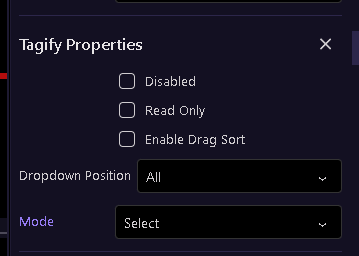
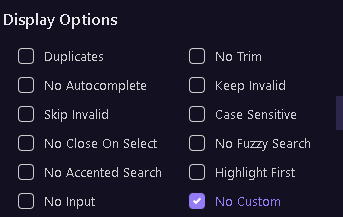
Yes, I'm in "Select" mode. Does it work for you? Here's what I'm seeing (the behavior is the same with 'No Custom' selected - the only change is that it only accepts the values in the dropdown when typed).
Thanks for the feedback gents. The issue appeared to be the width of the tagify input. For some reason it defaults to very small. Setting the width to a larger size (I used width: 300px;) worked. HOWEVER, it didn't work as expected on the two-year-old version of Tagify that we have in Wappler. I updated to the most recent release and it worked as expected (v4.33.2). However, the release seems to have other nuances that I'm working through, specifically dropdown styling and how validations are styled upon selecting the first option.
@George could we please put a Tagify update on the roadmap? There is a parallel thread the last few days requesting Tagify dark mode support as well. Thanks!
The dropdown/typing mixed option was solved by expanding the input width beyond the default and by updating the tagify version. The combination seemed to do the job. I must say though that @kfawcett 's Tagify selects look amazing. I saw his CSS in a different thread. Lots of work went into make them look that way. I'd be THRILLED if we could get them to look like the standard BS5 selects (including floating labels )
I am glad you got it working but the width has nothing to do with it. In the Wappler implementation of Tagify, the min characters parameter determines how many characters need to be typed before the dropdown is shown. If you just enter 0, it will show as soon as you click on the input.
You are 'lucky' that you have updated the version and it seems to have resolved your challenge in this regard, but I would suggest getting it right, with the correct min-chars parameter, otherwise when the Wappler team do update it, you will be left with a whole host of places that no longer act as you wanted them to...
You are indeed correct. Thank you for persisting Setting the min chars to zero resulted in the desired functionality on the current Wappler Tagify version (4.17.7), regardless of the input width. I guess even a blind squirrel can find a nut sometimes... thanks again

 )
) Setting the min chars to zero resulted in the desired functionality on the current Wappler Tagify version (4.17.7), regardless of the input width. I guess even a blind squirrel can find a nut sometimes... thanks again