I have a table with 3 columns that I would like to resize as-is into an xs viewport, regardless of how small the text is. Can this be done and how would you do that?
Also, how would you resize, say a cell that takes up col-3, into one that only takes up col-2?
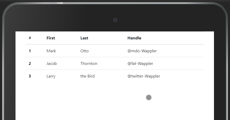
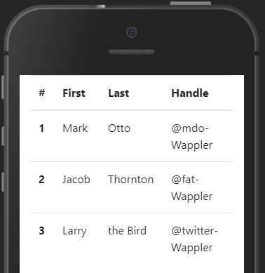
Alternatively you can set the tables up as responsive and configure them to have horizontal scrolling. But yes, Ben is right, Tables often don’t look great on mobile devices
Totally agree, Ben. How would you create a separate view for mobiles? Would I have to set up a new domain like mobile.domain.com? Or is there a simpler way to do it within Wappler?
Yes Ben this does make sense. I will give this a try. It should be interesting in that my tables are functional, in that they have edit and delete functions. Both were created using the table generator. I will just duplicate the table, assign it different ID, and do the hide and show.
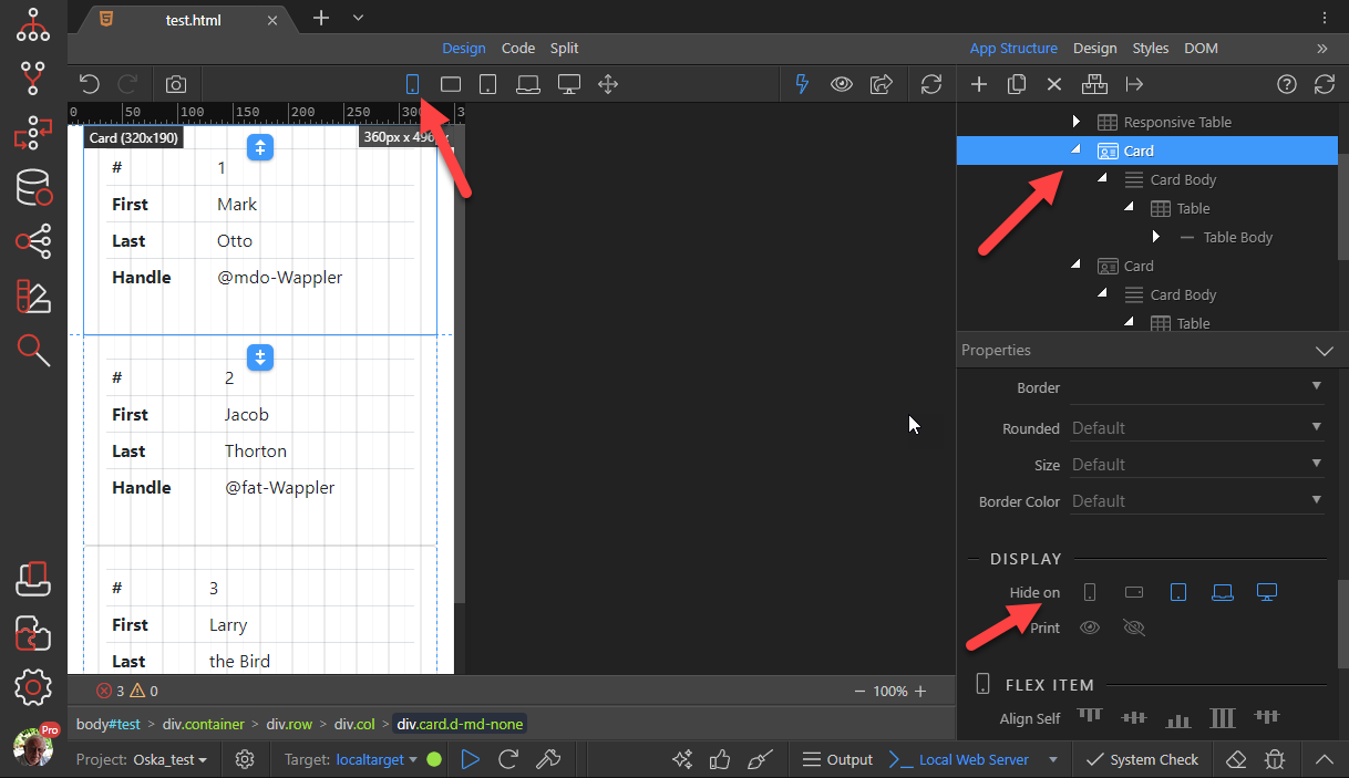
You can also show/hide just certain columns. Or like you first asked you can easily define any bootsrap column to have a certain size in mobile view. I.e. col-2 in smallest view and col-4 in larger views etc.
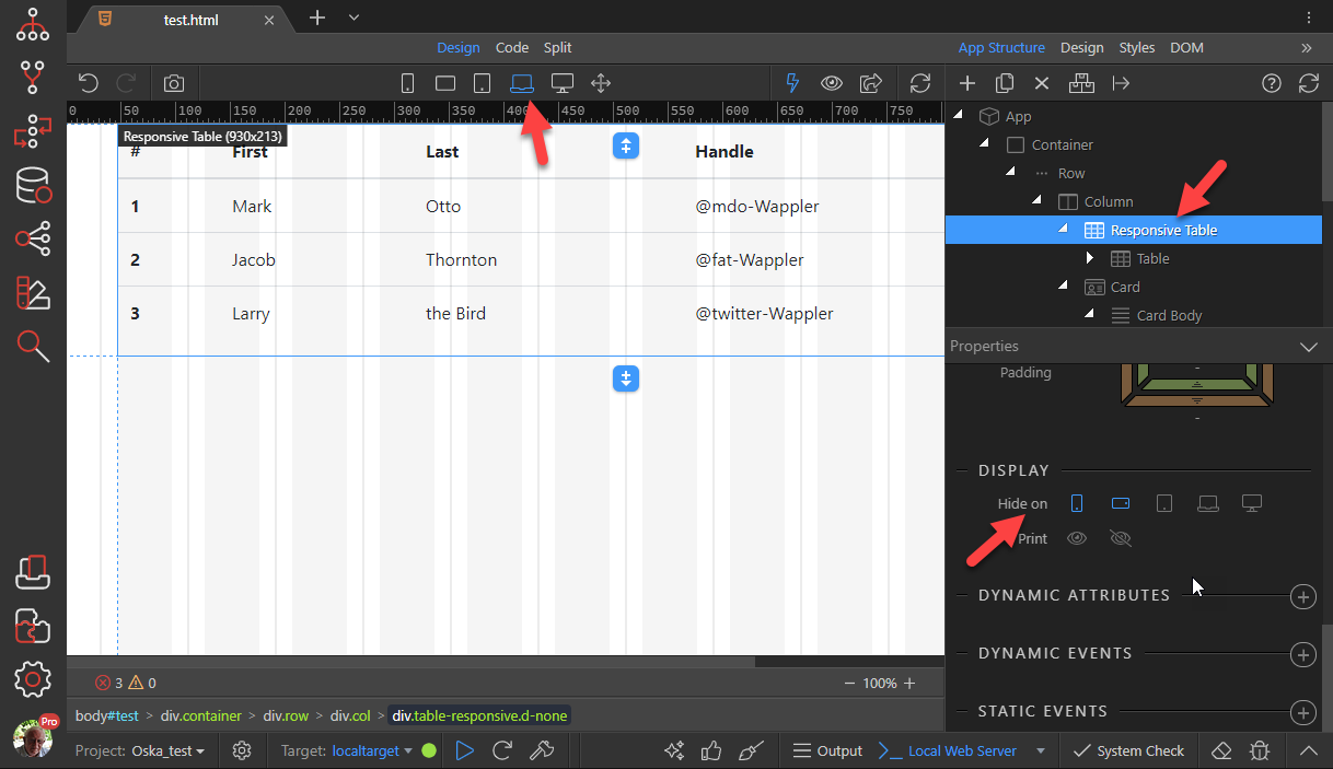
That’s just a matter of changing to the view in question and using the UI slider on the element to choose the column size. That will put the right class in like col-xl-4
Hi Philip, I did that with no success. There is no UI slider for either the Header or Body of table cells. There is good news.
When in XS Design mode, place your cursor on the table. You can then swipe to the left or right to see the rest of the table. Having said that. Add a paragraph to the top of the table and hide/show depending on viewport.
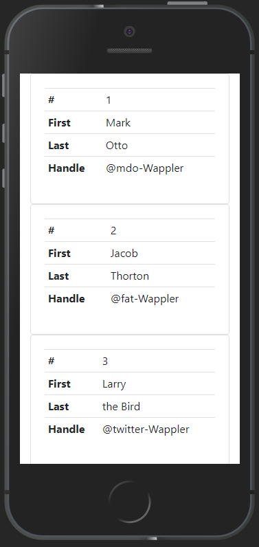
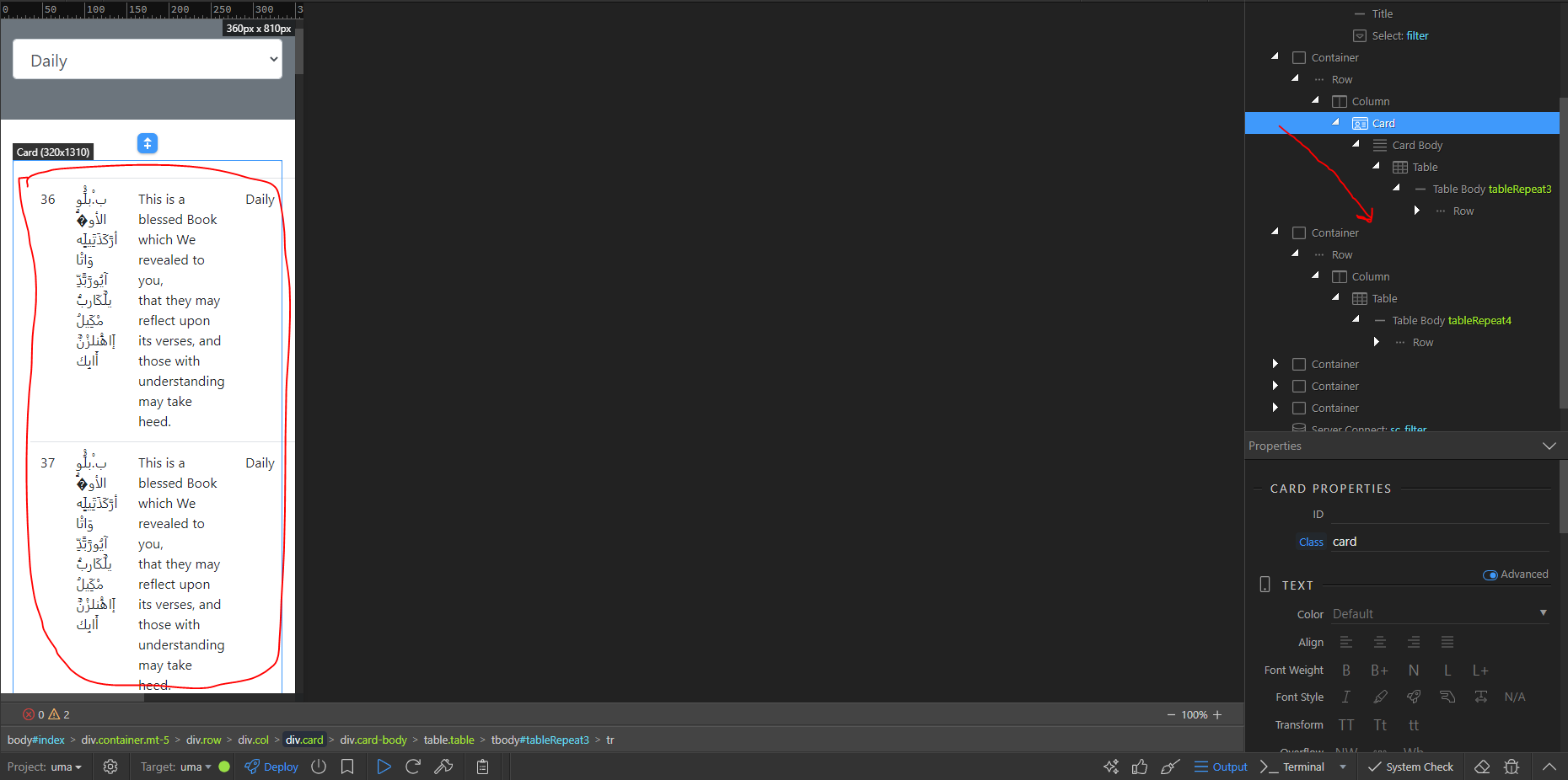
Qaiser: I would delete “Table” from your card. Then I would right mouse click on “Card Body” and start the “Table Generator”. When in the table generator, change “Horizontal” to “Vertical” and complete the remaining options. That should resolve your issue and creates a vertical table in your card.