I’m just wondering if it’s possible to create designs in https://bootstrapstudio.io/ and seamlessly add back into wappler. The reason is that some of these other tools seem easier to use for faster visual design. Although I would prefer to stay in wappler for everything it seems a little buggy right now.
1 Like
I guess the alternative to this is a really comprehensive guide, preferably a video to using all of the design features in wappler 3 as I definitely find it confusing despite being very used to designing websites.
Here is an example, safari (on left) and chrome (on right). Don’t know why I get this behaviour with the logo’s which are in a flexbox.
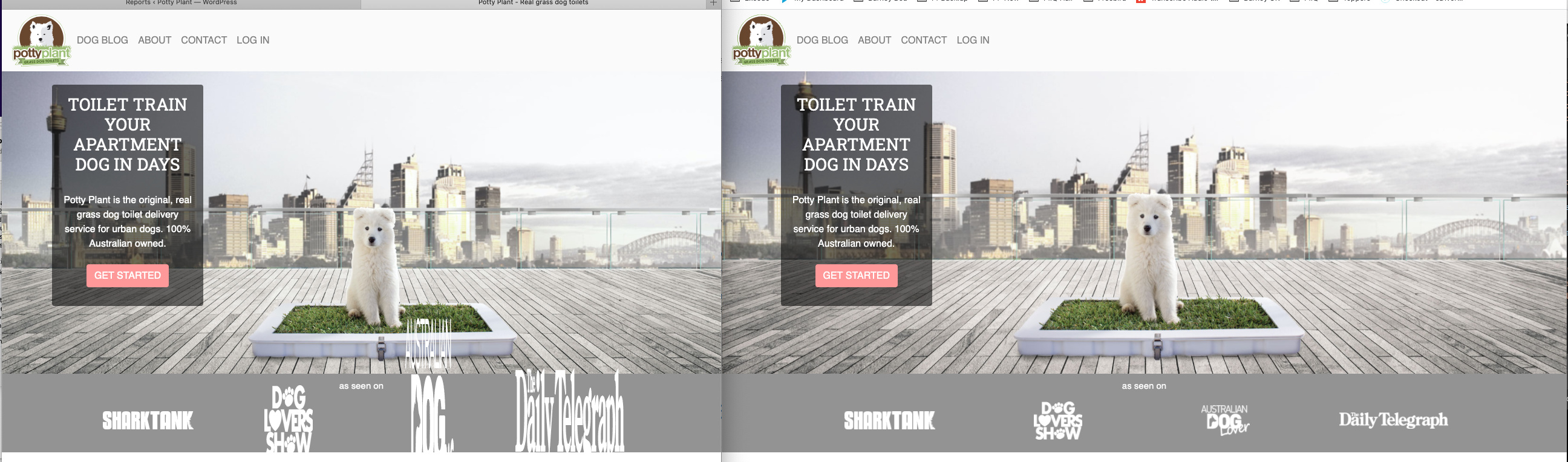
Have you set image heights on logos?
While people won’t really recommend it, you would be able to build something in Bootstrap studio and then copy the code into Wappler.
It should mostly be ok, you just need to make sure app connect and bootstrap framework is added in the page.
You might need to playaround with the order of some of the scripts in the head, but as long as it uses bootrap classes it should transfer over. It’s just all the Wappler functionality that you’ll be missing and would need to add.
1 Like
I don't think it's a matter of Wappler or Bootstrap studio. Looking at your page i see some really weird things going on.
You are using a row > col structure, but also you have some .style43 etc classes added to the row and also to the cols which are causing problems...
<div class="container style54">
			<h1 class="text-center whitetitle text-light">as seen on</h1>
			<div class="row style43 tablet">
				<div class="col-6 col-md style47">
					<img src="assets/images/featured-sharktank.png" class="style44">
				</div>
				<div class="col-6 col-md style51">
					<img src="assets/images/feature-dogloversshow.png" class="style45 img-fluid">
				</div>
				<div class="col-6 col-md style48">
                    <img src="assets/images/featured-australiandoglover.png" class="style45 img-fluid">
                </div>
				<div class="col-6 col-md style55">
                    <img src="assets/images/featured-dailytelegraph.png" class="style46">
                </div>
			</div>
		</div>
You apply some flex properties to them, using these classes and this breaks your layout.
Either add a flex container with 4 images inside it and adjust its properties in App Structure panel, or use the bootstrap 4 grid (container > row > col) for this.
The way you mixed them breaks your layout.
Also all these .styleXX classes added to the different elements are a really bad practice. You should name the classes and reuse them, instead of creating a new class for each element.
Maybe if you explain what are you trying to do, we can provide some example code for you to check. Changing the default Bootstrap 4 Grid flex properties can really mess the layout.
Yes, there doesnt seem to be much documentation around the use of such things in wappler?
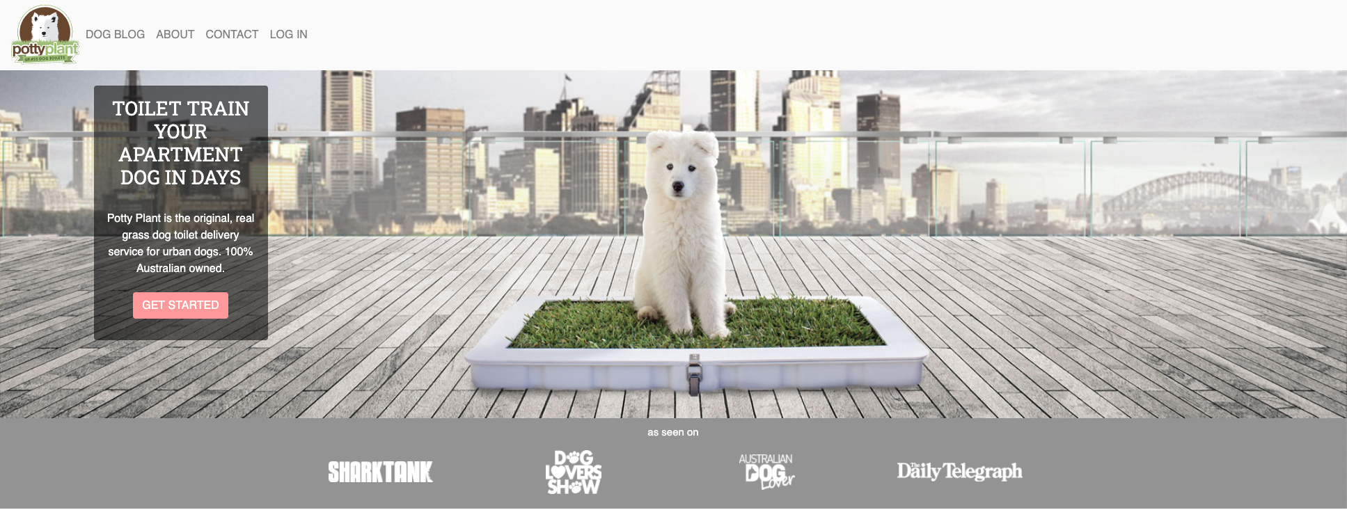
Here’s the behaviour I need in pictures:
- 2 rows of 2 evenly spaced logo’s on mobile centred horizontally
- 1 row and 4 evenly spaced logos above mobile width centred horizontally
Exactly as pictured and behaving correctly below (but only on chrome)
I take it that I need to code this as wappler won’t do it through the visual interface as described?


I dont know how to do classes and styles properly, I wish there was a video explaining the use of them in wappler. And the ability to rename styles.
No you don't have to code anything ... just use the bootstrap 4 grid, without adding custom styles as you don't need to add any.
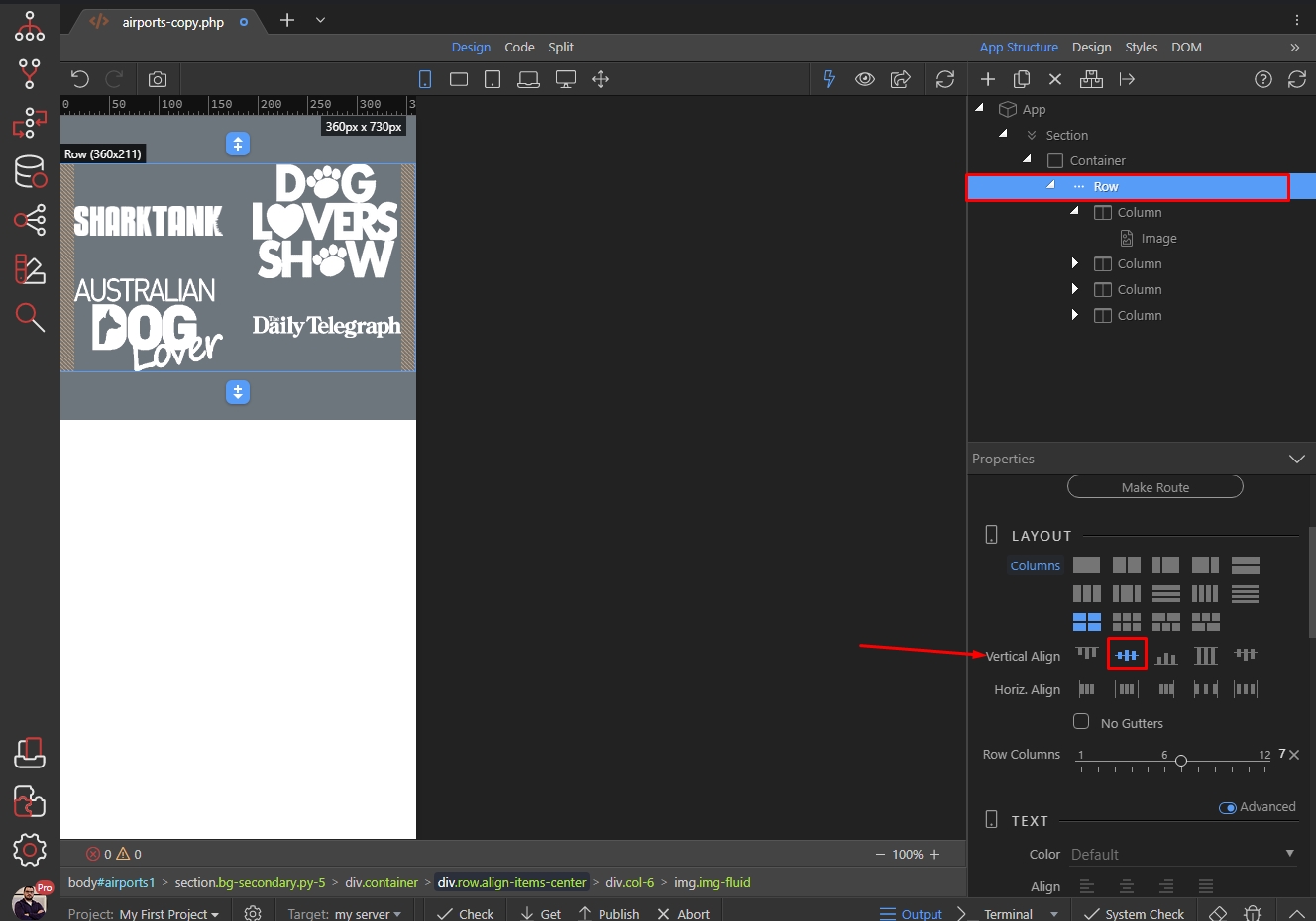
Just add a row with 4 columns inside and put an image in each of them.
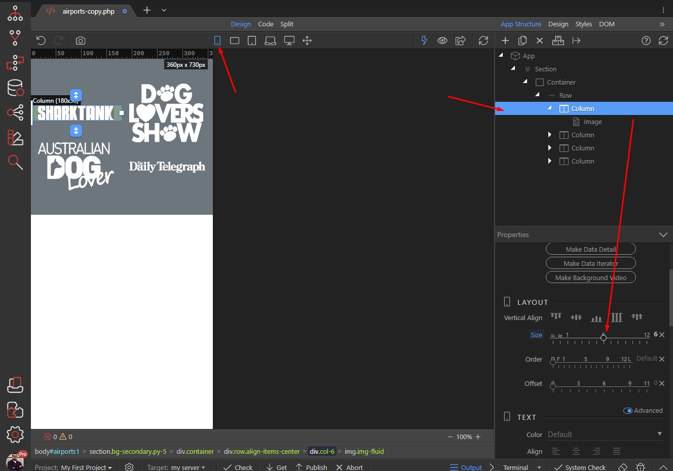
To style for smallest screens, switch to smallest screens view, select your column containing the image and select the size for the column. You want to have two logos per row, so set the size to 6. Do this for all the 4 columns:
To center each logo in the column just select align center:
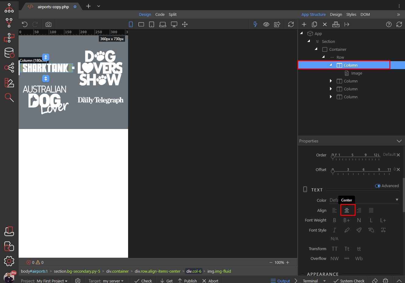
You probably also want to have them nicely centered vertically so select row and select vertical align center:
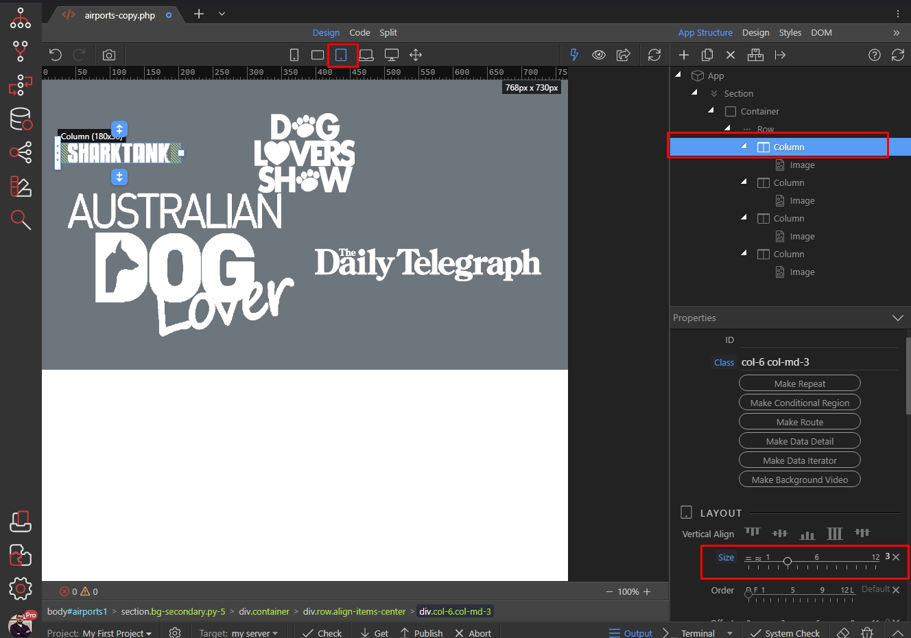
We are done with small screens. Switch to Medium Screens to apply the changes there. Select your columns and set the size to 3, as you want to have 4 per row:
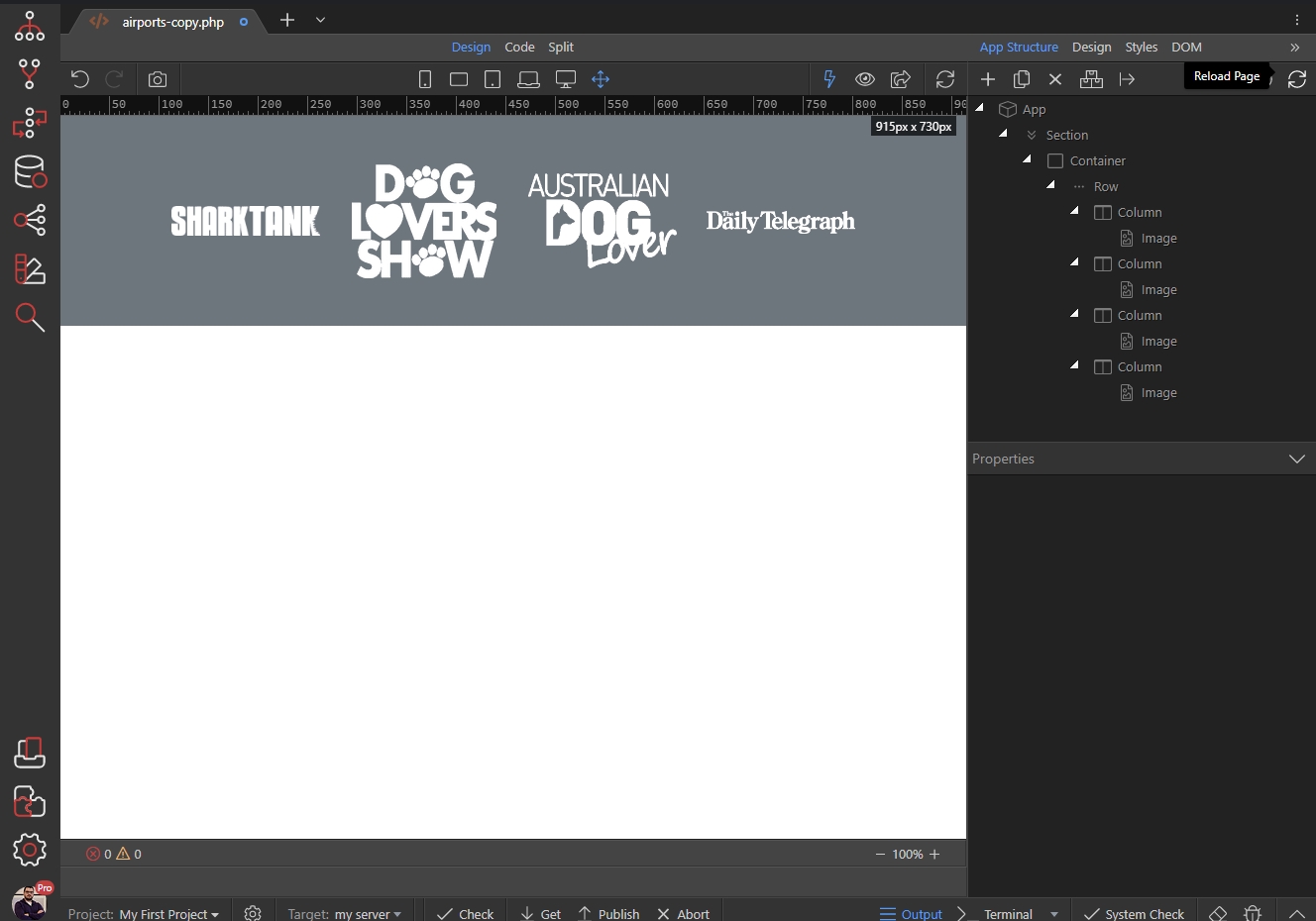
That's the result after we did this for the 4 columns:
No need to add any custom styles through the design panel, when you have all the properties needed available in Bootstrap 4.
Just for reference, this is the code generated:
<div class="row align-items-center">
				<div class="col-6 col-md-3">
					<img class="img-fluid" src="assets/images/featured-sharktank.png">
				</div>
				<div class="col-6 text-center col-md-3">
					<img class="img-fluid" src="assets/images/feature-dogloversshow.png">
				</div>
				<div class="col-6 text-center col-md-3">
					<img class="img-fluid" src="assets/images/featured-australiandoglover.png">
				</div>
				<div class="col-6 text-center col-md-3">
					<img class="img-fluid" src="assets/images/featured-dailytelegraph.png">
				</div>
			</div>
This is already in the docs - it explains how to use the Design Panel and it's pretty detailed:
I have seen that before, I don't think it covers enough for confident use and how section properties relate to it. Just saying it would be great if there was a comprehensive guide to the use of the properties and design styles - preferably in a video. I'm sure you have a lot of other more urgent things to do too of course.
These properties (in the Design panel) are standard CSS properties, nothing Wappler specific.
There are plenty of resources online explaining what all the CSS properties like width, height, align, flex-direction etc. do so if you are not familiar you can check https://www.w3schools.com/ for example.
Or are you referring to the properties available in the App Structure panel?
So you’re saying I should not use the UI and just code? What’s the point of the UI?
No, I did not say that. I'm saying that if you don't know what a property does, you can check it w3schools website as it is a standard CSS property.
The documentation on the Design Panel, though not a video, is explained with images. It covers naming styles, which might prevent the need to rename them later.
Given you're using Bootstrap with Wappler, and there is the built-in Theme Manager, it's likely you don't need most of the styles you're creating. I expect it might often be assumed that the first place to go to control styles is Design Panel, whereas it might better be seen as the last place to go - having made sure what you're trying to achieve would not be better managed in the theme itself or simply using one of Bootstrap's numerous classes (whether included in the UI or not).
2 Likes