Hi Teodor, I have done that exaclty like you say. set the image size to 1920 x 350 and unchecked crop this time. But it did not resized. I have attached restart logging zip file for wappler have a look and also visit here to see my slideshow that does not sized by height 350px. report_2018-9-21_14-27-22.zip (441.6 KB)
Are you sure you uploaded the newly generated images to your website?
its now uploaded…sorry please check now…
Your images are resized/cropped to 600x400: http://www.webonmaster.com/images/slider/slide1.png
I still don’t understand what exactly your issue is?
Let me explain: I want to have a slideshow in 1920 x 350 px size and also all the images need to be on that size to fit in to it. this is what i’m trying to use. When i set that size on image resizer no changes effect. As you saying that my images are resized to 600 x 400. which even wrong size. I set 1920 x 350 size. So image resizer not helping me to make my own size slideshow. Width can be set to 100%. But i want the height to be controlled or reduced to 350px. Because, now the slideshow takes all the default none scrolled browser area which looks bad for me. i dont want that big slideshow to my home page. Thats why i’m keep trying to make this happen. Please understand and help me out to have my slideshow and images fit into 100% width on slideshow container or sized 1920px for width, height 350px.
First of all - setting the size in the resizer to 1920x350 will make the images FIT this size, it will not make them exactly this size.
If you want to make them the exact size entered you must use the CROP option.
Then - the slideshow is RESPONSIVE - i.e. it will not be 1920x350 on every screen size. It will always be as wide as the element you placed it in is.
In your current page layout, you placed the slideshow in a bootstrap 4 container. Bootstrap 4 container will never be 1920px wide, it’s max size is 1140px.
I think you just don’t quite get how a responsive web page works, or how bootstrap 4 functions.
so wapplers Slideshow component does not allow custom sized slideshow? Even though if i set width size as you say by default size in bootstrap 4 1140px. here width not really a big issue for me. height, i need to have 350px. even the image looks compressed or ugly it does not mater. My point is this component not resize the slideshow. I’m fedup about this. Just let me know if you can make a slide show that exactly has height 350px?? just show me a screen shot steps. by using the image i sent earlier or take it from this reply. I attached.


Please use this two images and show me how you make slideshow as i wanted in 100% width or responsive width. height 350px.
I really don’t know what else to say, you just seem not be familiar with the ideas of responsive web design.
Responsive images scale their WIDTH AND HEIGHT proportionally depending on the screen size! They will not be 350px high on all screens, as this is not how RESPONSIVE web design works. The height is different on different screen sizes and it depends on image proportions.
@thines can i just ask
- Are your original image bigger than 1920px wide to start with?
- Are you wanting the images to be 1920px x 350px even if that means it is unproportional
- Are you wanting to crop the height to 350px rather.


Oh Common Teodor, I know what is responsive design, Matter is does your slideshow component allow us to do custom sized slideshow or not… could you please focus on that instead of responsive or not. i can see that image resized to fit the container, of course the container is bootstrap 4. But i can use css style right?? i have tried to right own style but it mess up the navigation for the slider, which mean i have to right so much css to make it as i want. I can do it if its outside wappler. What my concern it to without code much i want the slider height as 350px or less. image has to fit int to it. using photoshop to crop the image or whatever case. I really wanted to have my slidehsow height 350px.
Please look at this page that has a slideshow called html slidehsow. when scrolled to bottom you can see it. Thats the size i wanted to have on my home page. https://www.magictoolbox.com/magicslideshow/examples/
I know this slider size is 320px. this also a responsive slideshow note that.
yes this is what i wanted to… it does not mater images looks ugly or not i want this size. Great psweb you got my point. image i can allways customized to fitt my slide… great. can you share how did you gain this??
The component you mention works in a completely different way.
The App Connect Slidehsow component cannot have a fixed height, as i explained earlier because it is not how the responsive web design works. The images will always scale depending on screen size.
Well i cant share how I made this image
Because Wappler will not allow you to do that, there is no setting to allow an un-proportional scale to your images.
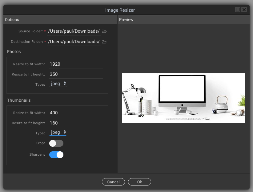
If i set options like the screenshot I am showing it will proportionally take the smallest measurement.
So the main images become 350px height by a proportional width of 525px
While the thumbnail images become 160px height by a proportional width of 240px
The only way to get Wappler to adhere the your width and height measurement is to use the crop toggle as far as i know.
2 Likes
I think what Teodor is trying to explain regarding responsive web is that when a browser or device gets smaller and smaller in viewport width, so the image width @1920px which takes 100% of the container will reduce to the device size.
So if you do the squashed version like i did in photoshop then view it on a mobile phone @450px wide lets say then this will be your result @ 450px x 82px

Which will just not look very good, and not what 99% of users would ideally want.
1 Like
I understood What Teodor tried to explain me. I appreciate that. My Point is to have a slideshow as i want. There is css to use aswell. I saw that image resize/croped images like you said, 1920 x 350 become 525 x 350, because proportional. So Slidehow component never allow us to make our custom styled or sized slideshow. This is not really what people look for … Please try to understand me. So i cant use app connect slideshow to make a slide show as i want?? is this the solution for now? maybe in future wappler brings those feature? please note that i have shown a responsive slideshow as i wanted hope you guys saw that.
No, this is not possible. Fixed sizes have no place in responsive design. The slideshow works as it is - fills the parent container size, and resizes image proportionally.
The only way you are going to get around this for now and have exactly what you want is to Photoshop (or any image editor) resize to your size you want and use the slideshow component but do not ask it to do the resize for you, tell it to just use your images as they are.
So you can still use the component just with the aid of other image editors.
I have to admit i always use custom image editors anyway because i need to fully control quality/filesize to the best i can, and crop exact where i need it.
YES. This is what i’m doing now. I’m using photoshop to resize the images to 1920 x 350. then i’m going to use slideshow component as you say. Thanks. I think Wappler team should consider that we can choose proportion or not when resize the images.
Cool, good luck with you project.
1 Like