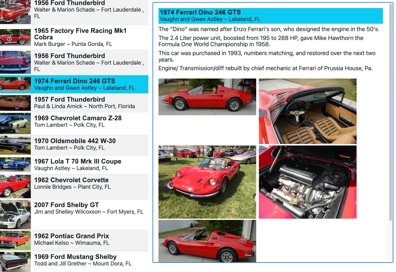
if you click on one of the items, you’ll see the blue-bordered detail-data area.
if you scroll down a page and click, you have to scroll back up to the top to see the detail.
Initially I was thinking about some split-scrolling region where the left list would scroll, but the right does not scroll.
OR
it is just as easy to make the data-detail DIV be a sticky area so its always in view as I move down the page?
Does Wappler support both ways?
What would you do here?
There is no Wappler way of making that div sticky. Not sure if there is a way at all.
Personally I would use a modal or offcanvas for the details so that it will be mobile friendly as well without losing your scroll position. But that’s just my thoughts on it. Maybe mobile is not important for your use case.
brad, it already works with offcanvas modal with a narrow viewport (at that same page - just narrow your desktop window).
i’m just trying to improve my experience when on a tablet/desktop.
this screen is a basic 2 column setup, with a detail-data area on the 2nd column.
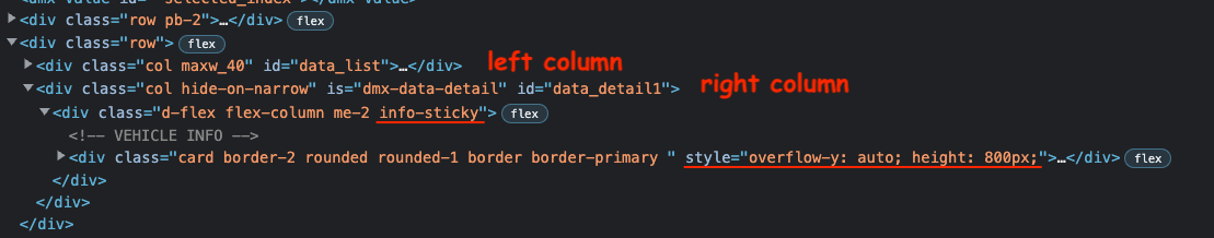
I only needed to add a class (see pic: info-sticky) to set the “sticky” CSS option, and then it scrolled nicely.
I also added a scrollbar inside my info area, because since it was “stuck” to the top, you couldn’t even scroll it down to see all the pictures. So with the simple Style hardcoded (underlined in pic) that makes a scrollbar in an 800px high area. Technically, I need to make that 800 be a formula based on the screen size, but for now its fine.