I am able to set element height but it only sets for the selected device for example if i set it for mobile it does not set the same for other devices. Is this expected ? I can see @media in the styles.css which seems to be setting the height differently for different devices.
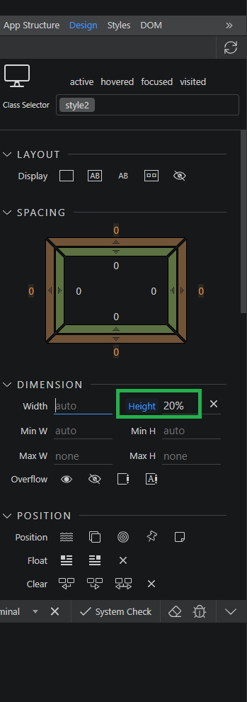
While designing elements say as a %, for example header should be 20% of total height , should we do this for every device or is there a way to do it for all devices? I’m a new user and I’m trying to understand how elements placing height etc work .
It all depends on what is your layout and where/how are you setting the height. Maybe explain more detailed what are you doing and what is your page layout.
Ok but what is your page layout? The height set in % is really tricky and it depends on what is the layout and where exactly is your element positioned.
Thanks 20vh has the advantage that the element’s container’s height can be auto and it will still work whereas height % does not work if the element’s container’s height is auto ( ithink width works in both cases) so i will use vh
I have one more question , if i select height as 20vh it only does that for the current device size , if i want it to work on phone i have to set it for phone too . Is this expected behaviour? Should i set it for all devices or should i edit the styles.css and remove the @media…
You could also add something like min-height:100px so that if the window was really small, the element will not shrink below 100px but will be 20% of vh the rest of the time