+1 for co-exist
Its a very cool feature but the tree functions works so well with longer more complex actions.
So best of both would be great.
+1 for co-exist
Its a very cool feature but the tree functions works so well with longer more complex actions.
So best of both would be great.
Actually it does have draggable canvas, you can simply drag around with the mouse as long as there are scroll areas. You can also zoom with ctrl+mouse (not yet on the Mac)
Also the drag and drop between actions has been greatly improved.
I see that some of you are using the actions view more as a code editor than as an over view with lots of long expressions.
Such long expressions can never fit in any flow, but the question is do you really need to see them all the time fully?
We will be improving the expressions display to use more shortened version of the expression that are also used in the visual data picker but we will be also introducing a title and description for each step that if entered will be used as a display content for the action flow block. So you can enter your own clear comment about what the action does.
Hi @George… thanks for your feedback on my comments.
The answer is yes, I always need to see those details… to debug something, I need to know exactly what it says, and having to give each statement a description of what it does just increases the workload.
I personally find the shorthand multi-coloured representations very confusing to read.
Hi Tom, this example shows 50 steps, but the actual steps doing something in your server side logic are 20 ![]() You are wasting so much space for comments each of them in a new step, i even see empty comment steps… That’s really not a code editor and the code view.
You are wasting so much space for comments each of them in a new step, i even see empty comment steps… That’s really not a code editor and the code view.
As George explained above, we are planning to add a description option for the new layout, where you can add a comment. For example - instead of entering 10 comment steps you can use none and enter “Insert orders in Database”, “Loop through stock”, “Get order items” - right in the block.
Hi Teodor, that’s great news. This will be very useful.
I certainly wouldn’t use so many comments if I were using the new flow designer - but not because the comments are unnecessary, but because the flow designer would make such an approach impractical.
I don’t think there’s anything wrong with using many lines of comments. I don’t think empty comments are a bad idea either, if they improve readability - obviously I’m using them instead of blank lines. Looking through some files in dmxConnectLib folder, there are many cases where comments take up most of the file contents. Eg this file of 26 lines has only 7 lines which are not spaces or comments:
My main point was that the comments feature in Wappler could be used in this way (if the user chooses such an approach), simply by enabling comments to be displayed as they are entered in the Comment Properties panel: with multiple lines, including spaces.
And that is exactly the difference, Server Connect UI != Code - it’s a visual interface for building the code and not actual code ![]()
Well our main concert is the user confusion, offering two views can be challenging to explain when to use which view. But on the other side it can be positioned the same as design and code view. So have the flow editor as default design view and an option to switch to the tree view which will be the code view.
Yes redesigning of the properties panel is on our todo list.
will improve that and also implement command+scroll for zoom on the mac just as ctrl+scroll on the pc.
Good points. Was already thinking how to improve library items integration and creation. Was also thinking to offer library items and other templates directly from the actions panel to drag from.
Yes we will be marking those actions as end actions, so that no steps can be added behind them.
well even if after the catch, the execution continues to the next action step behind the whole try/catch - so hence the connection line.
True, but this is a technical difference. You could say that about any ‘language’ - ie that it’s not the final machine code which will be executed. However, the logic, rules and thinking that might go into a server action could equally apply if you were using a traditional language - so I think the facility for commenting such ‘code’ should apply equally.
yes a switch statement with many cases is on our todo list.
this is interesting idea that we thought of some time now. It will be indeed great to have a test functionality and you can inspect the output step by step. However it might be only possible for nodejs (because of the web sockets support) due to technical limitations of the other platforms like php.
I think there is a very interesting debate here around what feels most intuitive for an individual to work with… a code versus a flow based representation.
Having created most of my app in Bubble before moving to Wappler, I’ve had experience of both.
Here are my thoughts:
A good analogy seems to be driving an automatic or manual car. One is less effort, but also gives less immediate control than the other.
We have a natural inclination towards one method or another… if you’ve never driven a manual car then an automatic seems the sensible choice… but if you are familiar with changing gear and enjoy the experience and control, then you will choose a manual car.
What I love about Wappler is that it has always given us that choice, and as someone who is very ccomfortable with creating and reading code, I will always want to use a toolset which gives me that option, along with tools which improve my productivity.
One of the biggest issues with Flow Designer right now seems to be the number of steps visible on the display without scrolling… the examples that @TomD and I have shown screenshots for have 3-4x fewer action steps on the screen in Flow Designer.
If you can find a way to bring the same amount of action steps on the screen as the Code View, that will make a big difference… there is a huge amount of empty screen real-estate in Flow Designer at the moment.
I would remove the bold text in each Flow Designer box which says what kind of operation it is (Set Value, Database Query etc), and just have the details visible, as the icon shows the type of action taking place.
My example shows these 3 vertical lines around the visible flow steps, and I have no idea what they are from as their start is not visible… can they be labelled in some way, or have a point you can hover over to see what they are, or be persistent at the top of the display in some way as you scroll through what is inside them?
We have to consider the human aspects of using a system like this… when our eyes and focus have to move around different parts of the screen and interpret things in different locations and colours, it puts a strain on us.
In the current Code View, all the detail is in one easily readable font, one line after the other. The detail in Flow View is in much smaller fonts and is incomplete, so we need much more focus to read it and then find a way to see the complete details…
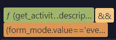
… and the shortened versions of expressions used in the data picker are not useful for real-world expressions and field names as they don’t show me what is being selected… here is a simple example from one of my apps:
dmx-show="(get_activity.data.activity.description.length() > 30) && (form_mode.value=='event')"
dmx-hide="
    ( (form_mode.value=='event') && (admission_free.value==0) && (add_to_waiting_list.value==0) && (total_price_is_zero.value==0) && (payment_methods.data.count() == 0) && (show_payment_details.value==1) ) ||
    ( (form_mode.value=='booking') && (stripe_not_working.value==1) )
    "
In conclusion, I just don’t see how the plans for Flow Designer are going to allow me to manage the complexity of my real-world designs or increase my productivity, and I urge you to have it as an addition rather than a replacement for the Code View we have today.
I have scanned through the comments of most people and at the risk of sounding (and intentionally being) facetious I must say the immense brainpower most people must have to focus and consume multiple lines/steps with one glance is incredible. How would seeing 10/15/20 lines at once benefit you unless you can compute all you see at once?
Most of us mere mortals treat this as a step function and read it from top to bottom. So we need to scroll a little bit more. Cannot think that is such a big deal.
But, I can see on a conditional step with lots of sub steps in the IF or ELSE you would have to scroll up to go to the condition step once you finished reading/working on either IF or FALSE and then view/work on the other. Besides that, I do not see a problem with viewing less steps, but gaining the visibility of your step flows.
Who multitasks when coding. Your eyes view details of one step/action and you have 1 keyboard and 1 mouse.
I would put forth that the new layout actually improves focus and therefor logic and code quality by letting you focus on what is important at that moment.

Make it possible to copy multiple blocks of code and move them between different Server Actions
For what it is worth, here is a video outlining my observation and major concerns
newflows
Brian,
You can just as easy collapse the flow blocks as you do in the tree view. So you can retain overview on where are you working.
When refreshing or loading new steps I see that everything gets expanded again, but will see if we can save the state so it remains as collapsed as it was.
It’s not about multi-tasking. It’s about moving back and forth between actions which is a looong scroll now, you’re just spending a lot more mental activity on actually finding what you need which makes it unusable for complex server actions (What I think it’s made for)
I do like the idea @Hyperbytes has of using the compact view as a “minimap” you get in front end view of most IDE’s and clicking on a certain section to scroll to it and view in the new view.
It’s appears to me it’s only a scrollable container, not a draggable canvas. Maybe the workflows I have are not big enough?
This is what I mean by draggable. I can grab by right-clicking and move the canvas with no scrollbars. Also using the mouse wheel I am able to zoom in/out.

n8n uses this type of canvas and allows for dragging objects anywhere on it and then dragging the connector between them.

I really hope the Wappler team doesn’t take away the toggle of switching views. If that happens I’ll have to pull a scalaris and stop updating Wappler. I have a very strong opinion one should have a choice here, please don’t ruin Wappler for me. Let everyone have what they want…