Hi everyone, back for a quick and hopefully easy solution to this functionality I’d like.
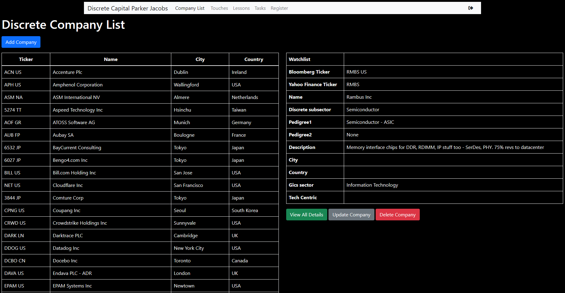
In the screenshot above, on the left-hand side I’m planning on having a long list of companies. This list will eventually reach around 500 companies so it will be a very lengthy page. When you select a company the table on the right pops up displaying a more in-depth view of that companies’ details.
Unfortunately, right now when you select a company far down on the list you need to scroll all the way back up to view the details. Is there a way to make it so the responsive table pops up where the user currently is on the list, or better yet the table on the right remains static on the screen while you can scroll the list on the left.
Any responses or articles to help would be appreciated. Thanks again everyone.
In that case, another option can be to display the list of companies in a container in the top half of the page with pagination and a search box and then display the company details at the bottom when clicked on a company name.
again, that works, but is the functionality that I’m talking about nonexistent? It would just be so nice if the right side of the screen was static while the left wasn’t.
@guptast has the right idea. A paged query with pagination and a search field is the way to go if you don’t want to use a modal or offCanvas. Actually, even with a modal or offanvas I would still used a paged query with pagination at very minimum.
The existing APIs can be converted to Paged Records under the Query Type options. So, you can skip the initial part of the How-To docs and begin from the Server Connect section.
In the past I have used affix plugin which was baked into previous versions of bootstrap to achive fixing the right hand column to the top of the page while you keep scrolling the left hand column:
Not sure if it is included in recent versions of Bootstrap.
I can send you more information should this be a solution for you. Problem is a work around for mobile should you need to have the site responsive for smaller devices and not only desktop.