Responsive Table not Responding Correctly

Hoping for a bit of help from a bootstrap/css wizard…I’m thinking it must be something simple but I just can’t see it!

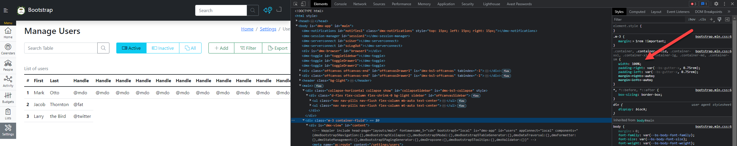
I have a page with a sidebar, all works fine until I add a responsive table. With a table on the page the table doesn’t become responsive until after it’s off the side of the page, taking the rest of the content with it:

image
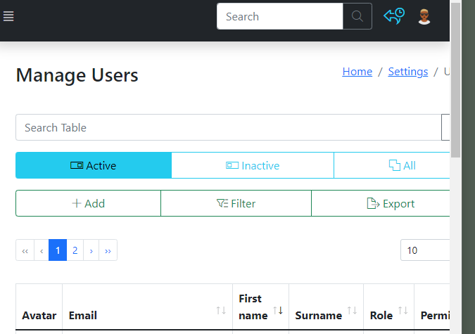
The same page without the table works fine, different pages without the table work fine, I’ve copied in a generic table from the bootstrap docs and it does the same thing so it doesn’t seem to be anything specific to the table setup.

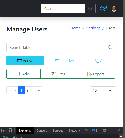
The page displays fine on full screen but the table doesn’t switch to responsive and show the overflow until it’s partially off the screen. It’s like the trigger for the responsive table overflow is out of position with the rest of the page.

I have some custom css (mostly from the bootstrap docs sidebar):

body {
  height: 100vh;
  min-height: -webkit-fill-available;
}
main {
  display: -webkit-box;
  display: -ms-flexbox;
  display: flex;
  -ms-flex-wrap: nowrap;
      flex-wrap: nowrap;
  min-height: calc(100% - 72px);
  overflow-x: auto;
  overflow-y: hidden;
 }
.offcanvas {
    margin-top: 72px;
}
.sidebar {
  min-height: -webkit-fill-available;
  width: 3.5rem;
}
.drawer-active {
  background-color: var(--bs-warning); 
  border-left: none;
}
.offcanvas-end.sidebar-hide {
width: 100%;
}
.offcanvas-end {
  width: calc(100% - 3.5rem);
  border-width: 5px;
  border-color: var(--bs-dark); 
}
.nav-link.sidebar-nav-link {
 padding: 6.5px 2px 6.5px 2px;
   font-size:0.7rem;
   width: 3.5rem;
   color: var(--bs-dark);
}
.nav-badge {
  font-size:0.6rem;
}
.nav-divider {
  background-color: var(--bs-dark);
  color: var(--bs-warning);
   font-size:0.7rem;
}
.nav-link.sidebar-nav-link.active {
  background-color: var(--bs-secondary);
}
.nav-icon {
  padding: 0px 10px 0px 10px;
    font-size:1.4rem;
    margin-bottom: 0.2rem;
    vertical-align: -.125em;
  pointer-events: none;
  fill: currentColor;    
}
.content {
  width: 100%;
  margin: 30px;
}
.avatar {
  height: 36px;
  width: 36px;
}
.circle-icon {
    background: var(--bs-secondary);
    color: var(--bs-warning);
    padding:20px;
    border-radius: 50%;
    font-size:2rem;
}
.dropdown-toggle { outline: 0; }

.nav-flush .nav-link {
  border-radius: 0;
}
.fw-semibold { font-weight: 600; }
.lh-tight { line-height: 1.25; }
a.nav-link.active.py-3.border-bottom {
}


}

Hoping someone can put me out of my misery!

Do you have a live link to your page, where we can check your layout?

I’ve just uploaded to a testing site (gotta love plesk’s dummy domain names!), Teodor’s had a look but isn’t at a computer for the near future.

This page: https://confident-hellman.51-195-150-71.plesk.page/testtable is just a table without the layout and the responsive table works as I’d expect (i.e. you get the horizontal scroll before the table leaves the screen).

This page: https://confident-hellman.51-195-150-71.plesk.page/settings/users includes the layout, nav/sidebar etc and the table goes off the screen before it becomes responsive (it does still show the horizontal scroll but not until quite a bit after the table has left the page):

The layout and content seem to work fine without the table in it: https://confident-hellman.51-195-150-71.plesk.page/settings

So something in the custom css seems to be stopping the table-responsive wrapper element from triggering responsiveness correctly…but I can’t see what!

If anyone has a few minutes and is able to take a look I’d be very grateful!

I just had a quick look at this page and from a little observation it looks like your page structure is the issue you have a container with the class m-3 which is instantly throwing a lot of things off in your page

Then the left side menu on big devices is outside of a container or row etc and is not of position fixed so this also throws the page off the table is noticeable because it uses 100% width, I expect you may have issues with more components like this too but maybe wrong

Taking the page that has the sidebar, have a look at the width of the table container:

The effect of this is that the container bleeds past the browser’s viewing window. However, the table is still not showing a horizontal scroll bar because it still fits neatly inside the container.

Try using a flex container instead and play around with the widths.

Thanks both. I’ve made changes and it works as expected now. The table being 100% width by default was the reason the table spilled over and this highlighted the problem, but it wasn’t the problem itself.

I’ve put the whole of the ‘main’ section into a flex container and used CSS for the sidebar (instead of collapse). Then added separate container for the content.

Many thanks for your pointers!!

3 Likes