Responsive heading Title

Hi all and happy new year to all Wappler users!

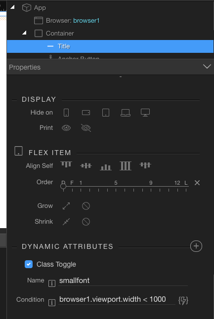
Just a basic question: Is it possible within Wappler to make a texte reponsiveso so it get smaller on smaller screen? For example I have a Title with heading 1 but I would like to make it heading 4 on small screens but actually if I change the heading size in App Structure all media screens inherit that size.

Only way I got this working is transfoming the title into paragraph so then I can change size for different screen sizes.

Thank you for helping :slight_smile:

Hi Jacques,

You could use a class toggle along with the browser component like this…

In your css setup a new class with the parameters you need:

.smallfont {
  font-size: 50%;
}

And then setup your title like this:

Just pick your breakpoint and perhaps use ternary syntax if you have multiple options. Not as simple as other media query stuff, but it will work.

Thank you for your suggestion mebeingken!

Interesting, I will give this a try.

Actually what I did and work pretty much as I want is I gave an overall heading 3 and in design panl I put different text sizes for PC and mobile screens and it is pretty much close to what I need even if that is not like a fully responsive text.

So I might try with your solution to see the difference.

Thank you again I really appraciate!

You could also consider @media max-width as below:

}
@media only screen and (max-width : 1200px) {
.SomeClassName {
font-size: 95px;
}
}
@media only screen and (max-width : 1024px) {
.SomeClassName {
font-size: 80px;
}
}

Etc. Etc.

There are also options in Bootstrap 4 to get responsive font sizes but needs recompiling of Bootstrap, see:

Thank you Dave! Indeed anoher interesting solution.

1 Like

I’m a huge fan of having css open for editing on one monitor and the design on the second monitor, then watching all my changes take place. Would be great to see more Visual Studio type auto prompting in Wappler as it makes writing css so easy, plus discovering so many other possibilities all the time as wondering hmmm what does that do then? :slight_smile:

1 Like

I agree with you Dave, personnaly I use both design panel and css editing a lot and I like to play around with things that I am not sure what they do or what affect they might have on elements :slight_smile:

1 Like

Another css option you could experiment with - slightly simpler not needing media queries, eg:

.banner h1 {
  font-size: 5.2vw;
}

There are more sophisticated ways to use the units, using calculations for the values.

Another reason to have Gulp installed as shown in https://www.youtube.com/watch?v=85tt7KwUMLo

2 Likes

Thank you very much George! This look interesting too I will check it out!