Being relatively new to Wappler (and in part web development), I’m curious if I am missing something when it comes to designing responsive websites in Wappler. I have attempted to use the documentation but couldn’t really find anything that fit what I was looking for.
I am first using the all screens design icon, throwing in my background images, containers etc. I then move to to mobile to ensure it is looking right, adjust the mobile version and move on to different screens. However, when I adjust different screens it ends up affecting the mobile versions and other screens. My understanding from the documentation is that anything I do on each of these screens would be independent of one another, is that case or did I miss interpret something fundamental in Wappler?
Does anyone have a tutorial on best practices for responsive design using Wappler? Would love to see all the features being utilized to get a better sense of what I’m doing wrong. If anyone has any tips it would be super handy as well.
Hello,
Not sure if you are already familiar with Bootstrap 4, but it is a mobile-first framework.
The classes applied to a smaller screen size/break point get inherited by the larger ones.
If i understand you right, you are using the icon, which adds the classes and styles to the smaller screen sizes (and as noted above they get inherited by the bigger ones).
So if you add a column size of 6, it will be added as col-6 which will make the column's width 6 for ALL screen sizes unless changed in some of the upper break points ant this is valid for align classes, etc.
So if you want to make make a column 100% wide for smallest screens and then 10 for small, 8 for medium, 6 for large and 4 for extra large the steps are:
Another example:
If you just set the md-view column width to 6 then the column will be 100 wide up until medium size, and then 50% wide for medium and up devices
Thanks for the advice, sorry I wasn’t clear. That’s what I am attempting to practice. Are you suggestion instead of first using the all screens button on the design window I first start with the mobile screen and move my way up to the all screen selection?
Thanks for your insight, that makes sense for columns, but what about containers. Some of the templates I have been working with in Wappler won’t have columns on those objects just containers.
So for each container I have been adjusting them using the width, height and padding for a given screen size and that’s where I am running into trouble. Right now I am using one of the navbar templates, and adjusting it as necessary in each screen but then I am running into issues when changing screens.
I don’t know bootstrap 4 all that well, but if there are classes for columns are there classes for containers as well? I think I’m a little confused as I was expecting Wappler to take care of that for me when I edited certain features without having to know the ins and outs of bootstrap 4. But it seems like that isn’t the case?
@Teodor I think I get what you are saying when it comes to the bootstrap 4 classes. But as soon as I try to update the padding/margins in the design menu a new style is created that affects each of the other screens.
This is where my confusion is still coming in.
A) Can I use bootstrap classes and custom classes using the Wappler design window?
B) Should I just be focusing on using bootstrap only classes to do exactly what I need and not use the Wappler design window?
C) Or am I following the right methodology (bootstrap + design window) but it sounds like I’m just doing something wrong overall?
I should also note, as soon as I update the ‘Type’ on the container properties (sm, md, lg, xl, etc) it changes for all screens. It seems I can’t have independently chosen classes for a given screen size.
With the above, I wanted to get a better understanding of what Wappler is doing so I just created a new file and added a 'Brand Menu Social' navigation bar. I then attempted to break down what each of the components are but don't see any difference between the screens and their respective components in the app structure. Each column in the navbar is 'col' each row is 'row', etc. What is the reasoning to not use the columns as you suggested in your first response? Is the only reason they are actually responsive is that everything is set to Auto? What happens if I were to change the Navbar Collapse to a width of 500px? Is that bad web design?
Using the above 'Brand Menu Social' navigation bar from the Wappler template I would like to see where I might be going wrong.
For argument's sake, let's say I want to put the menu 2/3 of the way across the screen, instead of halfway, on the laptop screen only (the 4th from the left screen). To do this I first need to attach a style file. Once done I select the Navbar Nav item and go to the design option. I then push the left margin to 300 px. This gives me the desired result in the laptop screen, but as soon as I switch to the monitor screen, or the all screens selection that menu has been pushed. As I switch between these components I can see they have the same Class Selector (style52) as the laptop screen does but I don't want it to have that selection. What am I doing wrong here in Wappler?
I hope that makes sense. I tried to come up with some concrete examples that could be followed along with.
I’m sorry I don’t really understand what are you doing or what are you trying to explain with your example.
A style added to a lower screen size gets inherited by the larger ones. The style will be the same for all larger screens unless you specify something else for them.
Of course you apply the same class for all sizes … It’s the styles applied to this class per different media queries that are different.
But the problem is as soon as you change one of the larger ones, it doesn't actually work because it's inherited a style by the lower ones. To make things worse when the style is removed from the larger one, it also removes the smaller screen's style. Is there a way to disassociate the two screens so they don't inherit those styles?
That being said though, are there any other videos contributors have added that go into more detail? I find the documentation to be rather lacking on the responsive side of things when using Wappler.
You lost me here.
Add a style for a screen per specific class.
Open the CSS file and see the media query created. Probably this will make things more clear for you…
Adjust the margin - A new style is created (Wappler named it style55)
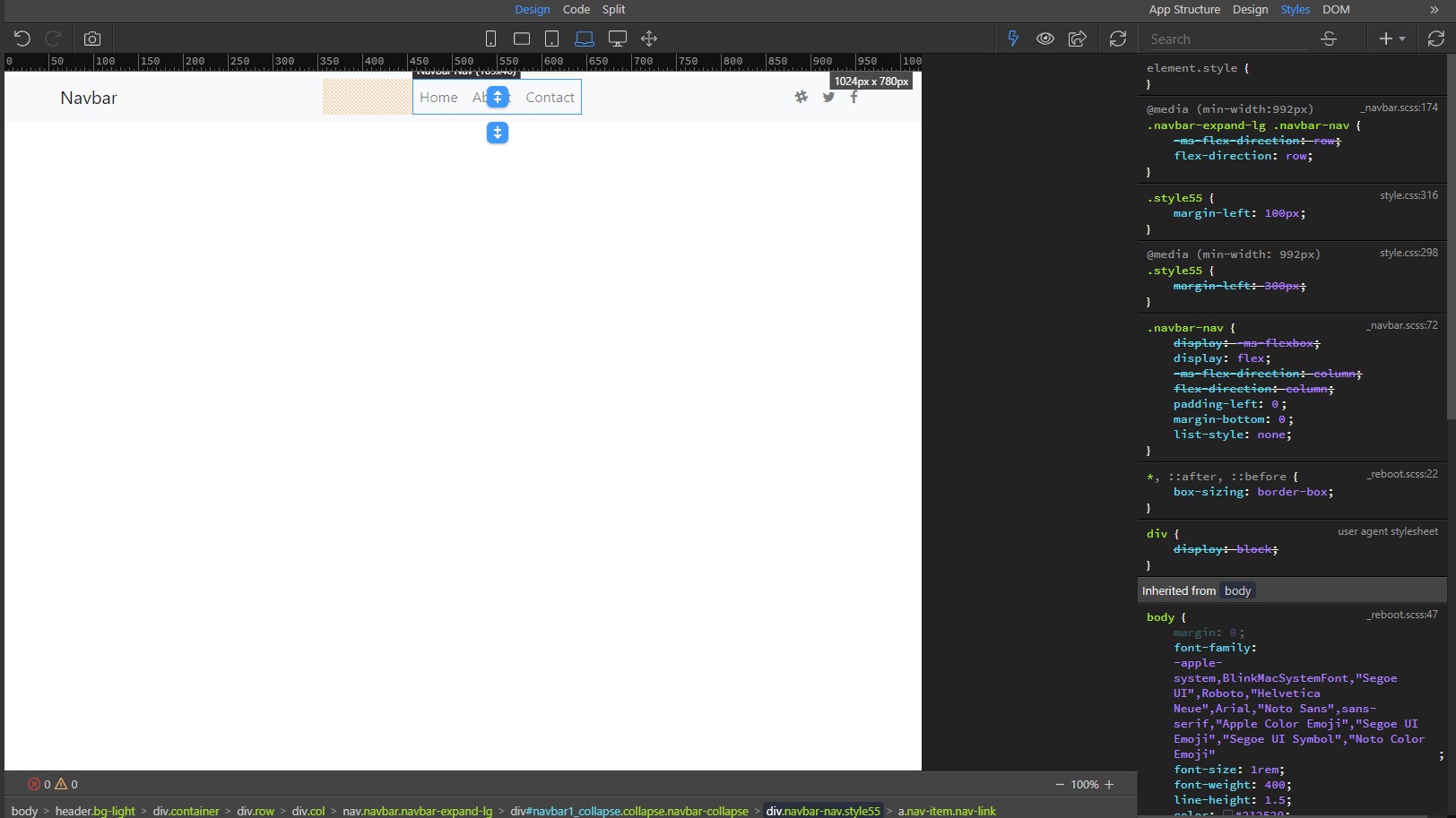
I go into the CSS file under styles and no media query has been created. What I see is this:
.style55 {margin-left: 100px;}
Now I click the laptop screen adjust the margin to 300px. I go into the CSS file and I see this:
@media (min-width: 992px) .style55 {margin-left: 300px;}
But the margin-left: 300px is crossed out and the visual is displaying the phone screen not the laptop screen
That's by design in CSS (which means Cascading Style Sheet)
So if you apply two rules that collide to the same element, it will choose the last one that was declared.
Move your media queries at the bottom of your CSS file to fix your issue.
Also:
You can just add your own class with a more meaningful name than that (as explained in the docs I sent you).
I think you might find this approach useful to being with. Once you understand how the responsive features work using the App Structure panel, then you could consider using the Design panel. I suspect you may be over-complicating things and confusing yourself, and perhaps using custom css with the Design panel unnecessarily. I would also suggest using split view - again to gain more understanding of what is happening and how the classes are added etc.
@TomD Do you happen to have any suggested resources to pass on that might provide more insight into the bootstrap only classes/design? I can easily google, but if you have any you’d recommend I’d love to hear them.
Also if there happens to be any more videos on responsiveness using Wappler I would be very much interested in seeing that. I honestly don’t think it’s tough but I imagine it will click when explained a different way as the current resources just aren’t doing the trick.
Thanks Teodor. I get what your saying I’m just not sure how to use the tool to do what I want as following the documentation just hasn’t worked for me.
I’m coming from Bubble.io where there is a ton of documentation, videos, and courses people have built to teach you how to use the tool. It seems like Wappler just isn’t quite as established on the teaching side and it is expected you have a lot more knowledge than I currently have to be able to utilize the tool effectively right away.
If there happens to be any videos out there of responsive design that would be helpful. I’m more of a visual learner as I find documentation (generally) assumes you know more than you do.
Feel free to ignore otherwise. Thanks for your help.
There is obviously a huge amount of information available online. The official Bootstrap docs are very good. Or you could try the w3schools. You can find any page created with Bootstrap and use the browser developer tools to examine the code. There are quick references like this. Or you might prefer to find some YouTube videos.
I don't have any specific recommendations. Just playing around with Wappler might be as helpful as anything else, assuming you have a basic understanding of CSS and Bootstrap classes.
 icon, which adds the classes and styles to the smaller screen sizes (and as noted above they get inherited by the bigger ones).