The site looks great, well done, Reinhardt. I checked the site from Melbourne, Australia on a laptop and it loaded without any noticeable lag. The navigation throughout the site is also very responsive.
My only feedback at this stage is to make some minor tweaks in the UI, if these are within the design guidelines.
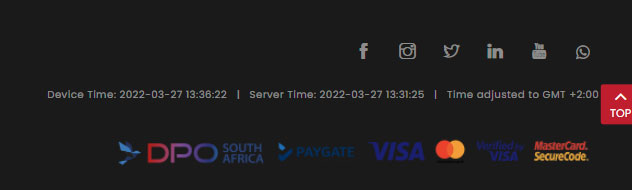
- Icon sizes for Facebook and chat are very small and can be easily missed.
- There’s an empty space between VISA card and device time rows. Perhaps some of the rows in the footer section can be displayed on a single row on larger device sizes and wrapped to multiple rows on smaller devices.