Here is some samples of what I have to replicate.
Check this comment:
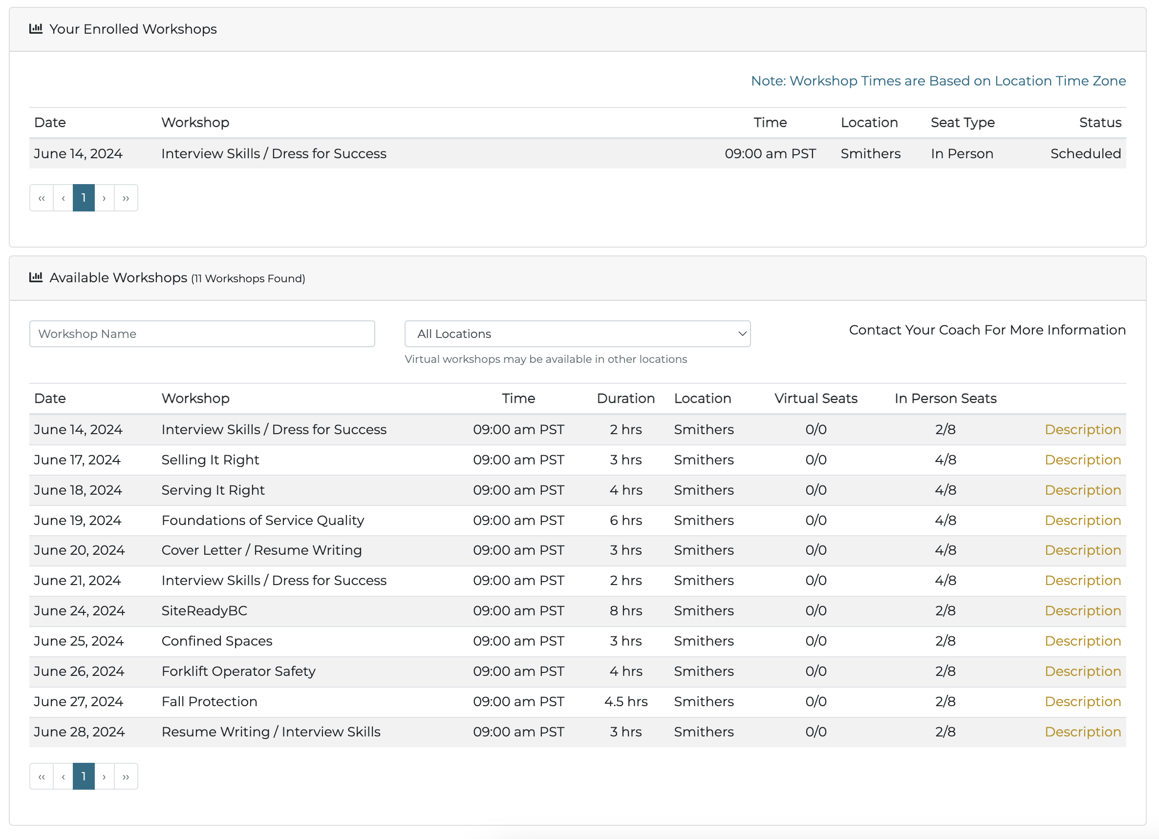
Thanks Ken, I am exploring the one project option. How would you display a table like this on mobile?
There are two ways.
Either use row>column structure instead of table tr>td and adjust the layout (col size) per screen size, or hide the table on mobile and show some other structure for mobile - such as list group.
2 Likes
Teodor covered the table stuff, but I do have another opinion on what should actually be shown in the table, which ultimately only you can answer.
When designing a page, I think it is important to be sharply focused on its purpose. Often with a table it is to find something, and so as developers we have to look for the best way to help the user find the entity (in your case, a workshop.)
You are currently utilizing two methods, a filter, and displaying parameters of the workshop), and perhaps a third (sorting the table.) I'm guessing there is an opportunity to display fewer parameters.
For example, do users really choose a workshop based on the Time and Duration? If so, maybe that should be a filter, but if not, it should be removed.
For seats available, perhaps that is also a filter?
A filter as a dynamic off canvas is a nice way to go...a single filter icon that opens a side panel, let's the user make their selections, and then gets out of the way to see the results.
And you have another component that could be used, a collapse for each row. If you are on the fence about whether or not all of these parameters need to be shown, maybe show less and use a tap on the row can expand to show more. In your example, maybe that includes the Description.
Like I said, only you can answer these questions, I'm just pointing out that the question that comes before "how do I make my table work in mobile", is, "What does the user need to see in order to select a workshop".
THEN, you can decide how to best display.
Oh, and one more thing...wouldn't this be more inviting in a card format? Maybe introduce a graphic for the workshop? Turn the Seats into badges with colors that visual indicate availability? Clock icon showing the duration?
I know, that's a lot of ideation, but again the developer is there to make sure easier and pleasant for the user, not give them a better spreadsheet. 
1 Like
Thanks again, Ken. You have convinced me to go the one project route. Even though I will have to add some mobile only pages at least I won't have to redo all those server connects.
Can you confirm that progressier can still be used to create the PWA on a hybrid project? Does it detect device or does it detect screen width?
Hybrid project? You use progressier with a standard Wappler web app.
Yes, by hybrid I mean built for desktop and mobile devices in one project.
You'll be fine with Progressier.
1 Like
For tables, try something like this
<style>
  @media(max-width: 760px) {
    thead {
      display: none;
    }

    tr,
    td {
      display: block;
    }

    tr {
      margin-bottom: 2em;
    }

    td:nth-child(-n+2) {
      font-weight: bold;
    }
  }
</style>

<div class="container">
  <div class="row">
    <div class="col">
      <div class="table-responsive">
        <table class="table">
          <thead>
            <tr>
              <th>First</th>
              <th>Last</th>
              <th>Handle</th>
              <th>Content</th>
              <th>Content</th>
              <th>Content</th>
            </tr>
          </thead>
          <tbody>
            <tr>
              <td>Mark</td>
              <td>Otto</td>
              <td>@mdo</td>
              <td>fourth content</td>
              <td>fifth content</td>
              <td>sixth content</td>
            </tr>
            <tr>
              <td>Jacob</td>
              <td>Thornton</td>
              <td>@fat</td>
              <td>fourth content</td>
              <td>fifth content</td>
              <td>sixth content</td>
            </tr>
            <tr>
              <td>Larry</td>
              <td>the Bird</td>
              <td>@twitter</td>
              <td>fourth content</td>
              <td>fifth content</td>
              <td>sixth content</td>
            </tr>
          </tbody>
        </table>
      </div>
    </div>
  </div>
</div>
Having said that, this is tabular data and as such the table element must be used for accessibility purposes.
@brad you can try:
- set the main table to responsive-always
- set all the columns of your main table (inside the green" mobile area) to texy-nowrap
- then the user will just have to swipe right with the finger to see the rest columns
- you can add a dropdown list and list there a link for all the the other contents.
By clicking a dropdown item, the specific content will open in a full-screnn modal
Now that I saw where it goes, it would be better to use an offCanvas-lg instead of a modal to open the rest of contents. This way you can show it as you have it on large+ devices and turn it in an offCanvas in small devices, fully responsive and easier to maintain.
Unfortunately off canvas is supported in bs4 and I am kind of scared to update it to bs5. So I may be stuck with modals.
OK, I hear you...
But by using the modal path is going to change your layout...
(bs4...  )
)
Please take a look at that (bs4 offcanvas):
https://www.codeply.com/p?starter=Bootstrap&ex=hB3cuJ3rj4
Thanks Tasos, I will see if I can make that work. It would certainly be more ideal to use offCanvas.
I'm glad Ken talked me into making this project more mobile friendly rather than build a seperate mobile site. I am making progress with a little creative use of the hide based on device width tools in Wappler.
I'm learning a lot.
Before I start adding more modals, I am going to back up the site and then try and convert to BS5. It should work alright, just not sure how current modals will convert.
2 Likes
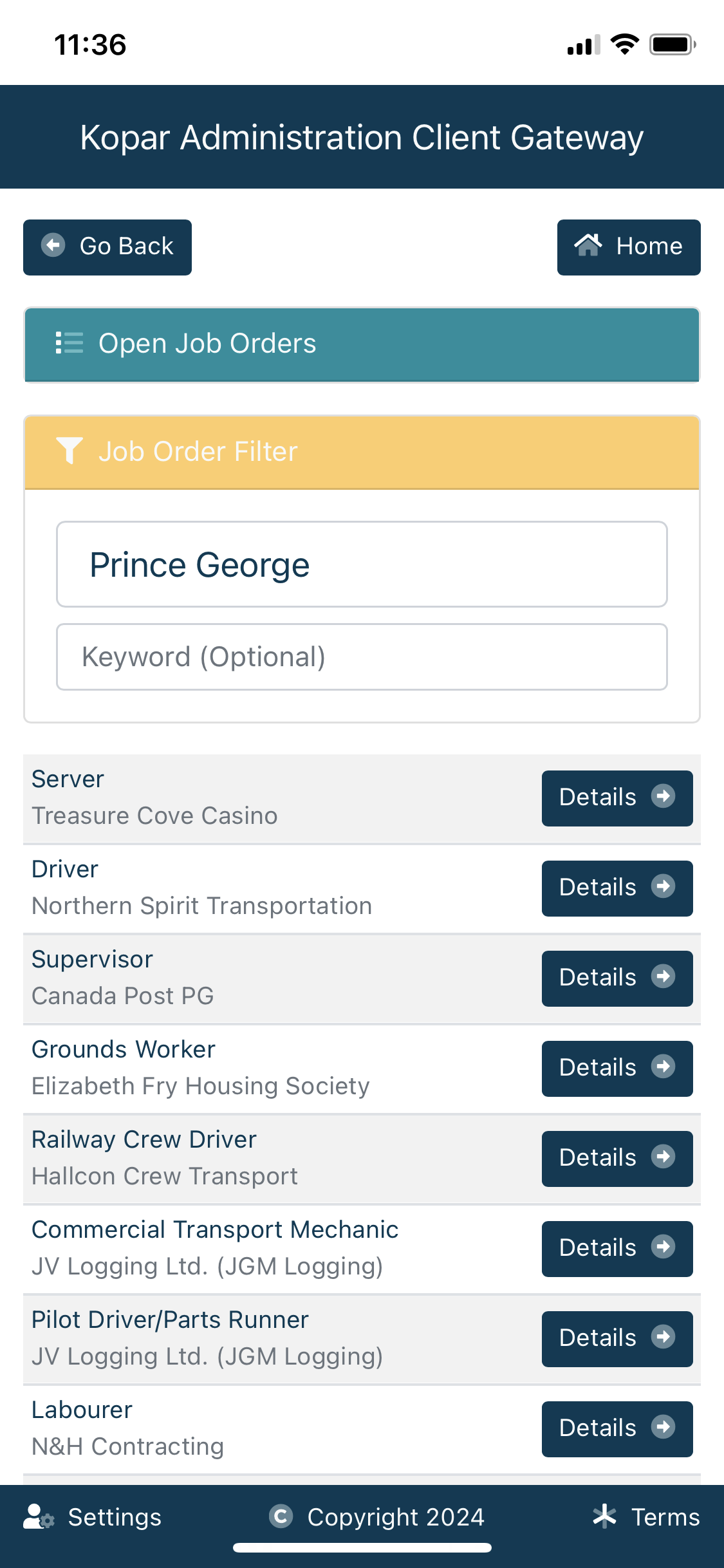
This looks fantastic! Is that BS5 with custom styles?
That's it Uma. Thanks
2 Likes
Ken,
So will Progressier turn my normal web-based app into a mobile app I can publish in the app stores?
Thanks
Richie
Hi Richie,
The short answer, and the long answer for most people, is No. There are options like PWA Builder that you can look at, although it is complicated at best. I personally have zero interest in being in the app stores having dealt with them for a couple years, so I have not tried PWA Builder.
—Ken
2 Likes