I like the simplicity. One question though: What happens to the insert after/before toggle? Have you already an alternative for that. You originally mentioned, that the insert position is weird and you need a more logical place for it.
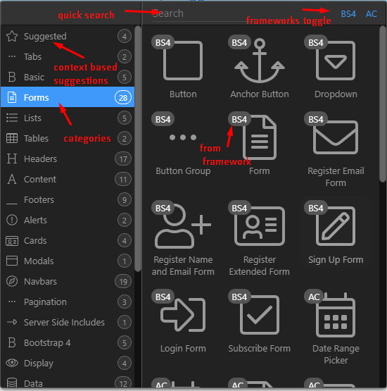
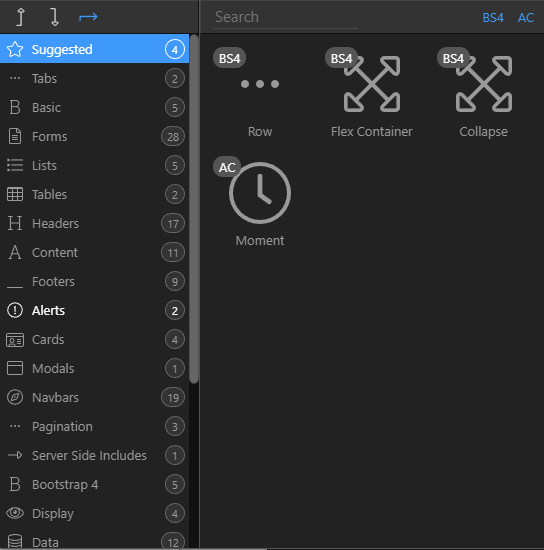
This is very good. Superb suggestion from @jowhiskey. I think it will really help navigation through the elements panel very efficient and more intuitive. Finding what you want quickly and easily is key to any good program and you guys are putting a lot of innovative ideas to task. This looks like it effectively gives you three ways to find what you want, and more importantly, the categories are always in view. This is very well implemented!
This will certainly raise the bar on accessibility for Wappler and you guys are really perfecting the program with changes like these.
Posts like this one where you are asking for feedback should be stickied or something in the forum so people are sure to see it. It will keep it front and center until you hear what you need, and it will also indicate that it is an important post that people should be looking at.
I too think it looks like it’s going to be a big improvement. I usually use the search facility to select components, but a disadvantage of this is that I overlook some of the available options and am sometimes (pleasantly) surprised to find some option I didn’t know about. This new design will be helpful in learning more about the many options.
Something your screenshot does demonstrate is a general issue with Wappler - the need for a lot of scrolling. To select something visually from the options in the proposed insert panel, it may be necessary to scroll in both panels; if you don’t quite know what you’re looking for, this could result in a lot of scrolling backwards and forwards. Would it be possible to increase the height of some of these panels - or include some options to do so (I realise you have to cater for a variety of screen resolutions etc.)? I appreciate it’s not feasible to reduce the need to scroll completely.
The right side of the Wappler interface would benefit even more from some options to reduce scrolling. It’s necessary to do a great deal of scrolling as you switch between the App Structure and Properties panels - then perhaps you need to apply a dynamic event and might have to scroll up and down to locate the required action etc…
Generally, I really like the Wappler UI - and look forward to it becoming even better.