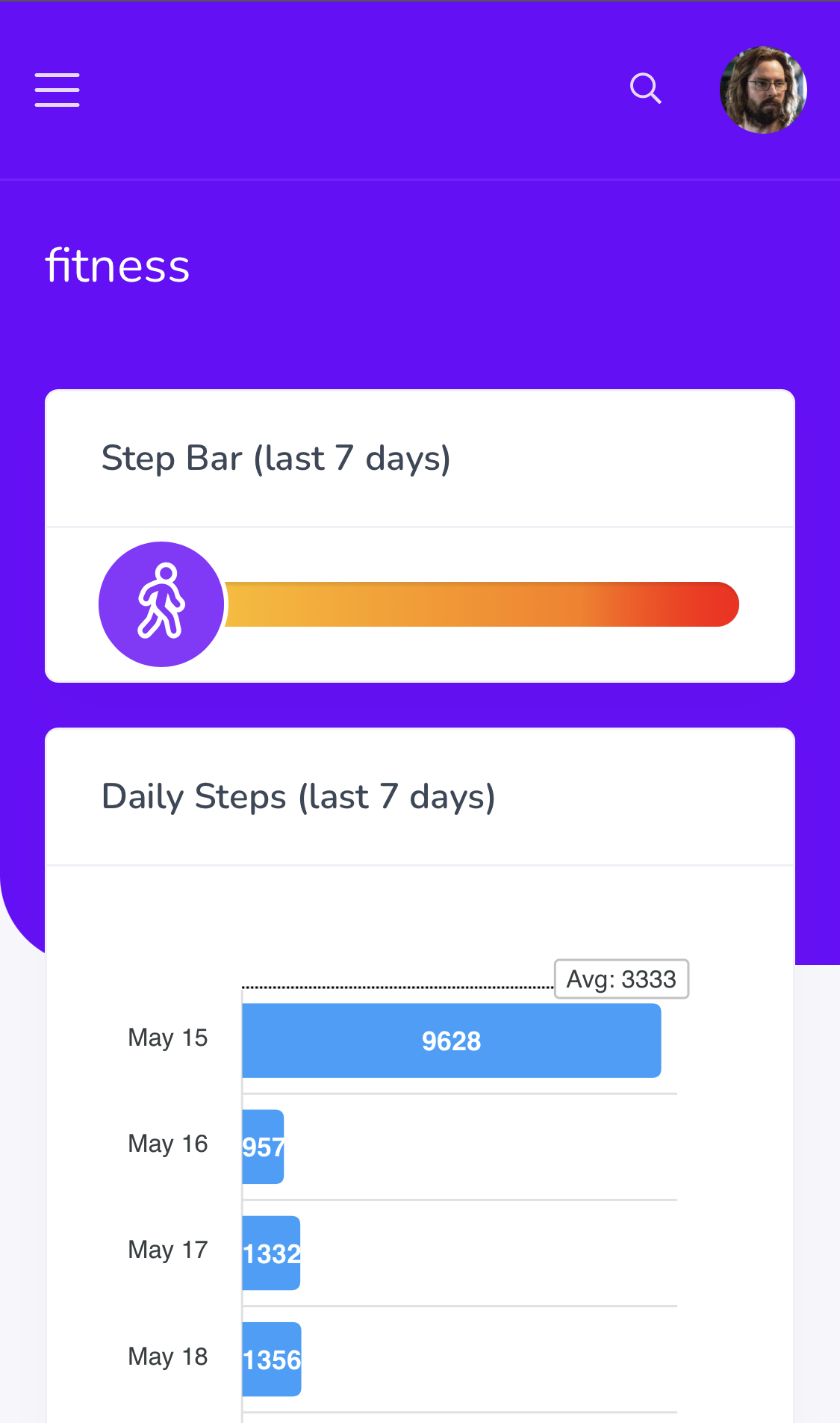
Anyone seen out there a library, codepen, css example that mimics this type of progress bar?
It’s the “burn bar” from the Apple Fitness+ app and I want something similar for an app.
I’m planning on using something similar to show to the user in realtime(sockets) their relative position in relation to others from a leaderboard data source.
What I’m actually looking is for the css for the circle(and the bar) that indicates the progress width.
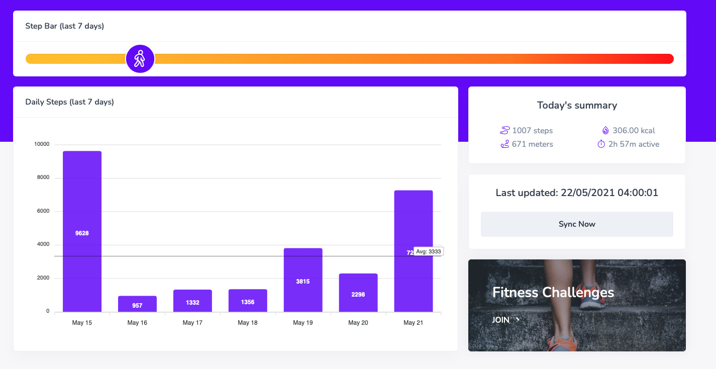
Interesting @JonL. May I ask how you gather the metrics, is it direct from the device in real-time? Looks like a nice Project to work on. Love interpretation of data in visual form. Something very pleasing about it.
User can choose. Device, wearables or apps. Depending on the integration chosen the data will be retrieved by scheduled jobs, manual sync or real-time.
It’s a new module I am developing within my main app(all things employee engagement) to try and keep our employees a bit more fit.
The idea is for them to enroll into fitness challenges and have some healthy competition individually, within or against other teams, business units, etc
Good bit of healthy (literally) competition is a great thing for morale! I'm terrible myself for it, Showcases, really should share more but sometimes difficult, but in saying that will you be Showcasing this once complete? @JonL
Always interested in using live data more client side and the way in which to incorporate it without being too overwhelming.
Yeah. Why not? Although it’s far from complete once I am happy with the UI and the feature set I will create some fake data for a demo account and showcase it.
It’s going to take some time though as this is just my pet project and progress on it is quite irregular.