This is a request based on a new feature in v2 beta1 (unless I hadn’t noticed it before).
There is a very new useful shortcut key: Alt+O, which opens the Projects panel. Not only is this much more convenient than moving the mouse to the bottom of the screen and clicking, but the panel is centred on the screen. Particularly with a very large monitor, this is much more convenient/comfortable than the panel appearing at the bottom left-hand corner of the screen. Database Query Builder for example has always been like this - and it certainly seems the right place for it to appear.
My request/suggestion: could other panels appear in the middle of the screen like this? Eg:
Dynamic Events and Attributes, Actions, Mail Body (in Server Connect) etc…
We will center the popup for all shortcut related actions, but when it is invoked from a picker icon, it seems to me more logical to bind its position to there as action initiator… don’t you agree?
I agree, except in the case of the projects panel. To me it seems squished into the corner. It would be fine to open in the middle just like clicking on the projects icon. Do we even need that projects icon anymore. We have two ways of opening the project panel right beside each other practically.
I actually wrote that first - thinking it would keep everybody happy - but then decided I wasn’t sure if there is any advantage in having the panels appear in different places. However I see what you mean and perhaps you’re right - but I wonder if anyone’s ever wished Database Query Builder was not centred.
You’re right - the new shortcut is great. I don’t think I’ll ever click the Project popup again. Having said that, I would love to see the last folder displayed rather then the top-level Projects folder; that’s the one folder I’ll never want to see open by default, because the projects will be saved in folders. So a few clicks are still required to switch between two or three projects. (I think it’s possible with the keyboard, but it takes about 10 key presses.)
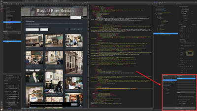
I think the Actions panel is rather squished in the corner too:
.. but this panel is an example of why centred panels would be easier to use (IMO). The position of this panel varies depending on what object is selected - so the mouse has to be moved to different positions. If it were centred, it would more consistent and easier to use.
Remembering the last folder would save lots of mouse clicks - it woud be really useful. As I mentioned before, I often want to refer to another project and sometimes switch between one or two repeatedly. At the moment, it requires too much mousework (but not for much longer ).

 ).
).