I’ve noticed in the new version of Wappler the Notifes have 2 colours in them.
Darker one for the icon and a lighter one for the text.
How can we create this magic?
Hi @gunnery
Nothing that you cannot do with CSS.
You can add similar style to any element, using the ::before and/or ::after pseudo elements with the appropriate CSS attributes added to them.
1 Like
OK but how do you get the icon into a different colour back ground as there would be no
and the css in the code is
position=“bottom” info-background=" #4586b6" info-color=" #fff" opacity=“1.0”
so a little unsure where to put it here, sorry to be a pain but unless we ask we never learn the magic
What rule is your CSS applied to exactly and where are you trying to achieve this look?
Thats in the html that Wappler puts there for the style of the notification.
I get the ::before ::after but what’s confusing me is how I could add the icon in there because in the html the code show on:click="notifies1.info(‘Loading’)
So where would I seperate it into 2 different colours.
Agin sorry to sound dumb, I know you’ve got heaps to do.
So your question is how to style the notification component, available in App Connect, so that it looks like the notification popups shown in Wappler UI?
correct, sorry to confused you.
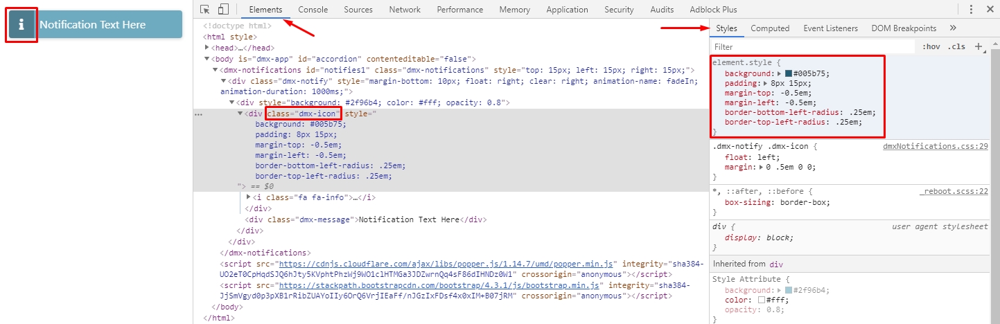
Then you can just inspect the notification CSS styles and discover that you need to add the following rules to the .dmx-notify .dmx-icon class:
.dmx-notify .dmx-icon {
    background: background: rgba(0, 0, 0, 0.3); /*Add whatever background color you like here*/
    padding: 8px 15px;
    margin-top: -0.5em;
    margin-left: -0.5em;
    border-bottom-left-radius: .25em;
    border-top-left-radius: .25em;
}
It’s really easy to build this directly using the browser dev tools:
2 Likes
you sir are a legend. Thank you very much 
1 Like