New position for left sidebar and reorganization of icons

I’ve been thinking on how to make the most of the space in the UI. Specially since @brad told me that the new approach for small monitors is going to be challenging.

So I want to propose this FR combining an idea from @mebeingken and @brad’s concern.

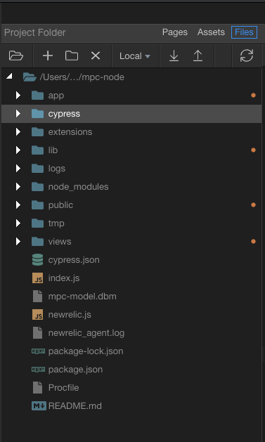
Right now the left sidebar is too bulky and takes up valuable space for those with small monitors.

I would like to propose to remove it entirely so people gain a few centimetres(Yes! Metric) of space.

image

These 4 ones could be removed entirely and sent to the native menu bar(if it’s going to be implemented) or to the actual 3 dots menu.

Why you may ask? Everything in the UI except for the 3 dots menu is related and helpful to the project you have opened currently. Except for these 4 icons and that is why they are actually separated from the rest on the sidebar.

As they do not help in anyway the current project get them out of the way. Add a keyboard shortcut for Settings and Projects if they don’t have one.

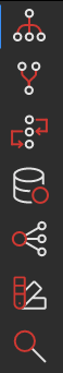
Now these 7 icons could be combined into less icons(5)

image

A good place for them could be here:

image

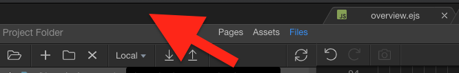
That space is blank and not utilized for anything. You could build a more minimalistic bar there with fewer icons.

I would combine Site Manager, Workflows and Routing in one single icon called “Project Explorer” or just “Explorer”

So there you would have Project Explorer, Git Manager, Database Manager, Theme Manager and Search

And use this bar to add there all the different sections for the “Project Explorer”

image

Pages, Workflows, Routes, Assets and Files with shortcuts for all of them(they currently have).

So now you don’t have the left sidebar and people have a bit more real estate to work on. The number of icons is simplified in a more natural way of working(you will normally work in the Project Explorer section) and you put to good use the blank space to the left of all the tabs.

The current left sidebar dissapears and the browser section becomes de facto the new left sidebar. I would extend the browser section to the top and add a new div below for the new 5 icons. That way it looks more integrated and separated from the tabs section.

I try to navigate Wappler using shortcuts as much as I can to acheive max productivity.
If shortcuts still work within the new nested-tab sort of structure, I don’t mind having this extra real eastate on my 14" screen.
Shortcuts do work right now to switch between pages & files, so I think it will with this UI too, but just mentioning explicitly.

Also, to add to this, an auto-focus search box in each tab (or just one context aware box outside, on the left of tab names?) with keyboard navigation to traverse results and open items in the list would be a huge productivity boost. :grin:
Something similar to one that is available on action pickers.

1 Like

I like it.

1 Like

I always use shortcuts for the options in this sidebar, so as long as these are not affected, I would be happy with this change.

However, for those who prefer to use a mouse, I think having to select Project Explorer in order to select Site Manager would be annoying (but if it encouraged them to use a mouse, perhaps it would be a good thing).

1 Like

It would be the same window. So once you click on Project Explorer you would see this section.

But with two more links besides Pages, Assets and Files. These are Workflows and Routes.

The rationale behind this is that if you think about it Pages, Assets, Files, Workflows and Routes are just special views/UI of files or folders.

While Database Manager, Git Manager, Theme Manager and Search are not views of folders/files but a separated functionality altogether.

You normally spend 90% of your time in the Project folder so why keep Workflows and Routes out of there if there are just special views of what you can already find in the Files view.

Where would the Server Connect button go? ‘Files’ and ‘Server Connect’ need to be upfront and easiest to get to. I never use the ‘Pages’ and ‘Assets’ panels.

I think that leaving the icons where they are leave more options for future expansion. But you’ve proved me wrong before. :wink:

It was renamed recently to Workflows.

image

So yes. It would be next to files but with the name of Workflows.

1 Like

I see what you mean. I think it would be fine as you suggest, though I wouldn’t have thought Workflows quite belongs in the same category as Files and Pages etc. In any case, if the UI is cleaner, it’s to everyone’s advantage, whether or not you choose to use these links.

1 Like

Noice! Now that a few heavy weights are on board @George for your consideration.
Sorry! We need to take advantage that you are working actively on the UI :slight_smile: