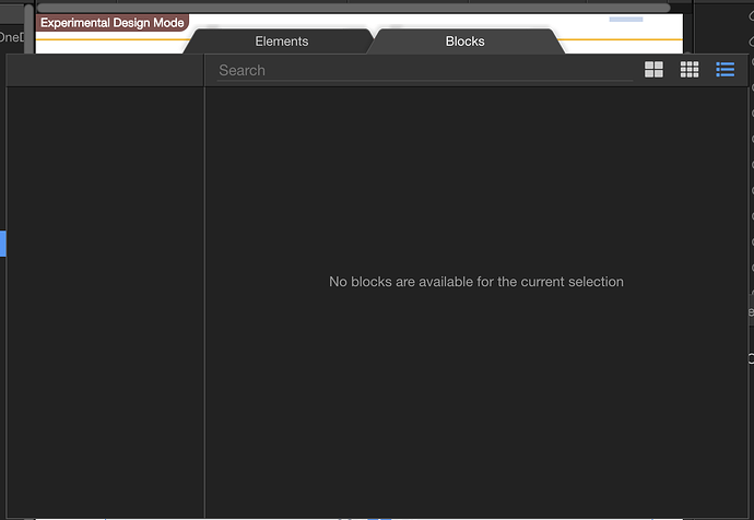
The new experimental design view is completely unusable. Way too many issues to even begin listing them. 
Hey Brad,
Keep in mind it’s a work in progress and we included it as a preview. Not all the features from the “old” design view are implemented yet, just the basics. For example, the text editing toolbar is not yet there, other things as well.
But please do share your thoughts.
I can’t seem to edit anything, double click try to click the pencil icon and nothing happens 
Brad always love your comments like “completely unusable” …
Maybe you can provide more details and don’t keep us guessing what you mean.
Btw the new design view is much smarter than you might thing so there will be a bit of getting use to it 
The only thing that does work is selecting elements. I realize it is experimental but I expected it to be at least functional. 
Likewise with Blocks, no matter where I try to insert one I get a message saying blocks are not allowed inside this element or something like that.
I’ll just turn off experimental features so that Wappler is usable again. 
Hopefully next update it will be further along.
They only seem to insert after a closed div.. No free range to decide where you want them ![]()
Have done the same for now so I can work. Have to play later when I have time.
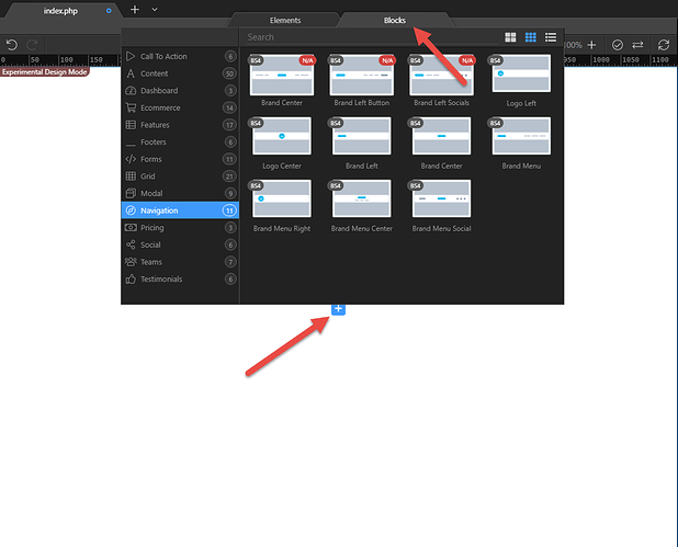
As blocks are top level collection of components you will see them on places where you can insert bootstrap containers, so primarily in the body.
The pencil icon does not do anything. It just closes as soon as I click it. Can’t even double click to edit… I’ve followed Brad in turning this off for now.
The pencil icon works for me OK. I’m using Windows 10.
Windows 10 here too Tom.
That’s strange, assuming we’re talking about the same icon:

Yes the same mate. Tried dragging it on to another monitor, no different. Tried restart of Wappler and Windows with no difference. Sad 
Closed panels, opened panels, tried Design, Code, and Split…
Ok as I said you have to “get” the new smarter functionality  first.
Each element can have an action icon in its center that runs when you click on or the element for second time after selecting it.
Texts elements go it to edit mode (text editing is a bit limited for now), images invoke the image picker dialog to change the image, videos to change the video etc. more actions are coming.
I think the new design view looks very promising. A potential concern with adding more functionality is that the UI will slow down and become more complicated to use. My impression so far is that design is very responsive - in fact more than before - and the design/code/app structure sync is very snappy.
I don’t know if you want issues reported at this stage, but here are a couple of minor issues:
PHP includes don’t display (when the include is viewed by itself - it’s OK in context, in the parent file).
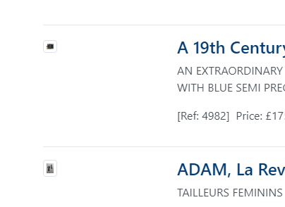
Dynamic images appeared at the wrong size (very small), but this seemed to fix itself after restarting or refreshing:
Similarly, large empty spaces appeared, in this case below an h4 tag:
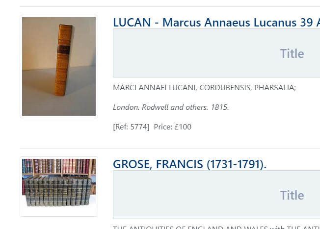
… but at one point this fixed itself, but now it’s back like this. This is an a repeat.
@brad, I have fiddled around with the EDM (Experimental Design Mode) and found it to be most useful. I realise that there is still a lot of work that has to be done and that the work flow is slightly (vastly) different to what we have been used to.
To get it up and running, I created a new Bootstrap document, clicked on the plus sign in the middle of the EDM and was able to get the functionality that I was looking for.
I’m happy to congratulate you, wappler. 

The new design view and blocks are still work in process, we hope to have a better working version next update. At this moment not all functionality is implemented in the design view and there will probably several bugs. Also there are still a lot of blocks not available in the current version, expect more in the upcoming update. You can still use the old design view by disabling the experimental features, we put these new features under the experimental so that you guys can experiment with it and we get valuable feedback from you.
Thanks Tom, yes please report all issues here.
As for your speed concerns later on - actually that is why we rebuild the design view from the ground up.
It is now supper fast and very extendable without any slowdowns!
It might now look much now on the outside, but the new implementation will give us so much more power. We have designed it to be easily extended natively by extra components and their own "design time" action controls.
You see that now for some simple controls like image, video and text editing - but more will be coming later on.
Like repeat region with its own design time navigation, html table visual editor, css grid editor, slideshow/swiper with its own inline editor and so on. All the the super speed and responsiveness that you are used to have in Wappler ![]()
This all sounds very exciting. Switching between the new and old design views, the new one is really fast.
Another minor issue I’ve just noticed. When a modal is added or selected, it’s not possible to select another part of the screen without making a selection in code view or app structure. This is how it was before - but there was a useful way to get round this - by pressing the Ctrl key when selecting a different object. This no longer works. It’s only a minor thing but the old feature was very useful.
Could this be reinstated - particularly as much emphasis is going into design view? (It still works if the experimental option is turned off.)
