Hello everyone,
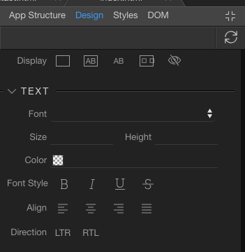
I’m making tests on the new design panel and when I change the text align for phone (xs):
It changes all screen sizes, not just the phone (xs)
Hello everyone,
I’m making tests on the new design panel and when I change the text align for phone (xs):
It changes all screen sizes, not just the phone (xs)
Yes that is because of the mobile first design. And the media queries which are based on bootstrap
So basically phone is always visible and other overrides come later on specified devices if any.
@George ,
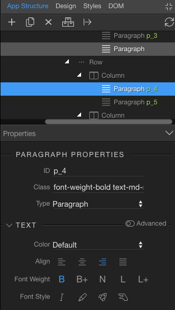
but after I select phone (xs) and change it, the other devices stay all like the phone xs even if they have other align selected.
Phone xs override everything
What are the media queries generated in your head tags?
Please paste the whole styles block
Got it.
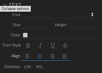
I had set to middle on full:
and was changing everything
Nop,
Something is not wright.
<style id="wappler-style">
    @media (min-width: 576px) {
      #p_1 {
        text-align: center
      }
      #p_2 {
        text-align: center
      }
      #p_3 {
        text-align: center
      }
      #p_4 {
        text-align: center
      }
    }
    @media (min-width: 768px) {
      #p_1 {
        text-align: right
      }
      #p_3 {
        text-align: left
      }
      #p_4 {
        text-align: right
      }
      #p_2 {
        text-align: left
      }
    }
    @media (min-width: 992px) {
      #p_3 {
        text-align: left
      }
      #p_4 {
        text-align: right
      }
      #h4_1 {
        text-align: left
      }
      #p_2 {
        text-align: left
      }
      #p_1 {
        text-align: right
      }
    }
    @media (min-width: 1200px) {
      #p_3 {
        text-align: left
      }
      #p_4 {
        text-align: right
      }
      #p_2 {
        text-align: left
      }
      #p_1 {
        text-align: right
      }
    }
    #h4_1 {
      text-align: center
    }
    #p_3 {
      text-align: center
    }
    #p_4 {
      text-align: center
    }
    #p_2 {
      text-align: center
    }
Well the following rules are below all the media queries and override them:
    #h4_1 {
      text-align: center
    }
    #p_3 {
      text-align: center
    }
    #p_4 {
      text-align: center
    }
    #p_2 {
      text-align: center
    }
I deleted everything and started again, this is the result:
 <style id="wappler-style">
    @media (min-width: 576px) {
      #p_2 {
        text-align: center
      }
      #p_3 {
        text-align: center
      }
      #p_4 {
        text-align: center
      }
      #p_1 {
        text-align: center
      }
    }
    #p_2 {
      text-align: center
    }
    @media (min-width: 768px) {
      #p_2 {
        text-align: left
      }
      #p_1 {
        text-align: right
      }
    }
    @media (min-width: 992px) {
      #p_2 {
        text-align: left
      }
    }
    @media (min-width: 1200px) {
      #p_2 {
        text-align: left
      }
    }
    #p_1 {
      text-align: center
    }
  </style></head>
What you have there will align everything center except your #p_2 elements
yap, but is Wappler that is doing automatically.
What exactly is Wappler doing automatically?
change the text align to center for all views after I put center on mobile xs
wappler.mov (3.5 MB)
So, you want to show that the #p_4 element does not get the styling for the tablet (and up) device?
Are you sure some other rule is not overriding the style?
@Teodor
can you replicate this? Is this a bug?
I am asking you a question in my last post. Can you answer it please, as I am not sure I understand what your issue is? 
you want to show that the #p_4 element does not get the styling for the tablet (and up) device?
Yes
Are you sure some other rule is not overriding the style?
There is no other rule overriding the style.
So what if you start with a new page, and try to do this on a random element?
What is the styles tag and its content being generated?
Ok now I got it.
It only worked if I was on the App Structure tab. On the Design tab, is not working properly, at least on this page.
What do you mean by:
These are 2 different panels with 2 different purposes.