Thanks for all your feedback ![]() We've simplified and improved the design in the latest update, make sure to check it
We've simplified and improved the design in the latest update, make sure to check it
We got rid of the boxed design, based on users feedback.
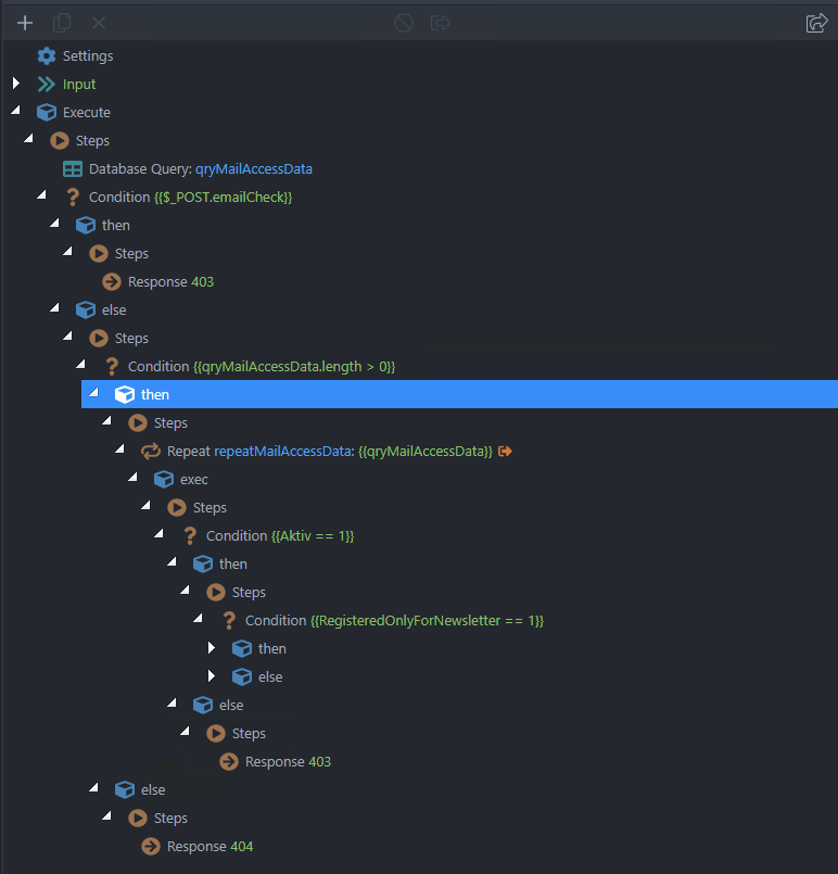
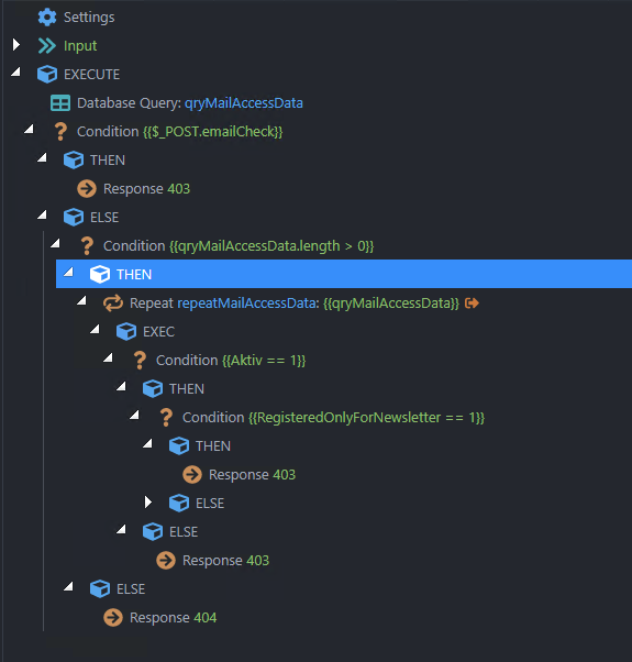
We got rid of all steps nodes in the tree. Also added a left border for the selected steps there for easier navigation.
Before:
After:
We styled and optimized the arrows and other icons in the tree.
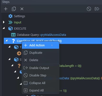
We added new options in the context menu (@sid) , such as: duplicate, delete, enable and disable steps and output, collapse and expand all child nodes:
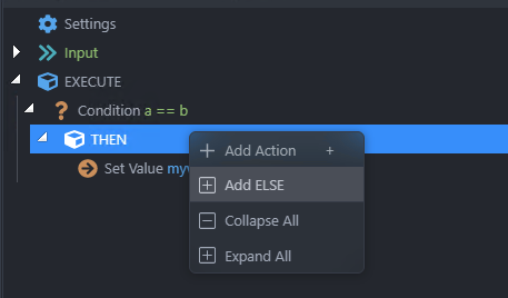
Also, an empty else is step is no longer added by default. Now you can add it using the context menu if/when needed: