Sorry once again if this is pretty basic, but I’m coming from a Webflow world so just need some help getting accustom to the Bootstrap way (p.s. I’m learning Bootstrap for the first time alongside learning Wappler)
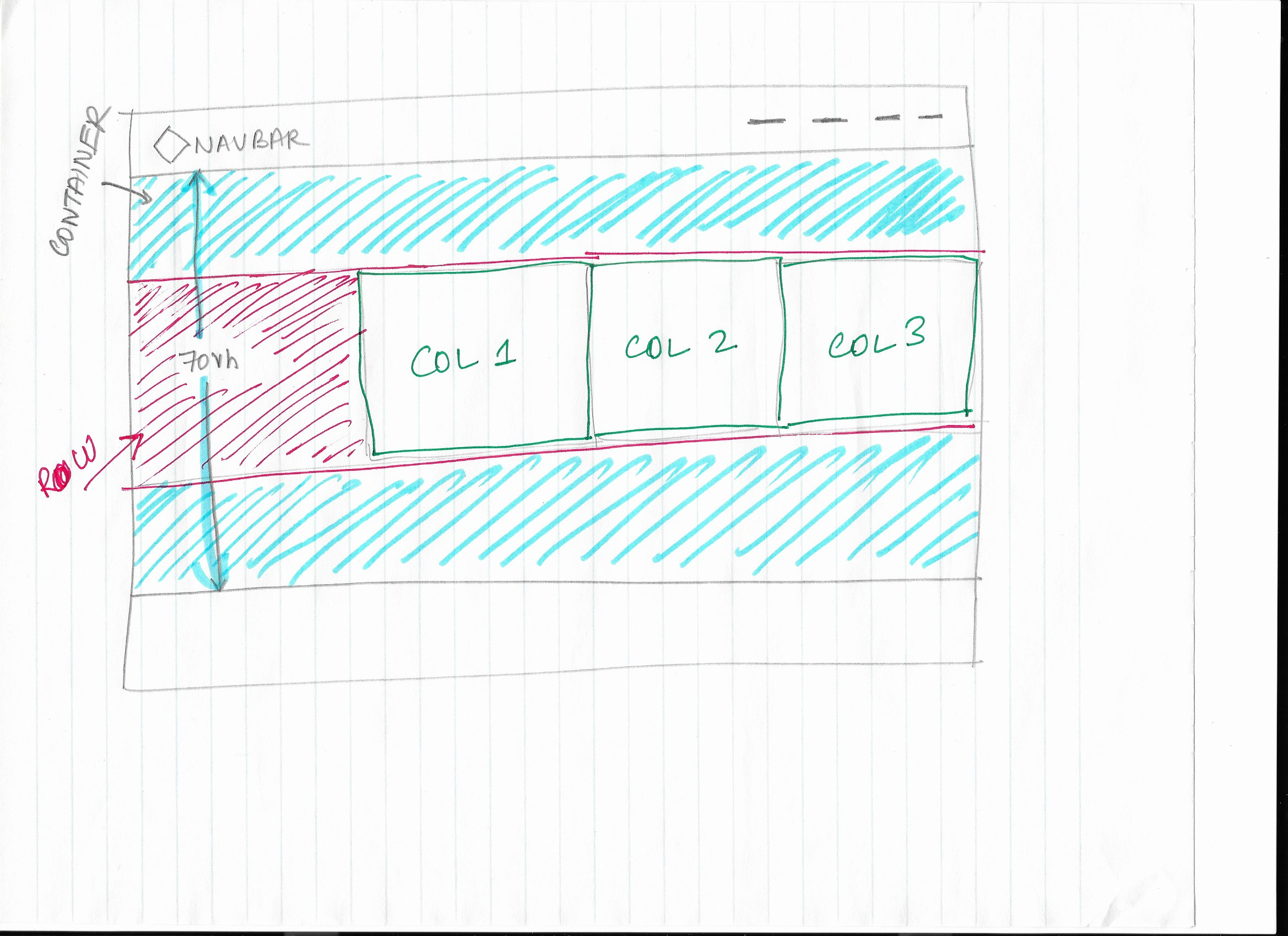
So on my page, I’d like my main hero section to be 70vh. Looking at Wappler tutorials and reading up, I understand that I’ll need to start with a Container element so I created one.
Problem #1 is I can’t seem to get the container to be 70vh. Do I need to add a class to the container and set the the Min H of that class to 70vh in the Design panel?
Problem #2: I’ve added a row within that container, and two columns in that row. I want to the row to be vertically centered in the container, but currently the row is the exact height of the container. In fact it appears as if the container itself is getting its height from the row height. What I’m looking for is to get the container to be 70vh and the row within it (which is a lot shorter than the container height) to be vertically centered so that there’s breathing room on the top and bottom of the row. I see the vertical align button in the layout, but that is for the row element, which I suspect vertically aligns the children elements inside the row. Can’t seem to find a way to vertically (centre) align the row itself within it’s parent container.
Also, what is the section element used for then? Is it used in the same way as Webflow does? I’ve noticed that none of the tutorials I’ve watched use sections – each ‘section’ mostly starts with a container.
Most likely I’m going about this the wrong way so any help would be much appreciated.
Here I start with a navigation bar and a container
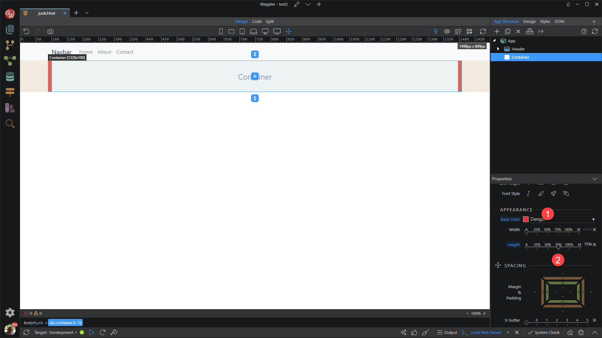
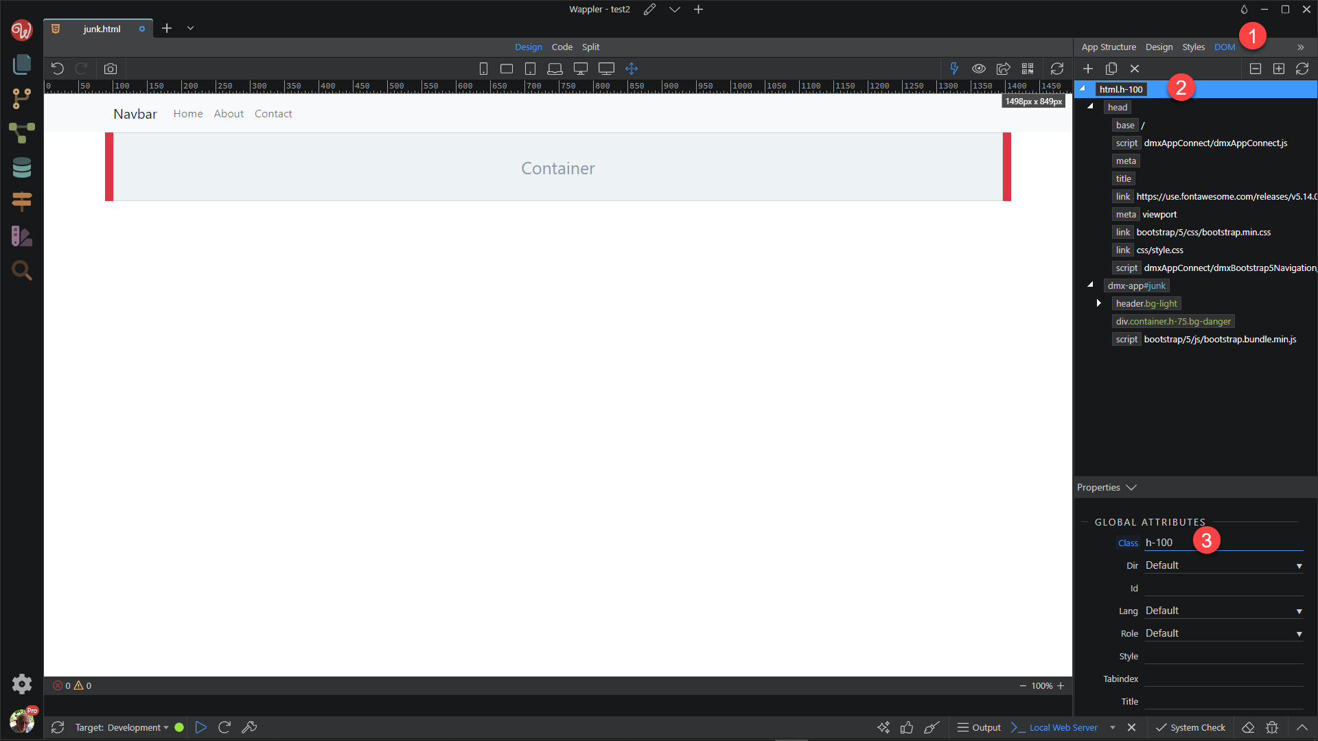
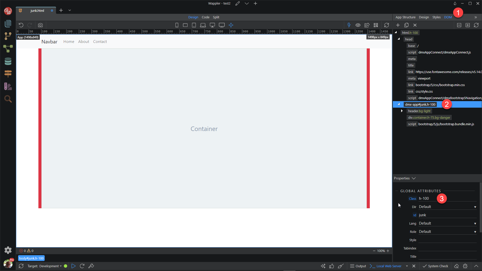
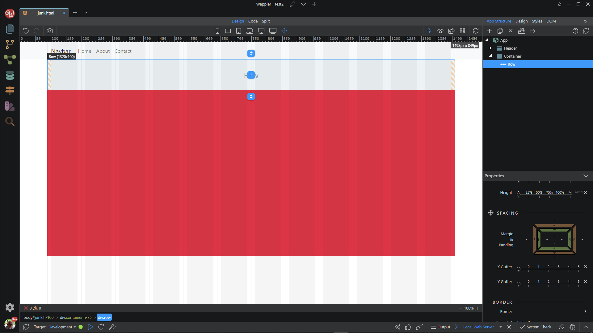
Set the container height. To make it easy on me, I have set the height to 75%. I also have added a background colour so that we can see what is happening
Notice that the container is now 75% of the viewport height. Setting HTML and BODY heights is not a Bootstrap or Wappler thingy. This is how HTML elements are meant to work, the height is controlled by the content unless otherwise specified.
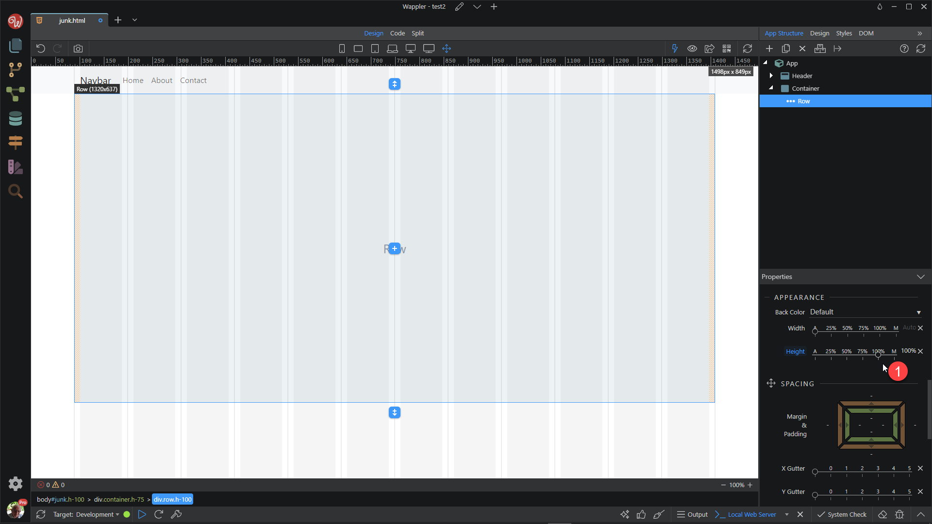
4, When I add a row, we are confronted with the same height problem. The row is as high as the content.
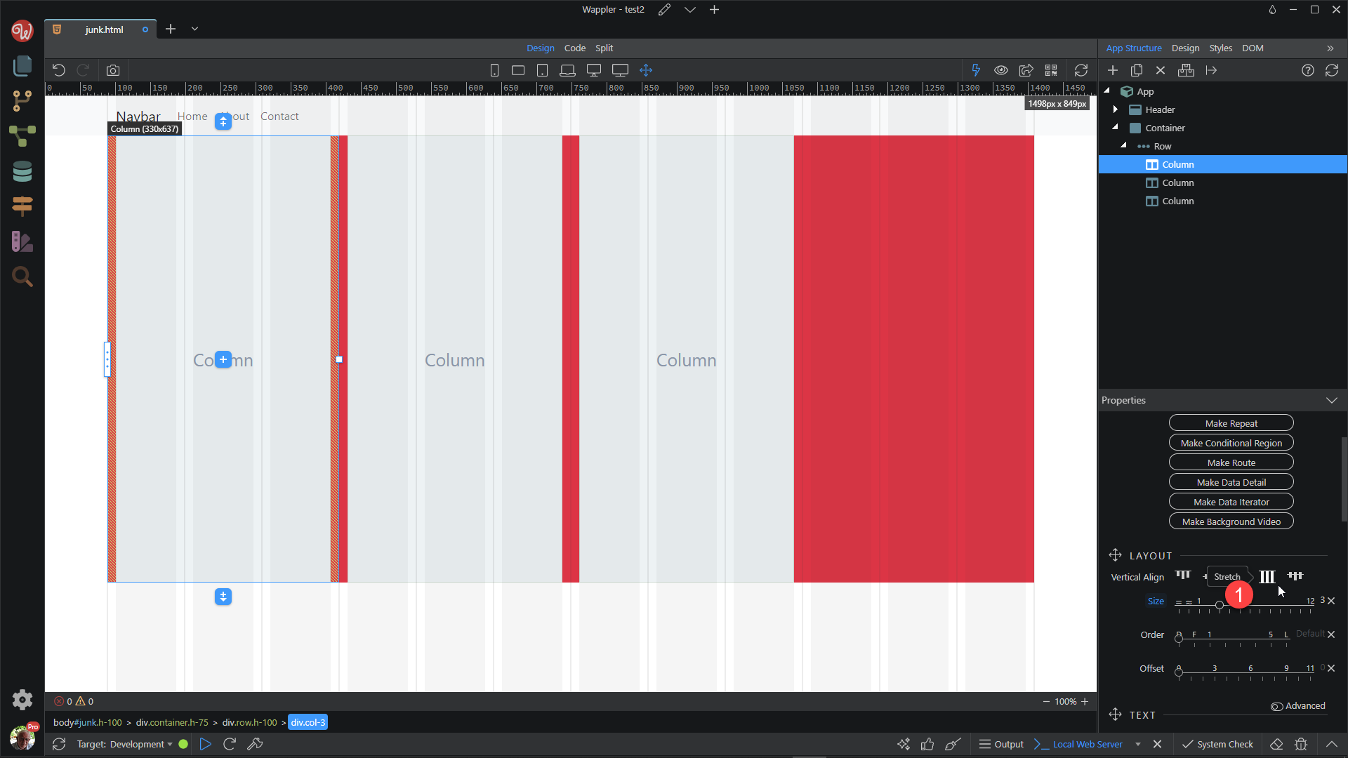
Add three columns with a width of 3 cols each. You will notice that default value for the column is to be 100% of the height of the row. This is because the row is in effect a flex container and the column is a flex item. See the video on this: https://youtu.be/roYyn3cfMrE
Wow! Thank you so much, Ben for such a detailed step-by-step. I really appreciate this. I’m going to try this out and let you know how it turned out. Once again really appreciate all the instructions and screenshots.