Navbar Collapser not working

Hi, I have a navbar set up as per the doc tutorial. The tutorial is differnt in teh way it specifies when the navbar will collapse into a hamburger.

This is the tutorial

Meanwhile in ver 3.9.7 i get…

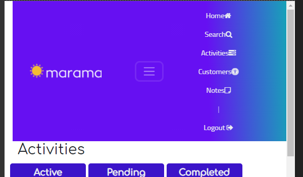
I thought tha the screen would automatically detect when the scrren width wound not be enough room for the navbar and collapse. But it does not do this…

image

Notice that the ‘Home’ is not displayed on the Phone form factor. How can I get the collapser to work?

Weirdly, in chrome, when pressing F12 to see teh phoen form favtor there, the complete navbar is shown

image

So I added an extra item as a test, the problem does continue to exist in teh F12.

image

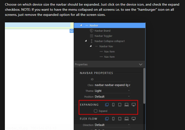
The way you set this is - switch the device size at the top of design view and toggle this option on the screen size you want this expanded.
The menu will be expanded on the selected device size and up.

Hi, that worked beautifully, except clicking the the hamburger does not display a drop down list

image

On the Navbar toggle is the action toggle setup correctly maybe a collapse and then the id of the collapse

Thanks, that a good result, I set up the navbar as follows

Now I get

image

The only problem is that the drop down forces the header to have extra depth, and whilst functional, is not desirable. Is there a better way?

How is you nav setup the default block nav bars created by Wappler just drop down below

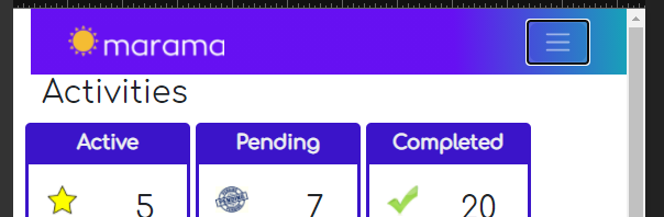
Hi, I am not sure what you mean, but I did adjust the layout a bit and now it is looks good and works great. I was expecting a drop down from the hamburger, as you would normally see in an app, but this result is fine.

image

Hi, on another page, where I have to use teh hamburger in phone landscape form factor, I get

image

Thats a bit haywire, it looks good in phone portrait, but how do I get it to behave in phone landscape?

Before dropdown the hamburger is positioned correctly.

image

That is not how the Bootstrap menu looks by default. It seems to me you changed / styled something which just broke the layout.

Quite possible, any suggestions as to what?

Something you can try is changing the flex order on larger screens on something like the Navbar collapse

I can’t tell you what’s wrong until i see your live page :slight_smile:

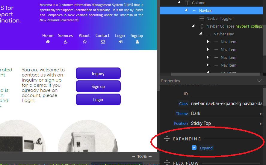
Thank you Teodor, the web page is https://www.marama-cloud.com/about.php. I have made all form factors not Expand. All except phone portrait have the problem.

how is it supposed to look on large screens are you keeping the toggle menu or like this

The bigger form factors will expanded, I just unexpanded them to bring out the problem easier. Every form factor bigger than phone landscape will be, in the end, expanded. So the problem exists genuinely in the phone landscape form factor.
But as this web site develops there will be some navbars that wil have more items, requiring tablets to be unexpanded as well.

The styles you created are breaking the Navbar it looks like

<header class="wappler-block bg-primary Blue-Gradient clsBlueGradient">
        <div class="container-fluid">
            <div class="row w-auto">
                <div class="col-12">
                    <nav class="navbar navbar-dark bg-transparent w-auto flex-row text-center justify-content-between sticky-top">
                        <div class="d-flex"><img src="/assets/images/marama_sun_small_orangeonblue_logo3.png" class="mr-5 mr-sm-0" height="28"></div>
                        <button class="navbar-toggler" aria-controls="navbar1_collapse" aria-expanded="true" aria-label="Toggle navigation" id="navbar" data-toggle="collapse" data-target="#navbar1_collapse" is="dmx-button" value="" type="button">
                            <span class="navbar-toggler-icon"></span>
                        </button>
                        <div class="navbar-collapse justify-content-around collapse show" id="navbar1_collapse" style="">
                            <div class="navbar-nav text-center flex-grow-1 justify-content-xl-end justify-content-end">
                                <a class="nav-item nav-link text-light ml-2" href="/index.php">Home&nbsp;<i class="fa fa-home"></i>
                                </a>
                                <a class="nav-item nav-link text-light" href="/services.php">Services&nbsp;<i class="fa fa-wheelchair"></i>
                                </a>
                                <a class="nav-item nav-link active text-light" href="/about.php">About&nbsp;<i class="fa fa-star-o"></i>
                                </a>
                                <a class="nav-item nav-link text-light" href="/contacts.php">Contact&nbsp;<i class="fa fa-envelope-o"></i></a>
                                <a class="nav-item nav-link text-light" href="/home.php">Login&nbsp;<i class="fa fa-sign-in"></i></a>
                                <a class="nav-item nav-link text-light" href="/SignUp.php">Signup&nbsp;<i class="fa fa-user"></i></a>


                            </div>
                        </div>
                    </nav>
                </div>
            </div>
        </div>
    </header>

Try this

Yes, that looks a lot better

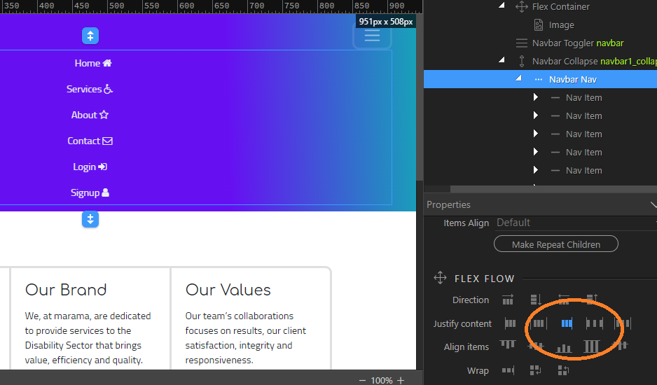
I have attempted to right justify the navitems so that they look as though they are dropped down from the hamburger, but the navbar does not respond to right justify.

use text align right

Perfect, I should not have missed that, I still have a lot to learn, thank you for your patience.

1 Like