I am having a weird issue with my background images and I am hoping someone out there has a solution.
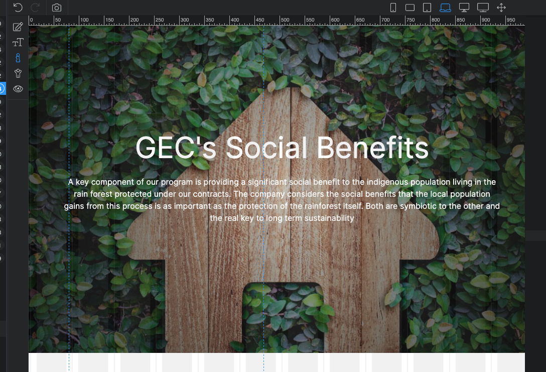
The issue I am having is that the background images that I am using for the hero landing pages on the site are not appearing in the correct way. Here is the issue. I have the code written below;
from there the issue is that when viewing mobile the images are extremely zoomed and pixelated. However, when working on them in Wappler they are sized correctly. I have viewed them in chrome, brave, safari and the images are all the same. When viewing them on desk top the look and act correctly.
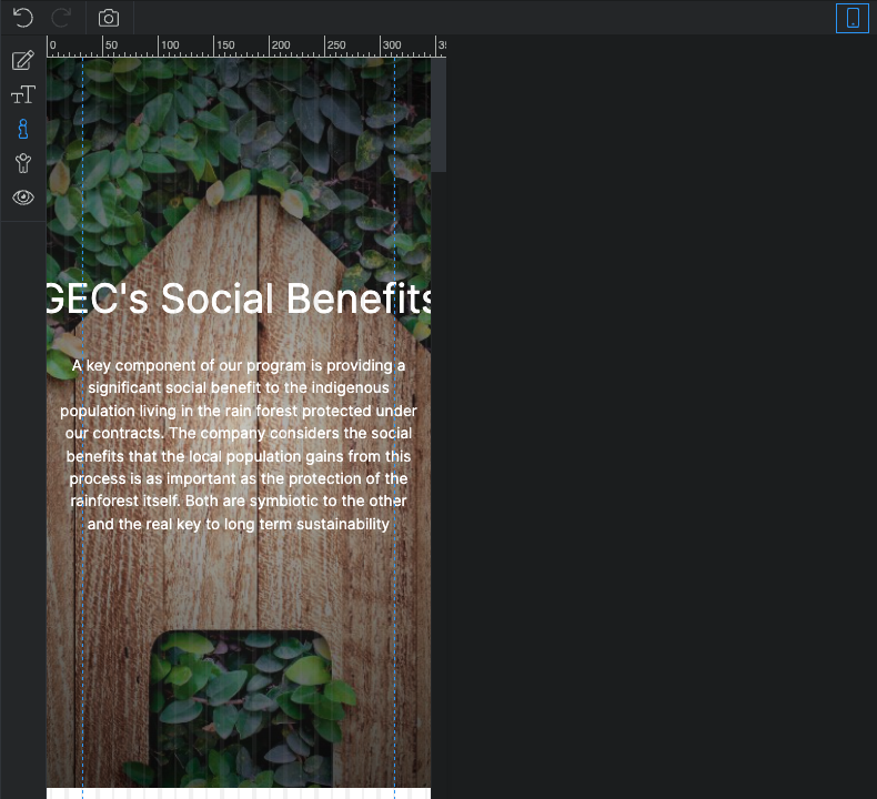
and here is the issue with background images on mobile. Please note, I have viewed them on chrome, Brave, and Safari all the same issue. The other issue is that the image on mobile does not fix position.
I have tried applying the following based on the article and still no dice. Am I applying it correctly to the CSS? I only as this because I have found that the way Wappler applies certain things sometimes they work and other times they do not.
This is how I applied the CSS,
.socialBG {
background-image: url("../assets/gecBackgrounds/socialBenfits2.jpeg");
height: 75vh;
background-size: cover;
background-position: 50%;
background-attachment: fixed;
}

/* for background-size:cover replacement on iOS devices */
@media only screen and (orientation: portrait) and (device-width: 320px), (device-width: 768px) {
.socialBG {
  -webkit-background-size: auto 150%;
  background-attachment: scroll;
}
}
@media only screen and (orientation: landscape) and (device-width: 320px), (device-width: 768px) {

.socialBG {
  -webkit-background-size: 150% auto;
  background-attachment: scroll;
}
}
I have not tested any of the solutions. I just googled and found this is a bug on ios devices, so just linked a couple of topics, not sure if any of these work. But yes, this seems like properly applied css styles.
Do you know of the reason why when this is applied to a style in Wappler it does not register the second class element? I seem to have to create separate @ medias for each one.
I am trying to simplify my CSS. When combining 2 classes, with the @ media the change effects the first class in the line.
.redd1, ,redd2. meaning I see the change take place for .redd1 not .redd2. But if I then create a new @ media with the same settings as the last and assign it to the .redd2 the change happens.