Max width and responsive image

Hello, I have a question, I guess it’s a simple thing but I don’t get it.

I have an image that I would like to be responsive:
image

And besides that, it would be nice that could have a limit about the width:
image

The thing is, those won’t work together.
When the css rule is applied, img-fluid (responsive) stop working.

Without class style101 the responsive is good:

But I need the max-width rule because it gets really wide on a computer screen.

Any idea how to solve this?

Hey @franse, you can address this using media queries in your CSS to adjust the image size based on screen size.

/* Styles for the image on smaller devices like mobile */
@media (max-width: 767px) {
    .custom-image {
        max-width: 100%; /* Adjust image to container width */
        height: auto; /* Maintain image aspect ratio */
    }
}

/* Styles for the image on larger devices like desktop */
@media (min-width: 768px) {
    .custom-image {
        max-width: 100%; /* Adjust image to container width */
        height: auto; /* Maintain image aspect ratio */
    }
}

This CSS sets the image to have a maximum width of 100% of its container across all screen sizes. However, it ensures that the image doesn’t extend beyond the width of its container.
Make sure to adjust the values in the media queries ( max-width and min-width ) according to your specific design needs.

I hope this is what you were looking for.

2 Likes

Thanks @Max_Saravia
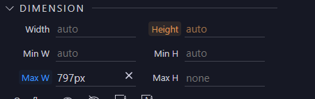
Yes I was thinking avoiding using media queries.
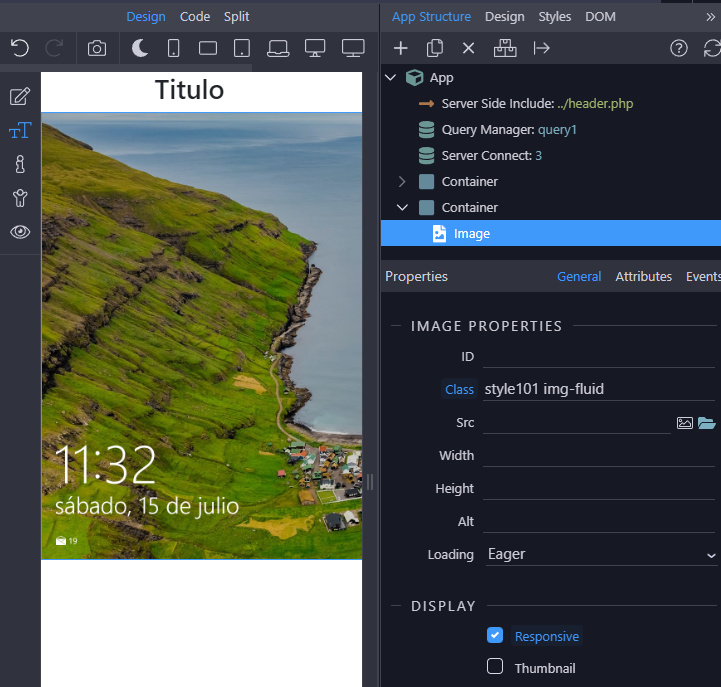
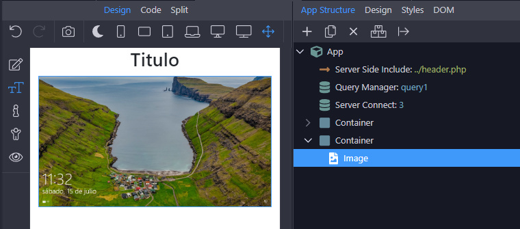
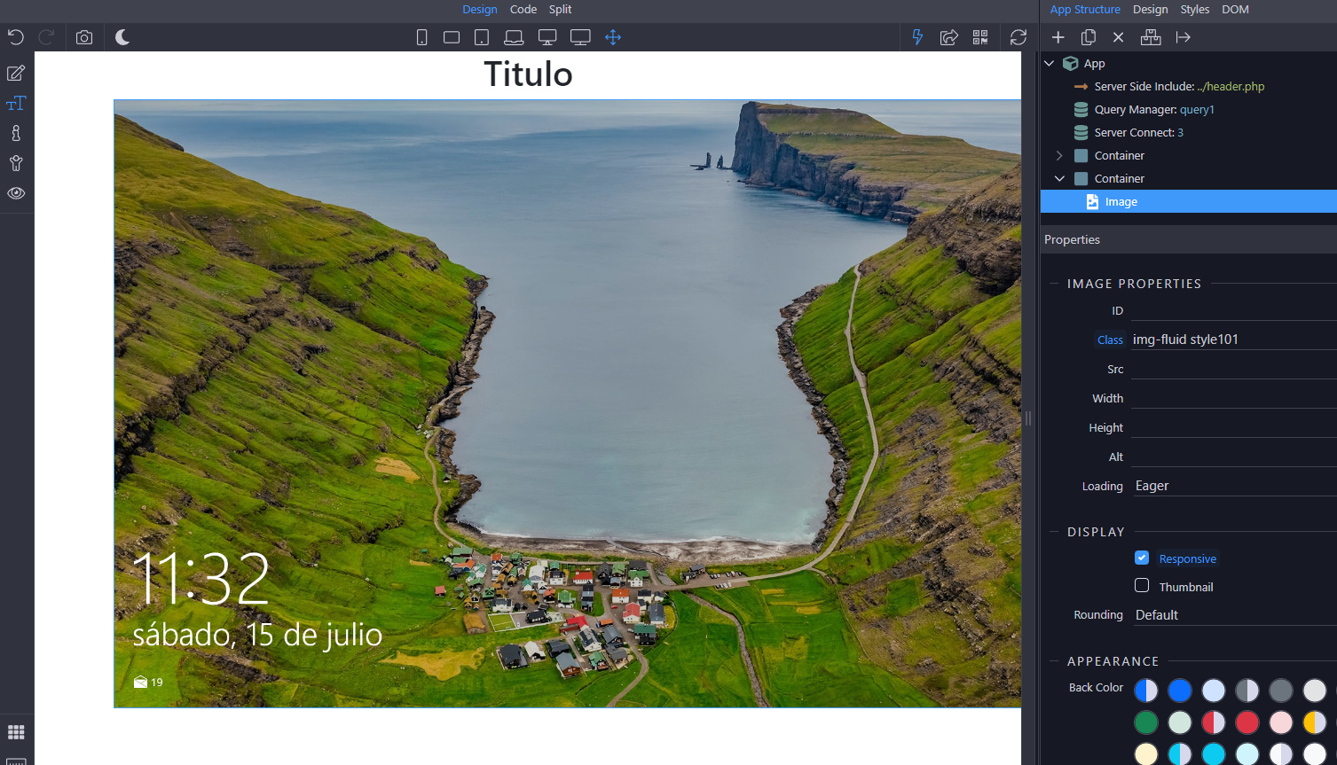
Hoping I can disable .img-fluid {max-width} so custom css can use it
But I guess your input it’s the only way

However, using:

@media (min-width: 1000px) {
    .style101 {
        max-width: 800px; 
        height: auto; 
    }
}

Does the trick. Thanks once again :slight_smile:

1 Like

This is an alternative without custom CSS

<div class="mt-5 container-fluid">
    <div class="row">
        <div class="col"></div>
        <div class="col-lg-9 col-xl-8 col-xxl-7">
            <img class="img-fluid d-block ms-auto me-auto" alt="Card image cap" src="https://picsum.photos/seed/picsum/800/533" width="800" height="533">
        </div>
        <div class="col"></div>
    </div>
</div>
2 Likes