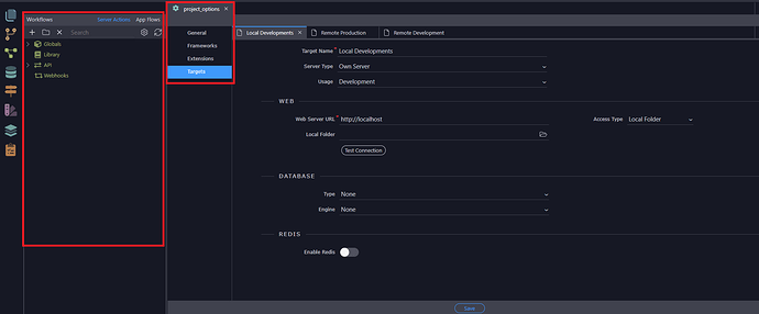
We all know the project options now work as a tab and not as a popup anymore, but the sidepanel… Well, it makes me noise, I’m thinking about new users here.
So what if we change this:
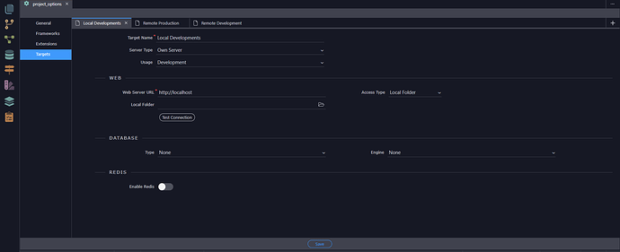
To this (Respecting the way that other screens (like site manager/git manager/workflows/database manager/routing/theme manager and resource manager do):
It can sound a little worthless but think about new users that open the project options and they still see other info that can create some confusion and nothing to do with the project options.

