In Bootstrap 4 there are 5 set breakpoints
Extra Small (.col-X) = less than or equal to 576px
Small (.col-sm-X) = larger than or equal to 576px
Medium (.col-md-X) = larger than or equal to 768px
Large (.col-lg-X) = larger than or equal to 992px
Extra Large (.col-xl-X) = larger than or equal to 1200px
Now I see that obviously within the App Structure properties panel on say a column I can set all 5 breakpoints as different parameters, so my question is the Design View breakpoints only really account for 4 breakpoints and not 5 unless i am very mistaken, which i could be.
So lets say as an example I set the following a blank page with a container > row > column and set COLUMN PROPERTIES to
Desktop > Size = 6
Laptop > Size = 1
Tablet > Size = 6
Mobile > Size = 1
All (Equivalent of Extra Small) > Size = 6
Now in my Design preview I want to look at each size i just set i click on
Full icon and see 6
Desktop icon and see 6
Laptop icon and see 1
Tablet icon and see 6
Mobile icon and see 1
It seems in design view there is no way to see Extra Small
It starts with X-SMall and works upwards from there. So “ALL” is really “X-Small”. And then you go upwards to set the settings for devices bigger than that. So in other words, Bootstrap 4 is made for small devices and then you expand it upwards. X-Small is just saying - default settings that aren’t small.
Additional Edit: You probably don’t need to set small breakpoint. Set all to 12 for a column. Then Tablet to 6 and then laptop to 4 for instance. The going upwards is important. Don’t think desktop down.
I know all is x small but try the above example. Just make a new page and add a container. Row. Column. Then on the column add a class of.
col-6 col-sm-1 col-md-6 col-lg-1 col-xl-6
Now in design view go from Full to desktop to laptop to tablet to mobile and you can not go smaller than that so how do you see the 6 column version of col-6 which should show at browser width less than 576px.
X-Small does not have a minimum media query. In other words - the minimum size for small is 576px or something. So Phone view shows that width. Extra Small doesn’t have a minimum so it would effectively be 0px -> or the way it is intended - all pixels.
I understand but still think wappler design view needs an additional design view button to make the view port width smaller than 576px so I can see what my design looks like at that screen size considering I can use it as a preprogrammed breakpoint
I can’t think of many things smaller. I think Apple watch is 312 and the 4 series will be bigger than that. I think putting an arbitrary size of 300px might be a good idea or something. But what if the device is 225px? I think that is where the extra small is meant to be default for all sizes. You could literally have ten different sizes that matter under 576px. For instance a design at 100px can show different things than 220px can or 470px. But there isn’t much difference between 768 and 1200. In other words - at small sizes - it can matter greatly based on something as simple as how many letters are in a column. So I think the intent is to play it safe as a default. The focus being user-friendliness and ease-of-use. Set columns to 12 in most cases.
With that in mind, since Bootstrap doesn’t have any specified sizes beneath small, I think if they added a way to drag the window smaller so you can see what it looks like at any size beneath small, that would probably be smart. Particularly if it showed how many pixels you were at. Then as you say, you could program in your own media query or something.
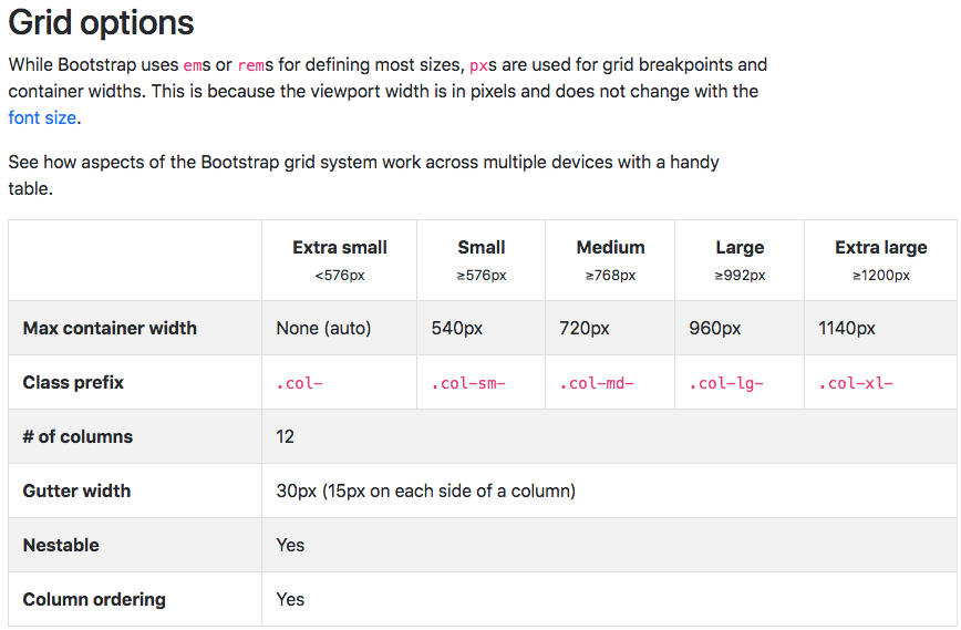
But in the link I just posted bootstrap 4.1 as standard without anything additional added allows 5 different sizes
All for extra small intended for anything under 576px and accessed by using built in default bootstrap 4.1 class .col-x
Small for between 576px and 768px and accessed by using built in default bootstrap 4.1 class col-sm-
Medium for between 768px and 992px and accessed using built in default bootstrap 4.1 class col-md-
Large for between 992px and 1200px and accessed using built in default bootstrap 4.1 class col-lg-
Extra large intended for anything above 1200px and accessed by using built in default bootstrap 4.1 class col-xl-
So let me give you an example, I would like a design where a I am only giving a person the exact correct size image based upon their device view port width.
ImageXS is 576px wide cropped in photoshop @20k
ImageSM is 768px wide cropped in photoshop @28k
ImageMD is 992px wide cropped in photoshop @40k
ImageLG is 1200px wide cropped in photoshop @90k
ImageXL is 1920px wide cropped in photoshop @135k
Each image size is vastly different in file size and there are 50 images on my webpage so load time and file size is imperative. I can access the different view port sizes in my browser and all works perfectly but Wappler is intended to work in design view and I want to see the last size as a per how bootstrap 4.1 intended me to see it.
Small is 576px and up to infinity.
Medium is 768px and up to infinity.
Large is 992px and up to infinity.
Extra Large is 1200px and up to infinity.
Extra Small has no size whatsoever. It is just destined anything below 576px, however, it really means 0px to infinity. (You had extra small as 576px.)
So, that image for 576px - if you only set breakpoints at medium thru extra large - will cover anything from 0px to 767px. You could create an image at say, 300px and designate it for all sizes. And then set a new image for S, M, L, and XL. And the 300px image would work for anything that is 0px to 577px.
Can you please try this for me Chad. Open a new page and add a container with a row and a column.
In the app structure set the column properties size which is quite far down to all size 3 then click the mobile icon in the app structure and change the size to 12 then click on tablet and set its size to 12 then click on laptop and set its size to 12 then lastly click on desktop and set its size to 12.
Now duplicate the column 4 times.
Now see if with the design view there is any view point you can choose that will display all 4 columns side by side. Because in Google chrome you can. But in Wappler all I can ever see is 4 columns all full width one under the other.
I am almost certain that this was not wapplers intention when the 5 buttons were added in the app structure. One labeled all, one labeled mobile, one labeled tablet, one labeled laptop, one labeled desktop.
I get what you’re saying Paul. You can’t see that particular configuration at all. In the top they have the four breakpoints that Bootstrap 4 comes with - and in the App Panel they have the fifth designation of All.
For the record, you would have the same result if you set ‘All’ to 3 and phone to 12. You wouldn’t be able to see the four columns next to each other. (Because the phone is to infinity, and the other devices at default inherit whatever is below them.) Not putting for your information, but anyone reading this that doesn’t get bootstrap at all.
So I get what you’re saying. That view isn’t available. From a designer standpoint, I’m okay with that, because I would never use a layout on a small screen that is complicated. I would go with 12 on ‘All’ at all times (with a few exceptions.)
For readers and not you: The reason there isn’t a fifth button at the top is because Bootstrap has no values at all for a fifth size. All just means 0px to infinity. If you change laptop, then ‘all’ means 0px to laptop size. And laptop means its size to infinity. And this point is crucial I think. That there is no size for ‘All’ or extra small.
For you: However, I think allowing you to change the viewport size to whatever you want - so you can see it at different sizes would be useful. Like adding something similar as Chrome has. Chrome’s preview of different devices and sizes isn’t based on Bootstrap 4. It is just changing the viewport size to whatever you want or preloaded device sizes. So if Wappler had this - they wouldn’t have to add anything to Bootstrap 4 that isn’t there, and instead would just be enhancing the functionality of Wappler’s GUI.
In other words, I would reword your suggestion to: Can you enhance the GUI of Wappler so that you can input custom viewport size, and store it if you want as a default setting for viewing. Similar to Chrome. I think by bringing up Bootstrap - it is a different question or appears to be different.
I’m drunk by the way. Not much use while the weather is windier than crap.
I get what you are saying, honestly I do but I still think that Bootstrap v4.1 was built with 5 viewport sizes even though the last is referred to as all, so I do not really see this as an enhancement but rather something that should be there. If I were smart enough to even contemplate creating a GUI that would give access to the extensive list of Bootstrap 4.1 classes and took a look at this image from the official Bootstrap 4.1 documentation below
It states 5 sizes, not 4 sizes, and it states Extra Small < 576px, so Bootstrap themselves say LESS THAN 576px and not
I do understand that if only All is set and no other breakpoints then all would effectively produce 0 to infinity though.
This is why i am questioning Wappler on this, as they say it has a GUI for Bootstrap 4, and they have about 4 places where they allow a user to differentiate between all 5 sizes, the only place they do not allow for this is in the design view itself.
I do realise that the same thing can be achieved with col-4 col-sm-12 which will also make all sizes above sm take the same parameter as sm, I just listed it all for example purposes.
Maybe this is all my fault, i read the < 576 as LESS THAN, but google is saying that symbol is actually GREATER THAN, so now i really do not know. Im very very confused now, and I am not drunk.
Here is the issue though, and I’m not arguing. To be clearer - I’ll just ask this:
What specific size should the viewport be to show Extra Small? 575px? 400px? 300px? 100px? There is no specific size for extra small other than less than 576px. So if small is set - then Extra Small could be set to 575 different pixel sizes. Which of those would it be?
A solution to this may be a toggle button at the top that turns off all breakpoints in the viewport so you can see the layout of Extra Small - say maybe in phone view.
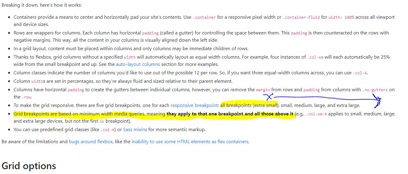
For your comment on Google and Less than - that graphic should help.
It says All Breakpoints (and in parentheses it says Extra Small) and then it shows the four main breakpoints. Also notice that the second line says that Extra Small means everything. Small means 576px to all sizes above it and so forth. Anyway, hope this helps.
Or to put it another way- Extra Small actually means All Breakpoints or all sizes. And Small means Anything greater than 576px. And medium means anything greater than whatever number that is and so forth. The Destination of All Breakpoints only really means “Extra Small” when small is set to something and that just means that all sizes below small will see whatever the default setting is.
I see what you are saying, I suppose I got a little concerned when i was creating a layout where i had an image size consideration and needed smaller preview images so I did this
All set to 12 cols wide (one column row)
Small set to 6 cols wide (2 column row)
Medium set to 4 cols wide (3 column row)
Large set to 3 cols width (4 column row)
Extra Large set to 2 cols width (6 column row)
Which works great because now my largest pixel width image is 576px to show a high quality image at the smallest file size. But then I was switching from one view to the next in Wappler and suddenly realised after almost a year of using this application that suddenly I just can not see my single column version in the design view, which makes it difficult to adjust things like bottom margins to get the layout looking just right.
Anyway it’s late so I am going to pack it in for the night and hopefully tomorrow i will have gotten my head around this.
I do however agree with your synopsis that it would be best to have a custom breakpoint that can be set for the last one as Wappler does not know what number between 0 and 576 the user might choose. For my personal purposes of just wanting to see my single columns so i can set some margin and padding accordingly I just want another button that shows 576px or 575px, whatever is needed to show the single column version.