I am currently experiencing an issue with the color theme for charts in Wappler and I’m seeking assistance to resolve it.
The problem I’m facing is that the available color options in the chart’s color theme do not reflect the custom color coding I have for my data.
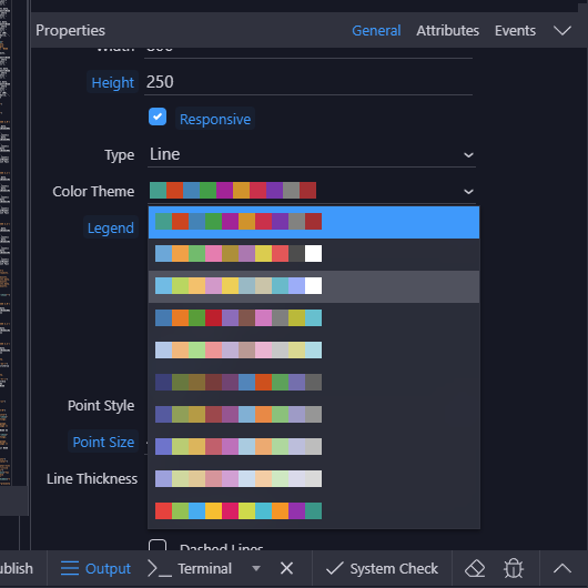
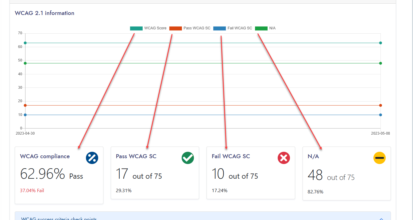
Specifically, I have a line chart that displays historical information for four data sets: WCAG score, pass, fail, and N/A. In my custom color coding, I have associated the following colors with each data set:
- WCAG score: blue
- Pass: green
- Fail: red
- N/A: yellow
However, I am unable to associate these specific colors with their respective data sets within the chart’s color theme options.
I would greatly appreciate your guidance on how to achieve this customization within Wappler. Is there a way to override or customize the chart’s color theme to reflect my specific color coding for the data sets?
Thank you in advance for your support and insights. I’m eager to learn how to address this issue and make the charts in my Wappler project more visually aligned with the associated data.