Is there a bug in the radar chart?

Wappler: 7.4.0
OS: MacOS M1
Server: PHP

I have been working on charts and spent some time trying to get my data to output in a Radar chart without success. The data is there but it’s just not rendering. I have a repeater which should show a few charts. The first chart renders fine but the rest just plots the points on a vertical line.

If I change to any other chart type then it all renders fine so I’ve narrowed it down to specifically the Radar chart type.

This is how it’s rendering:

And this is the same data just with the chart type changed to Area:

Cheers, Jon.

Can you post the code of the repeat region with the chart inside?

Hi @Teodor

No problem. Here’s the code:

<div class="col-6 align-self-end" dmx-repeat:repeatcategories="serverconnectChartData.data.repeatCategories">
    <h4>CATEGORY</h4>
    <dmx-chart dmx-bind:id="chart{{$index}}" type="radar" dataset-1:label="SA" dataset-1:value="cSAScore" dataset-2:label="R1" dataset-2:value="cRef1Score" dataset-3:label="R2" dataset-3:value="cRef2Score" dataset-4:label="R3" dataset-4:value="cRef3Score" dataset-1:tooltip="'Self-Assessment: '+$value" dataset-2:tooltip="'Referee 1: '+$value" dataset-3:tooltip="'Referee 2: '+$value" dataset-4:tooltip="'Referee 3: '+$value" label-y="$index" labels="cQuestionSmallText" dmx-bind:data="queryChartData" points="true" legend="top" fill="false" point-size="5" label-x="cQuestionSmallText" width="600" responsive="true" cutout="" nogrid="true" colors="colors9"></dmx-chart>
</div>

However, this works perfectly in all the other chart types I’ve tried.

What version of the charts js file do you have on the server? Can you provide a link to your page?

I’m afraid I can’t provide a link as it’s not public but the versions are:

Chart.js v4.5.0
App Connect Charts Version: 2.0.2

Is there any update on this?

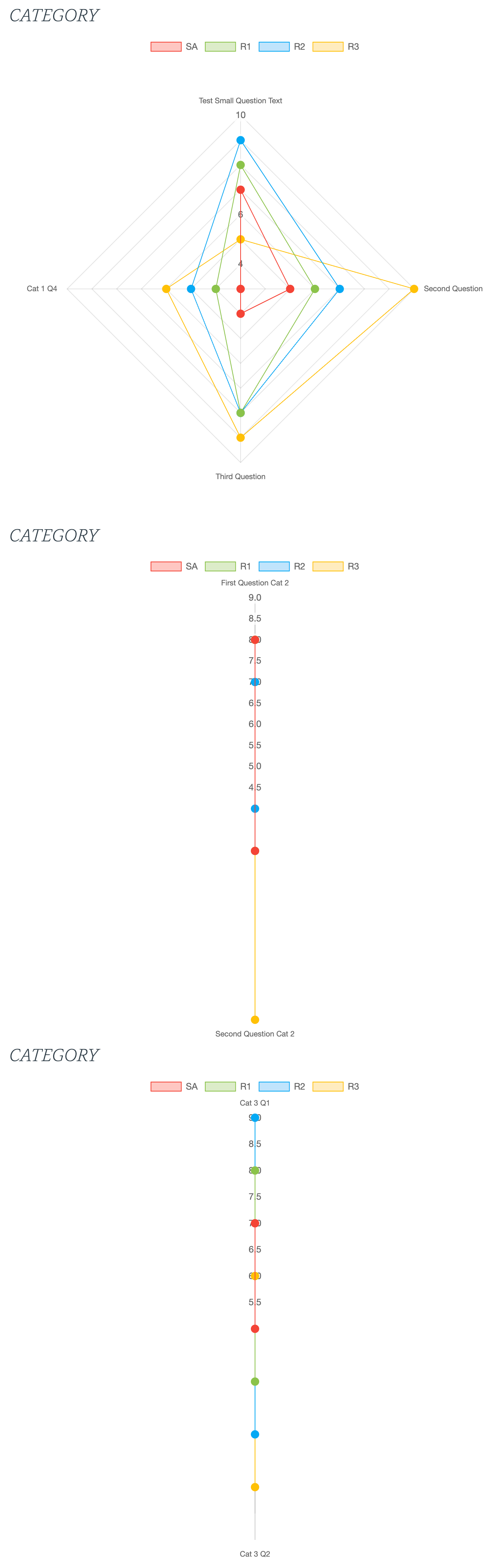
It doesn't look like a bug. It shows data in a different way, the first dataset has 4 datapoints while the others only have 2 datapoints, that's why you see only 2 dimensions.

Thanks @patrick. The example I gave shows the first chart displaying correctly but the subsequent charts being only in 2 dimensions. However, if I change the type to ‘Area’ they all show correctly so I’m confused as to why radar charts aren’t working.

They are different charts that represent data in a different way. In the area charts you see it creates a line between the datapoints on the horizontal axis. In the radar charts the datapoints are distributes around the center point, you need more points (questions) to display the data correctly.

See the demo at Radar | Chart.js

Then click on Remove Data, when there are only 2 months left it shows shows the data exactly like in your case, adding more data will add more points.

1 Like

Thanks Patrick. You’re spot on. I’ve just added some more data and they are now showing correctly.

Must remember… minimum 3 data records needed for radar charts.

Thanks again. Please tag this as not a bug.