Is it possible to create nested tables? As well as tables with expanding rows?

Perfect! Yes, I found that on getbootstrap.com: https://getbootstrap.com/docs/5.0/content/tables/#nesting

So, I’m getting this now:

Now to figure out how to show the details collapsed and then the user can expand and collapse at will. What markup would work for that?

Something like this?

I got this working using the collapse class on the nested tr and a button on the main row.

<tr class="collapse" dmx-bind:id="'collapseOrderDetails'+$index">
Then the button:
<button id="btn1" class="btn" data-bs-toggle="collapse" dmx-bind:data-bs-target="'#collapseOrderDetails'+$index"><i class="fas fa-plus"></i></button>

However, it’s messing up the row stripping. I think its because the collapsed row is every other row and that is the expected offset color.

As you can see, all the rows are the shadow color. Any idea how to correct this?

1 Like

You can add a custom css class and style it. Example, add the following class to your table table-collapse and remove the table-striped class from the table. Then in your css style it like:

.table-collapse tbody tr:nth-of-type(4n+1) {
    background-color: rgba(0,0,0,.05);
}
2 Likes

That’s awesome! Seems to work very nicely.

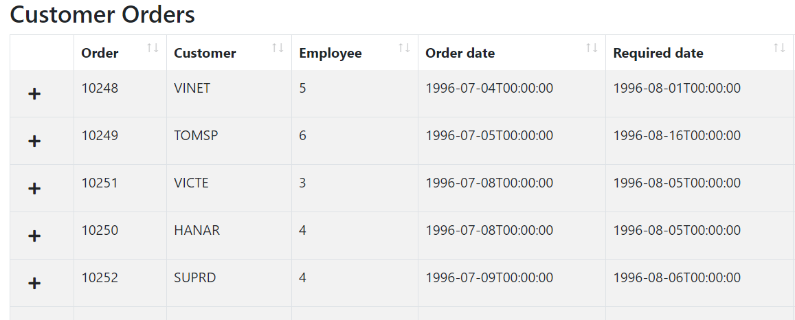
I think that pretty much does it, except for the icon in the expand/collapse button. I’d like the icon to change from a plus to a minus on each row when it’s expanded and back to plus when collapsed. Is there a way to reference the collapsed state of the tr and show/hide icons? Maybe reference the class? Or what would work for that?

I have a similar setup, but use arrows, so the icons will need changing, but something like this should work:

<td class="text-center"><i class="fas fa-fw" dmx-class:fa-caret-down="!bs4collapse.collapsed" dmx-class:fa-caret-right="bs4collapse.collapsed"></i>{{id_ord}}</td>

1 Like

What does bs4collapse.collapsed refer to?

I converted it to plus/minus for my case:
<i class="fas" dmx-class:fa-plus="!bs4collapse.collapsed" dmx-class:fa-minus="bs4collapse.collapsed"></i>

But, I’m still only getting the plus regardless of the state.

The row which displays the details when clicked:
<tr dmx-on:click="bs4collapse.toggle()"

Hmm, I’m not using the onClick event. I’m using the bs toggle and target method:

<button dmx-bind:id="'btnCollapseOrderDetails'+$index" class="btn" data-bs-toggle="collapse" dmx-bind:data-bs-target="'#trCollapseOrderDetails'+$index">

I could use a combination I guess, but was hoping for a way to reference the collapsed state of the tr.

I don’t think my example was very helpful - I just copied some code from something I had done before. In principal, could you use dynamic classes like this:

<button id="btn1" class="btn btn-primary" data-toggle="collapse" data-target="#collapse1"> <i class="fal" dmx-class:fa-angle-down="!collapse1.collapsed" dmx-class:fa-angle-right="collapse1.collapsed"></i>
</button>
<div class="collapse" id="collapse1" is="dmx-bs4-collapse">
<p>Collapse body text goes here.</p>

?

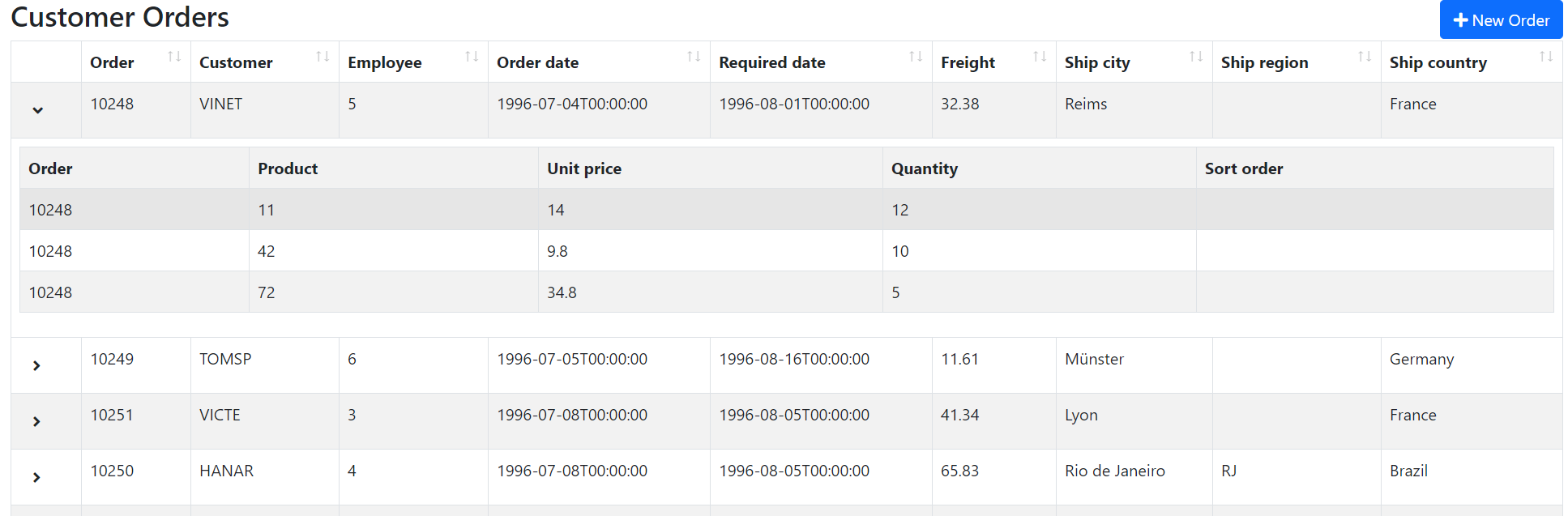
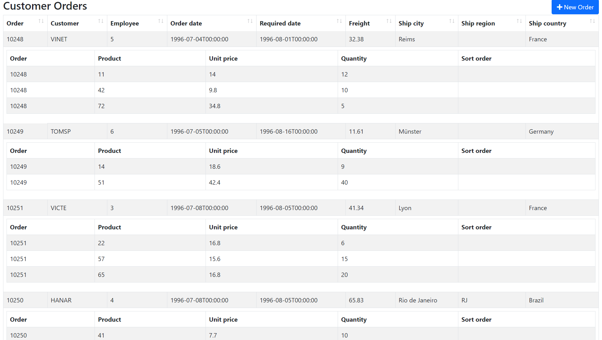
I could see in principal that could work. The id changes for each row, so would have to account for that somehow. I tried just hardcoding the first row, which I assume to be an index of 0, but it doesn’t work.

<i class="fas" dmx-class:fa-plus="!tr_collapse_order_details0.collapsed" dmx-class:fa-minus="tr_collapse_order_details0.collapsed"></i>

The tr is:
<tr class="collapse" dmx-bind:id="'tr_collapse_order_details'+$index">

I’m missing the “is” in the tr, but when I add it, it breaks it completely - doesn’t expand at all. Without it, it will expand and collapse, but only shows the plus icon.

This is similar to the above example, but in a repeat:

<div class="row">
      <div class="col">
        <div dmx-repeat:repeat1="sc_news.data.qry_newsitems_list">
          <button class="btn btn-primary" data-toggle="collapse" dmx-bind:data-target="'#collapse2'+$index"> <i class="fal" dmx-class:fa-angle-down="!collapse2.collapsed" dmx-class:fa-angle-right="collapse2.collapsed"></i>
        </button>  
        <p>{{newsitem_title}}</p>
          <div class="collapse" id="collapse2" dmx-bind:id="collapse2{{$index}}" is="dmx-bs4-collapse">
            <p>Collapse body text goes here. {{$index}}</p>
          </div>
        </div>
      </div>
    </div>

That works for you?? You don’t need the index for the class condition? I can’t get it to work.

And, whenever I add the “is” property, it breaks the functionality completely - won’t expand or collapse.

Opening the browser, I’m getting this in the console:
image

That means the collapse component has not been added to your page … the is attribute is for wappler components and you need it.
Add a collapse component on the page. It will add the required js files to the page and will also create the required code - which you can copy and paste where needed.

YES! That did the trick! It’s working now.
And, yes, you need all the attributes in both the button and the tr.

The button:
<button dmx-bind:id="btn_collapse_order_details{{$index}}" class="btn" data-bs-toggle="collapse" dmx-bind:data-bs-target="#tr_collapse_order_details{{$index}}"> <i class="fas" dmx-class:fa-angle-right="tr_collapse_order_details.collapsed" dmx-class:fa-angle-down="!tr_collapse_order_details.collapsed"></i> </button>

And the tr:
<tr class="collapse" id="tr_collapse_order_details" dmx-bind:id="tr_collapse_order_details{{$index}}" is="dmx-bs5-collapse">

End result:

Thank you @TomD and @Teodor for your kind help!

5 Likes

This would be a perfect user case for a tutorial as it’s a very commun thing those days

1 Like

I was thinking the same thing, @GlobaticoLabs. Maybe someone will get inspired :slight_smile:

I’d like to add one more feature. I want to add an Expand All/Collapse All button at the top.
Did a little searching and found this: https://www.codeply.com/go/i5h1tBmTaa/bootstrap-4-expand-collapse-all-accordion
But not sure how to implement it in Wappler. Am I on the right path, or any ideas how to do this?

Are you using Bootstrap 4 or Bootstrap 5?

Ah i see you are using BS5. All you need is a button which targets the collapses class, not any of their ids.

So just:

<button class="btn" data-bs-toggle="collapse" data-bs-target=".collapse">Toggle All</button>

Yes, BS5.
Well, that’s close. That will toggle the elements, but if there are one or more already open, it will close them and open the rest.

What I want is to actually expand or collapse all, regardless of the current state.