I have a project where the buttons take there colour from the primary colour in light mode. It looks fine.
But in Dark Mode the buttons don’t show up as well.

Is it possible to change the button stlye based on display mode?
I have a project where the buttons take there colour from the primary colour in light mode. It looks fine.
But in Dark Mode the buttons don’t show up as well.
Is it possible to change the button stlye based on display mode?
This will get you experimenting.
HTML
<div class="row">
    <div class="col">
        <button id="btn1" class="btn btn-outline-success">Button</button>
    </div>
CSS
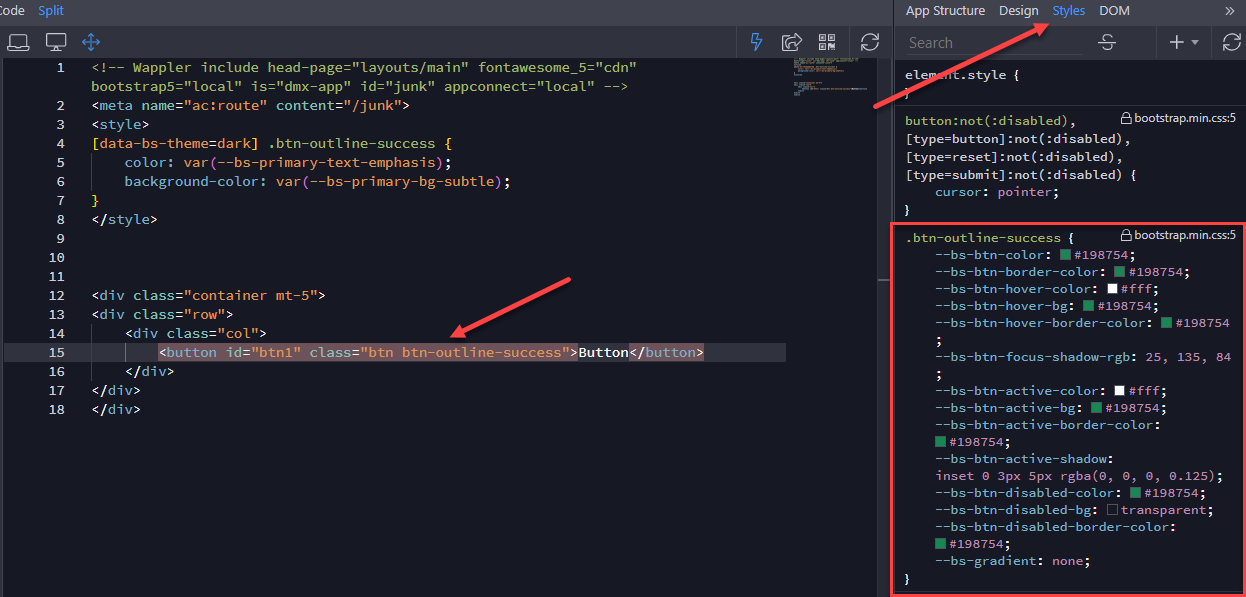
[data-bs-theme=dark] .btn-outline-success {
    color: var(--bs-primary-text-emphasis);
    background-color: var(--bs-primary-bg-subtle);
}


Thanks @ben !!!
This works great. I was able to get my buttons to be the right colour in dark mode. However when I click on them they still show in the light colours.
Any idea how I would change the active styles as well? I have tried several things but can’t seem to get it to work.
Here is where I am at but the active background colour doesn’t work.
<style>
  [data-bs-theme=dark] .btn-outline-warning {
    color: var(--bs-primary-text-emphasis);
    background-color: var(--bs-primary-bg-subtle);
    border-color: var(--bs-primary-bg-emphasis);
    background-color: var(--bs-active-bg-emphasis);
  }
</style>
Thanks again for your guidance.
Maybe in the same way defining the :active stage?
<style>
  [data-bs-theme=dark] .btn-outline-warning {
    color: var(--bs-primary-text-emphasis);
    background-color: var(--bs-primary-bg-subtle);
    border-color: var(--bs-primary-bg-emphasis);
}

[data-bs-theme=dark] .btn-outline-warning:active {
    background-color: var(--bs-active-bg-emphasis);
}
</style>
Worth a try…
Check Ben’s screenshot and the variables corresponding to the active state, that’s what you need.
Well, I am closer … thanks @famousmag!
No matter what colours I assign I only get two options … primary and light. No matter what colours I pick it sets it to one of those two colours. Nothing I do changes button background colour though. It’s always black with a dark grey on hover.
emphisis displays as primary and all other colours (danger, success, etc) all display as light.
<style>
  [data-bs-theme=dark] .btn-outline-warning {
    color: var(--bs-primary-text-emphasis);
    background-color: var(--bs-primary-bg-subtle);
    border-color: var(--bs-primary-bg-emphasis);
  }

  [data-bs-theme=dark] .btn-outline-warning:hover {
    color: var(--bs-primary-text-light);
    background-color: var(--bs-primary-bg-emphasis);
    border-color: var(--bs-primary-bg-light);
  }

  [data-bs-theme=dark] .btn-outline-warning:active {
    color: var(--bs-primary-text-light);
    background-color: var(--bs-primary-bg-emphasis);
    border-color: var(--bs-primary-bg-light);
  }
</style>
No idea how to do that. The rules in the screenshot are completely different than the code Ben shared.
Sorry to talk without being able to test it first…
But maybe if you set the !important to overtake the default values?
[data-bs-theme=dark] .btn-outline-warning:active {
    color: var(--bs-primary-text-light) !important;
    background-color: var(--bs-primary-bg-emphasis) !important;
    border-color: var(--bs-primary-bg-light) !important;
  }
Just saying, forgive me if I’m wrong
It was worth a shot … but no luck. Added important and changed text and border to success and still got white. I’m beginning to think this is a bug?
Hello Brad!
Is the custom css added after the bootstrap css?
If you allow me one more try…
Instead of var(--bs-primary-text-light) !important; set a hex color
eg. #FF0000 !important;
Ha! assigning hex colours instead works! Thank you!
I guess the system automatically set the vars values according to the mode (light/dark)